LS Hotel Group
Branding
The LS Hotel Group was born with the aim of launching a new hotel group in Portugal, starting with a 5-star aparthotel in Sesimbra and with plans for expansion to Porto and other locations. GRINGO – Uncomfortable Creativity was the agency chosen to create the group’s brand.

Challenge
The main challenge was to create a brand and a brand architecture that not only reflected the high standards of quality, refinement, and charm of the founder, but that were also flexible enough to encompass future expansions into different typologies, such as villas or resorts. The brand needed to communicate an atmosphere of calm and exclusivity, aimed at a public seeking rest. It was essential to build an identity that would position the group on a “first division” level, justifying a superior and distinct offer from the local competition.
Concept / Storytelling
The concept is embodied in the tagline “A place of contemplation,” a statement that is an invitation to meditation and that reinforces the brand’s positioning.
Visual Identity
To meet the challenge, an identity was developed that is, in itself, a “space for immersion.” The LS brand was designed to be premium, organic, and modern, with features that express contact with nature in a simple and minimalist way. Its universe is guided by refinement, delicacy, and sensitivity.
A monogram was created with an organic approach, which explores connection through feminine, delicate lines with dynamic variations in strokes. The “L” represents a landscape, while the intertwined “S” evokes the sinuous forms of nature. The result is a visual expression that balances intellectual concepts with a sensitive posture.
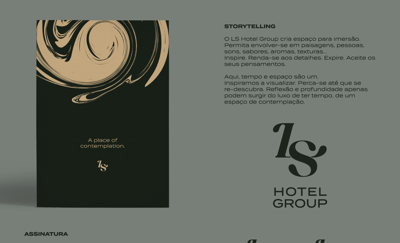
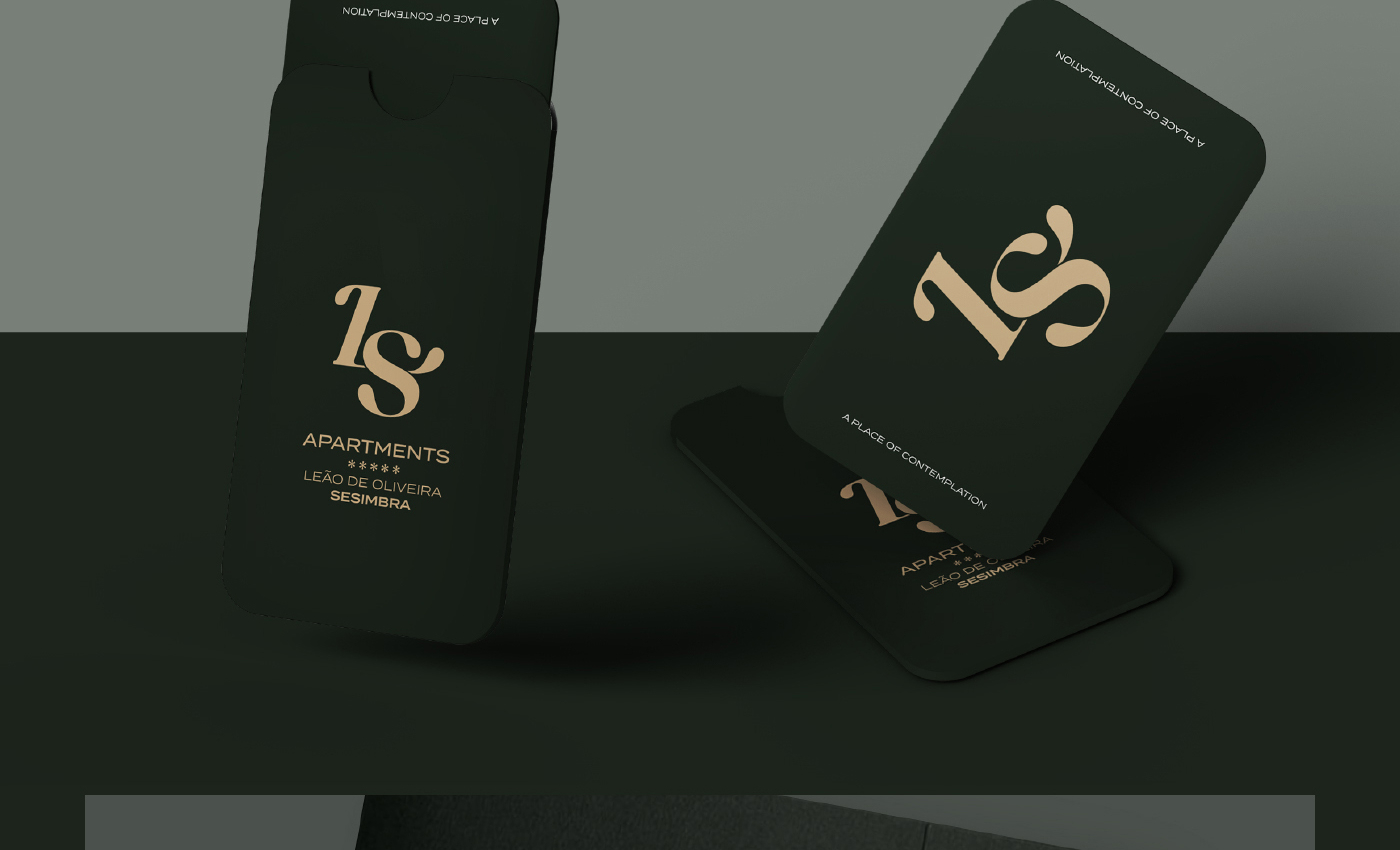
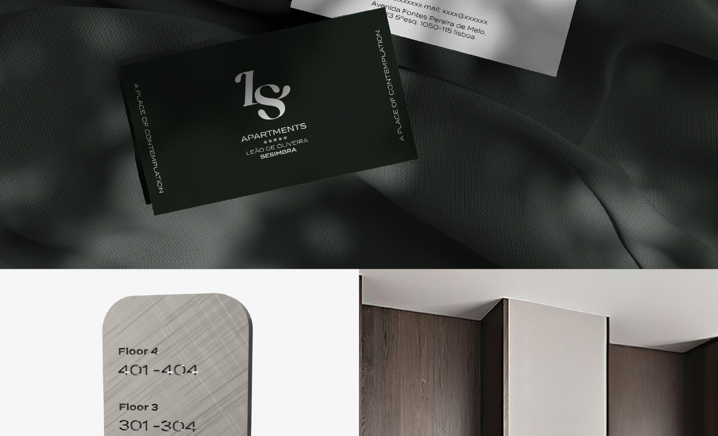
The color palette is directly inspired by nature, botany, and the organic world. It is a sober palette linked to sensations, which transports to a universe of exclusivity and serenity. The main color, Deep Green, was chosen for being immersive and natural. The secondary colors, Gold Sand (warm, soft) and Pure White (calm, pure), appeal to thermal experiences and luxury universes.
The main typography is Termina, chosen to break the norm of geometric fonts with its generously wide letters.
With the group’s future expansion in mind, the architecture is based on a monolithic scheme, allowing the brand to evolve while maintaining its coherence and reinforcing recognition. The uniformity between the different segments guarantees the solidity of the structure and the integrity of its language, accommodating future units cohesively.


Did you like this brand?
Challenge GRINGO to question your brand and feel the discomfort.