Hub Nacional para a Saúde do Cérebro
Branding
AICIB (the Agency for Clinical Research and Biomedical Innovation) presented us with the challenge of creating the brand for a new entity of national strategic importance: the National Hub for Brain Health (HNSC). GRINGO – Uncomfortable Creativity was thus the agency responsible for developing the brand concept and its visual identity.

The Challenge
At a time when brain health is a European priority, this Hub was born with the mission to gather, organize, and energize the Research and Innovation community in Portugal, connecting academia, industry, health, and society to generate real impact. The biggest challenge for the HNSC was cultural: how to foster collaboration in a sector where industry and other stakeholders are accustomed to working in isolation? The brand needed to be a bridge, inspiring trust and breaking down barriers between areas that do not normally intersect; it had to communicate the “hub” concept in an innovative, clean, and minimalist way, avoiding at all costs the visual clichés of the health sector, such as puzzle pieces or literal illustrations of the brain.
Our Approach
We positioned the HNSC not as an institution, but as a “catalyst for innovation and collaboration.” The brand’s personality was defined as Innovative, Collaborative, Trustworthy, and Inspiring, with a clear, accessible, and motivating voice. The brand tagline, which objectively and clearly encapsulates its mission, became “Joining efforts, driving impact.”
Visual Identity
The visual identity was conceived to translate the concept of a dynamic collective and an ever-evolving intellectual ecosystem.
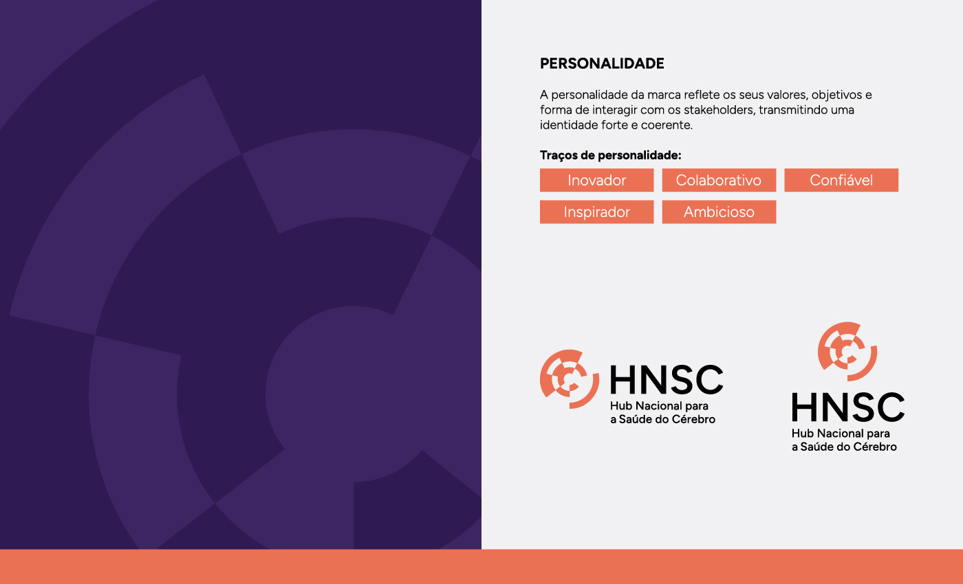
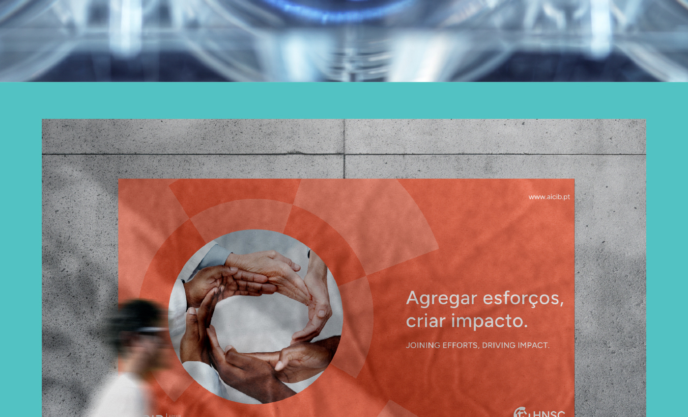
We created a symbol that, without being literal, alludes to the shape of a brain, representing collective intelligence. Its visual composition, formed by several non-closed circles, conveys the idea of continuous movement, adaptability, connection, and receptiveness to new ideas.
The predominant color is orange, chosen for its strong association with energy, enthusiasm, creativity, and optimism. This color also conveys a sense of welcome and dynamism, essential for an environment that aims to be modern and collaborative.
The main font chosen was Figtree, a modern and versatile typeface that, with its vast family of weights, allows for the creation of a clear and clean visual hierarchy, aligned with the brand’s innovative personality.


Did you like this brand?
Challenge GRINGO to question your brand and feel the discomfort.