Bouba
Naming, Branding and Labelling
Sontu, a food import and export company, approached us to create a new private-label brand. This new brand needed a strong identity to stand out in both the national and international markets. GRINGO – Uncomfortable Creativity was responsible for the naming, branding and labelling.

Challenge
The challenge was threefold. First, we had to create a brand that would stand out in a highly competitive ethnic food market driven by strong emotional ties. Second, the identity had to be immediately understandable to its primary target audience—mothers and women from the Angolan and Guinean communities, some with low literacy, who value quick visual recognition at the moment of purchase. Finally, the naming and branding had to be flexible enough to encompass new products for different communities in the future.
Our Approach
For a challenge so linked to identity and emotion, the answer lay in simplicity and comfort.
Naming: “Bouba,” a phonetically simple name, easy to remember, and with no prior meaning. Its sound evokes a feeling of comfort, of “fluffy” and familiar things, creating a positive and universal emotional foundation.
Storytelling: We focused on the idea that food is culture, belonging, and the cure for homesickness. We transformed this truth into the brand’s tagline, a promise that connects the new name to its emotional essence: “Tastes like Bouba, tastes like home.“
Visual Identity
The visual identity was designed to be familiar, warm, and full of flavor.
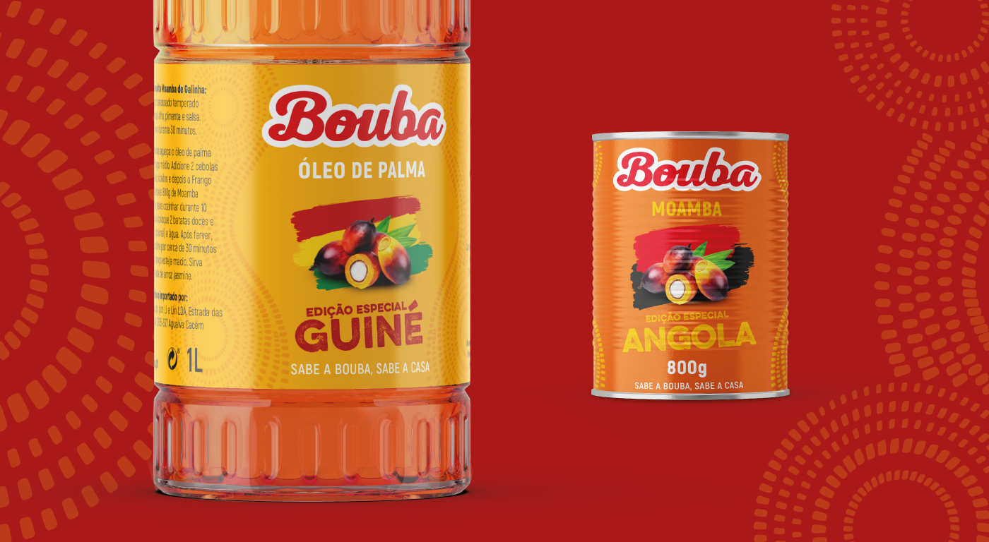
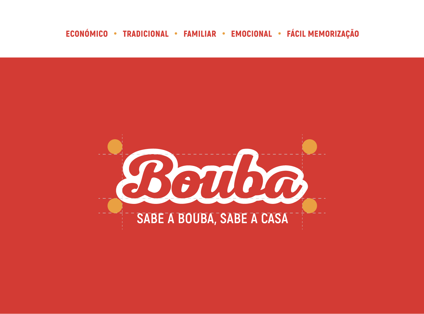
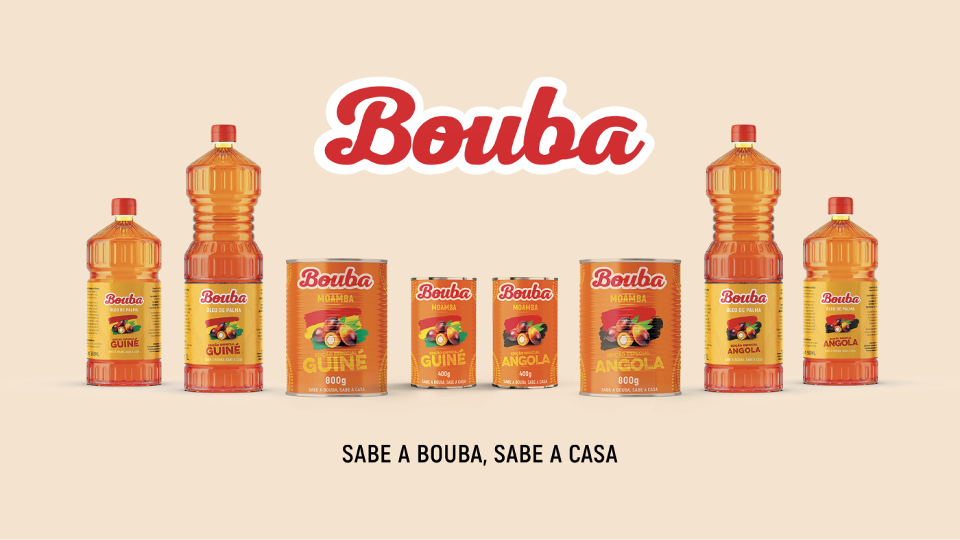
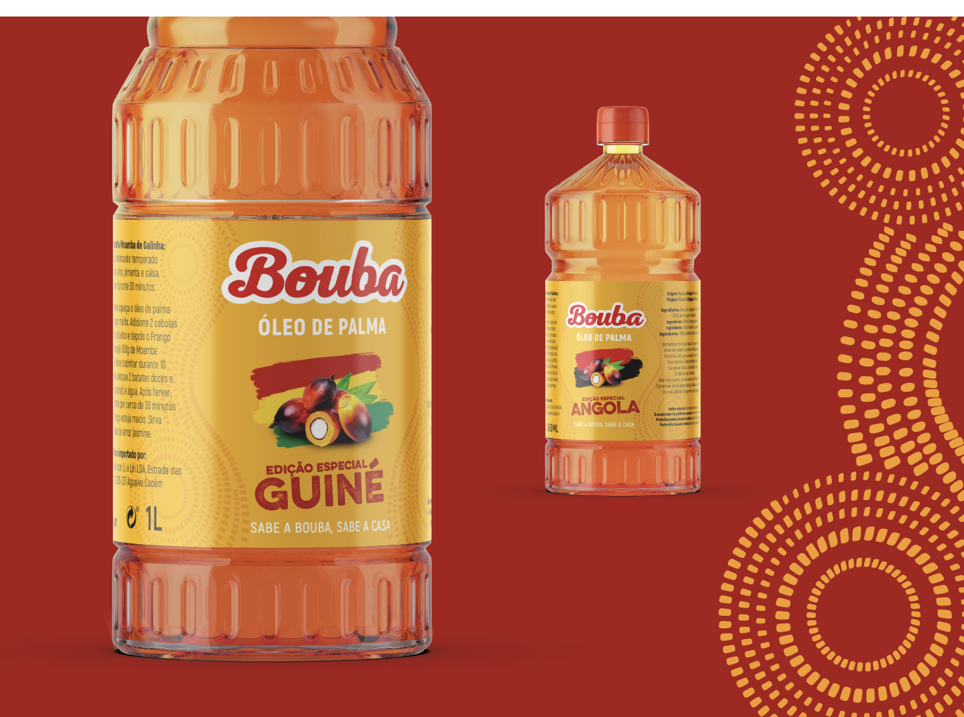
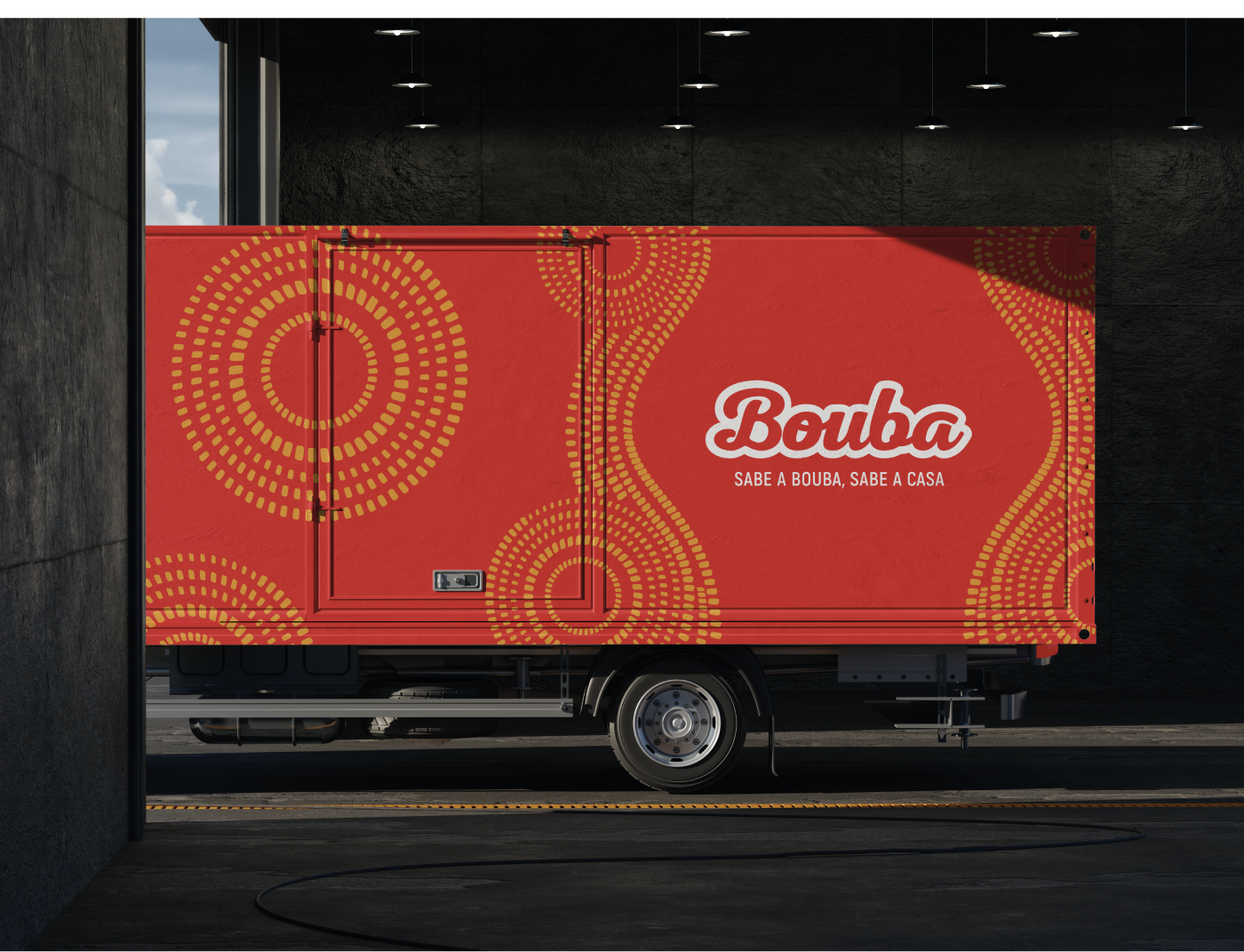
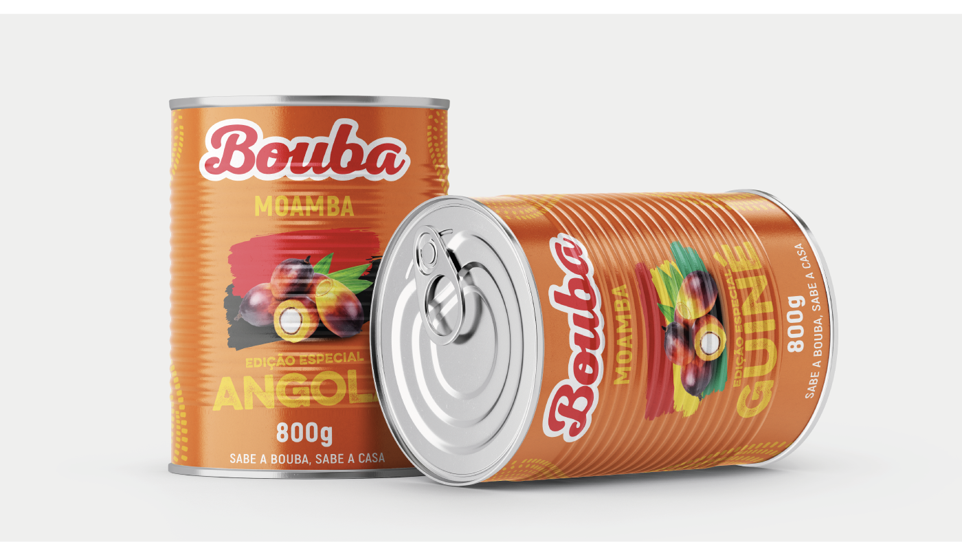
We designed a logo with a calligraphic and curvy font that appeals to the comfort of home-cooked food, with a modernized retro touch. The white outline reinforces this nostalgia because, as we all know, “in the old days, the cooking was really good!”
Red became the brand’s central color. It is the color of the love with which the food is made, but also of countless ingredients that make up the most cherished dishes, creating an immediate and powerful association.
To create a rich and flexible visual system, we drew inspiration from the creativity of traditional and tribal face paintings. These geometric patterns evoke the dynamism and tradition of the cuisine, allowing for visual differentiation for each product and community (Angola and Guinea) in an authentic and respectful way.


Did you like this brand?
Challenge GRINGO to question your brand and feel the discomfort.