Hairlox, one of the anchor products from the Portuguese laboratory Edol, is an established supplement brand in the hair health market. At a time when the brand’s growth potential was not being unlocked, Edol approached GRINGO – Uncomfortable Creativity for the brand’s rebranding and packaging project.
Challenge
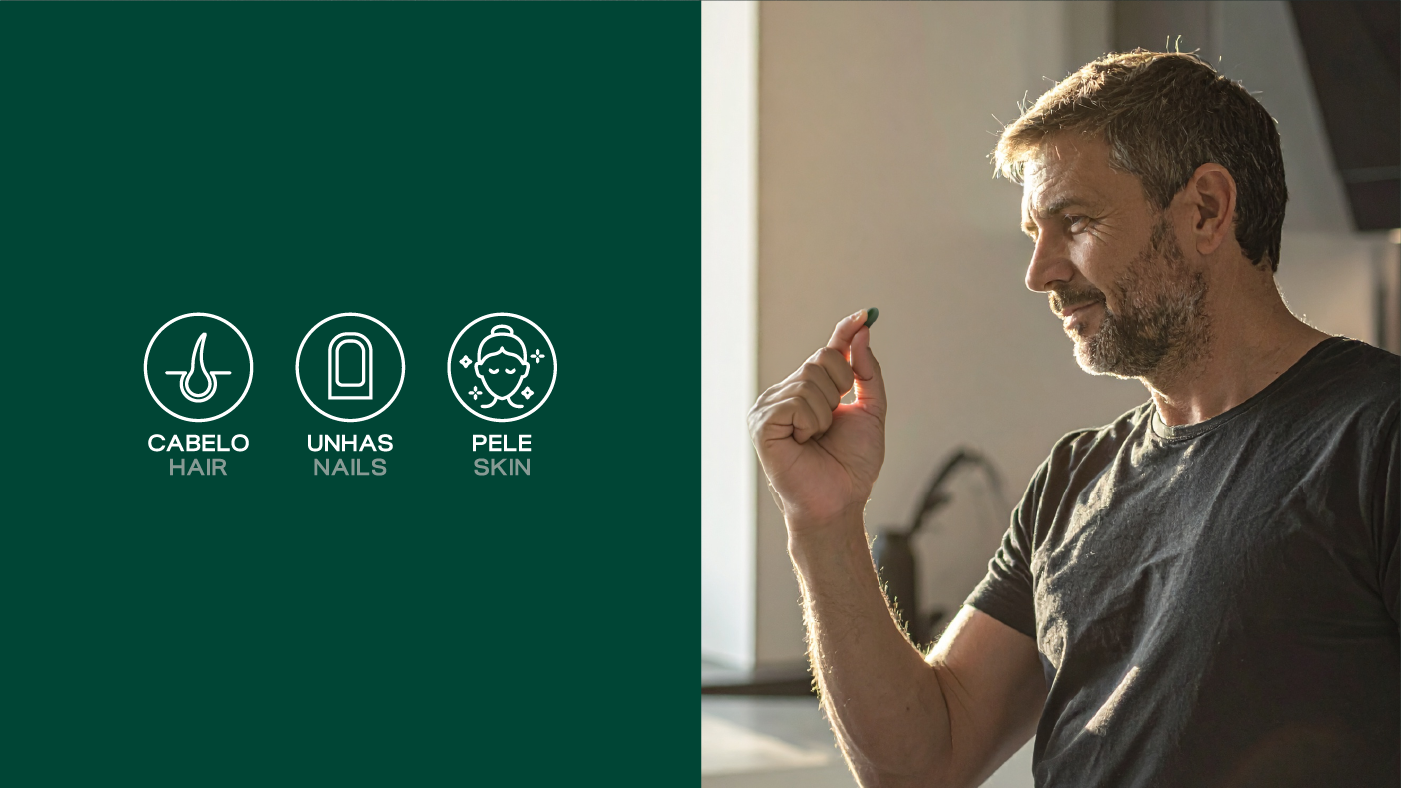
The central challenge was to unlock Hairlox’s growth potential. The brand, despite being established, had an unappealing image and “overly medical” communication, focusing heavily on the B2B channel (doctors) and very little on the end consumer. It was necessary to create a more relatable and appealing brand, capable of broadening the target to include a male audience, balancing clarity for the consumer with the credibility demanded by professionals.
Our Approach
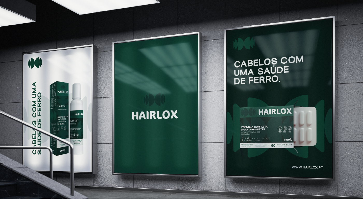
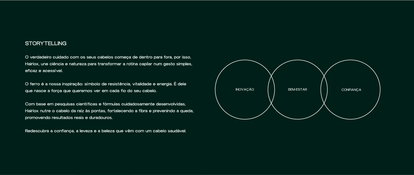
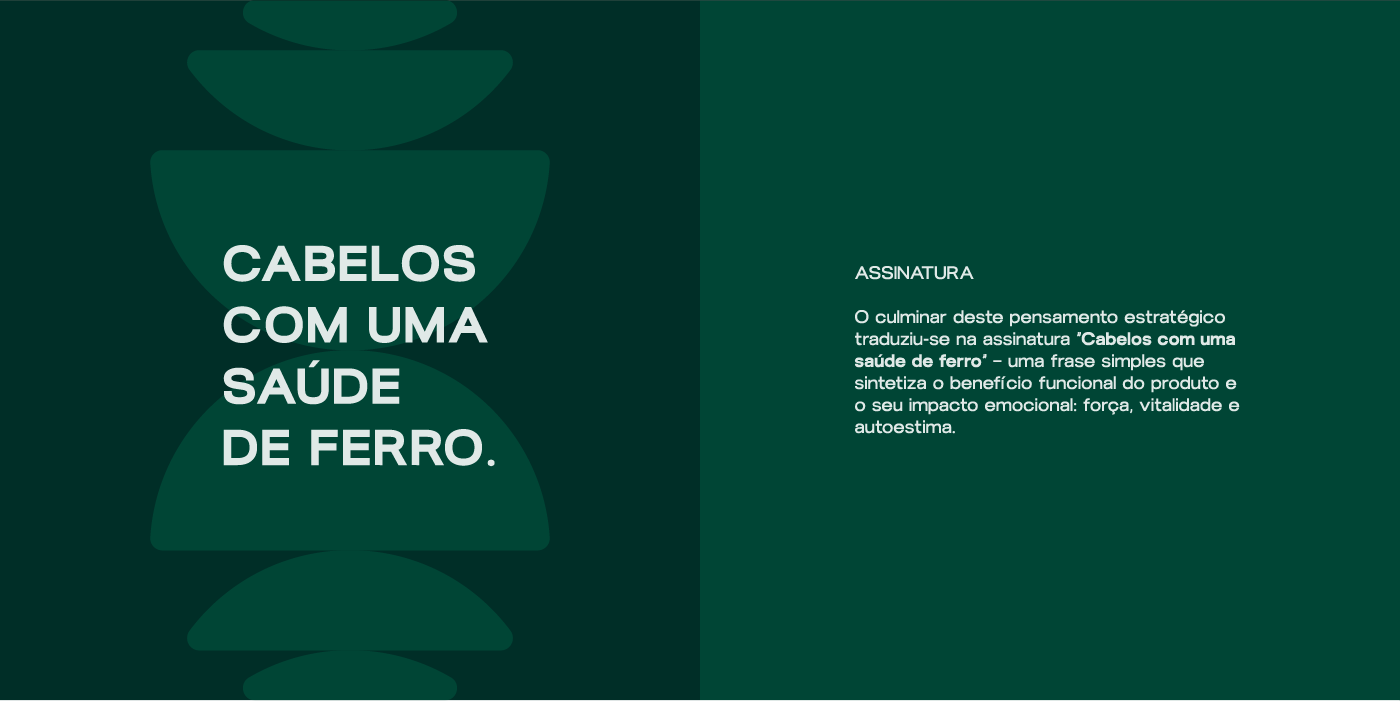
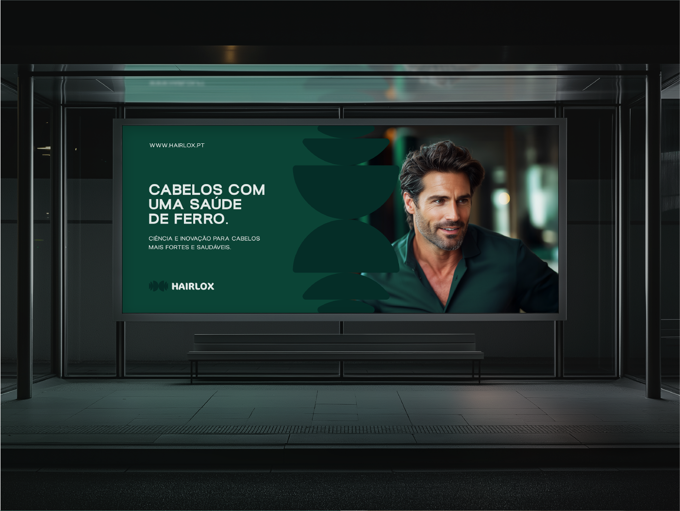
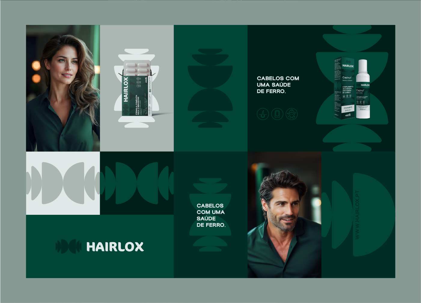
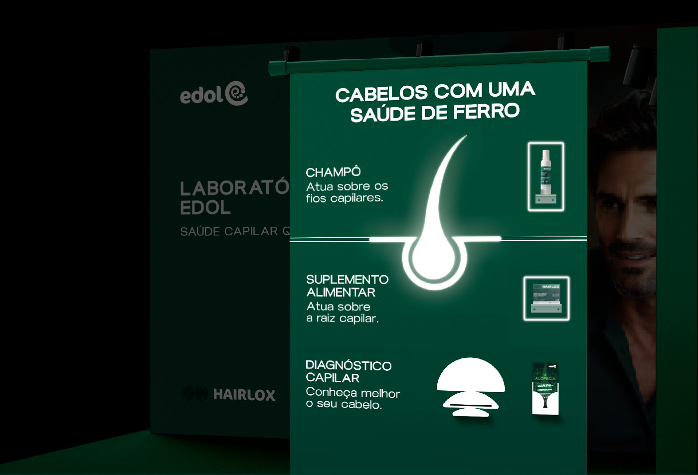
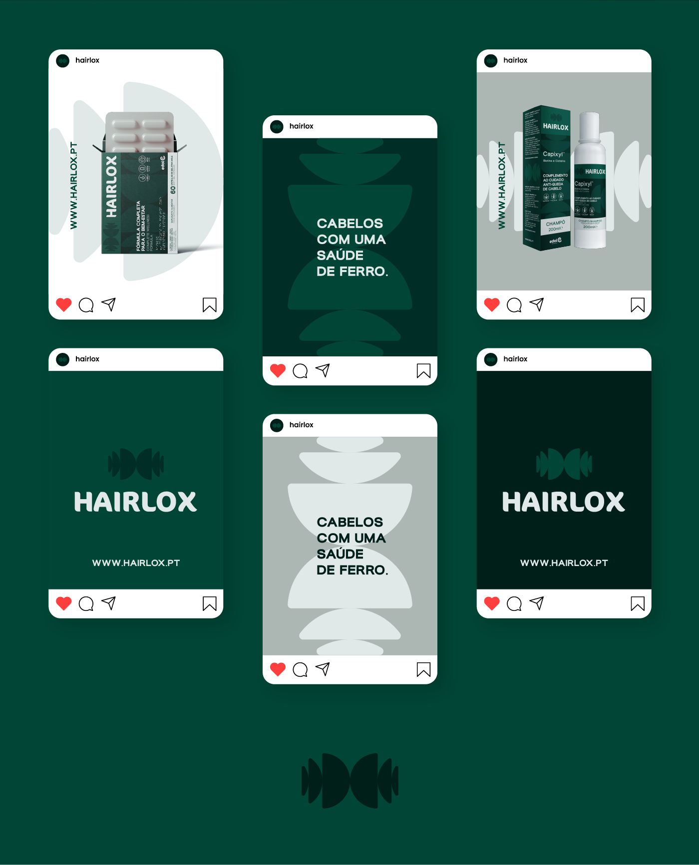
We started with an in-depth diagnostic, redefining the brand’s positioning. We moved away from the strictly medical approach to embrace a new concept that was translated into the new tagline: “Cabelos com uma saúde de ferro” (Hair with iron-clad health), which reinforces the product’s effectiveness and its formula (rich in iron).
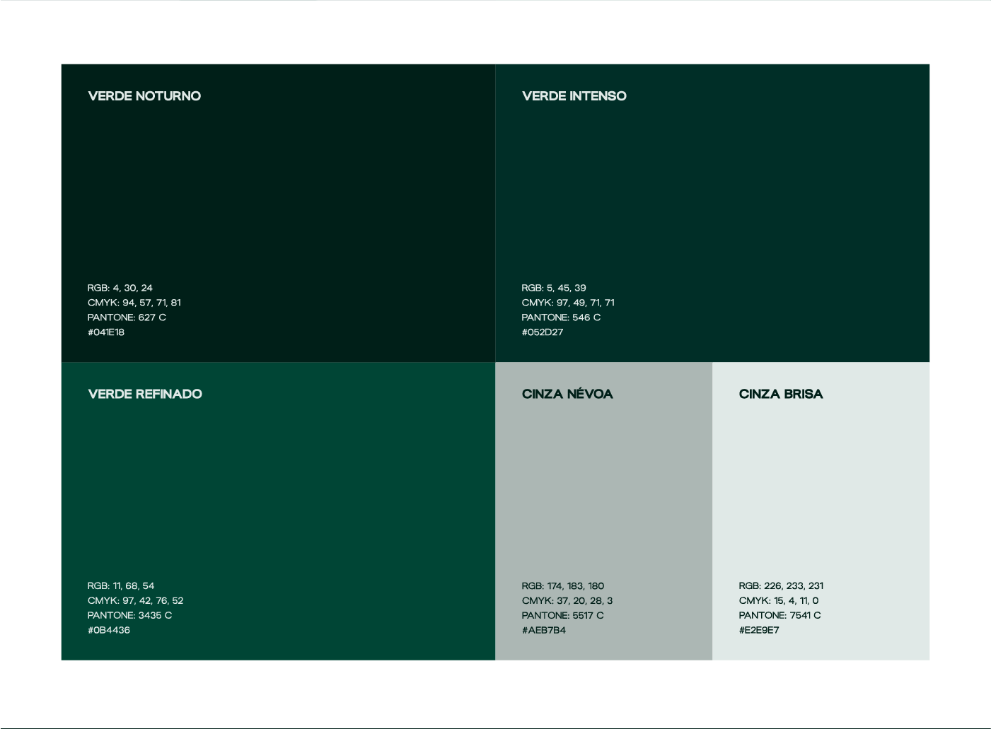
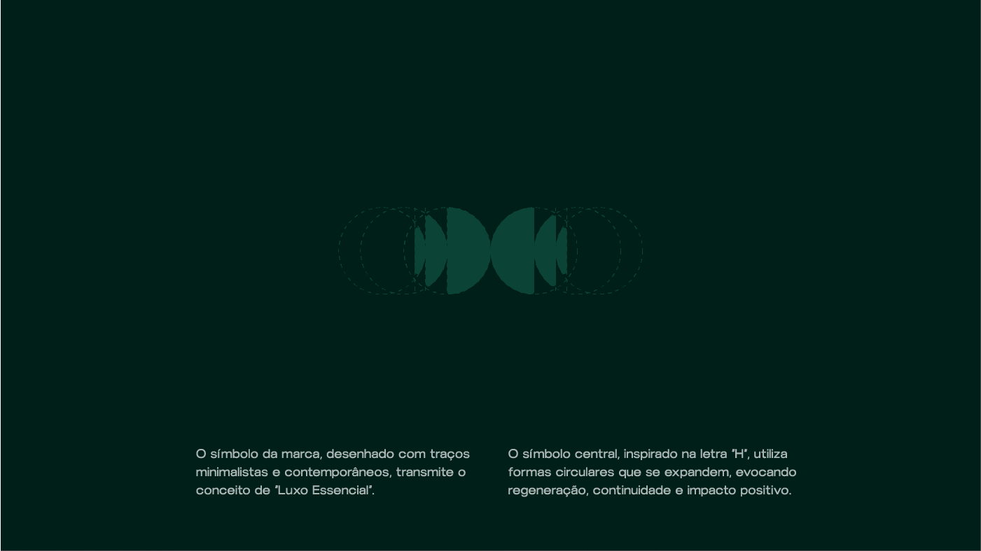
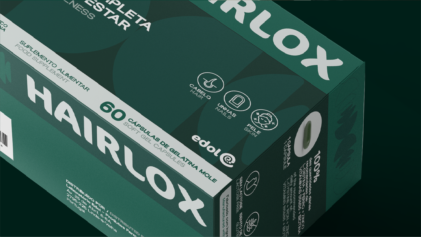
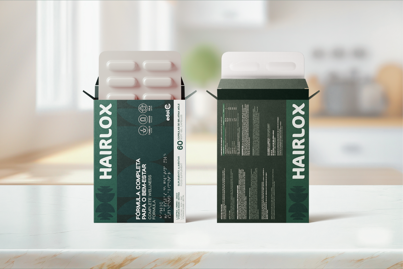
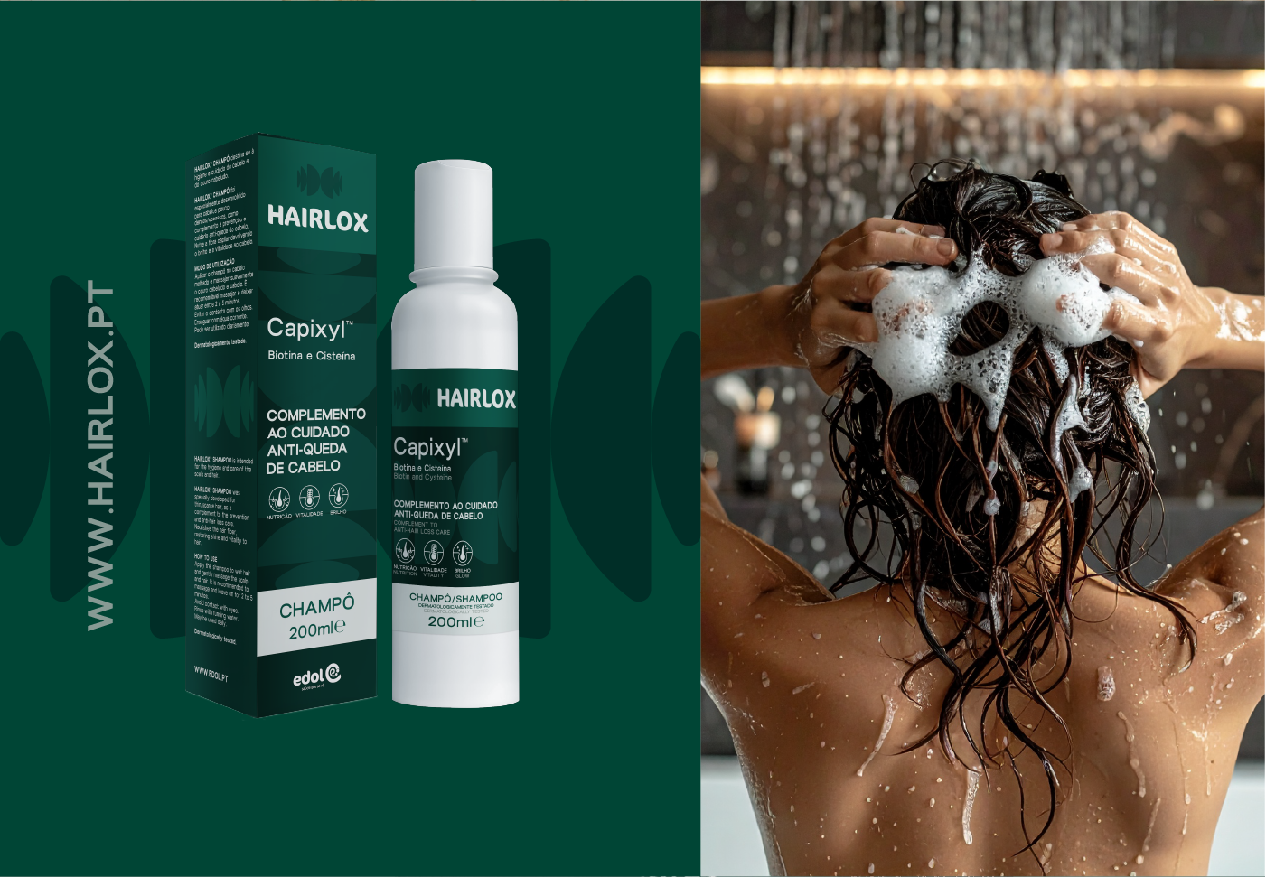
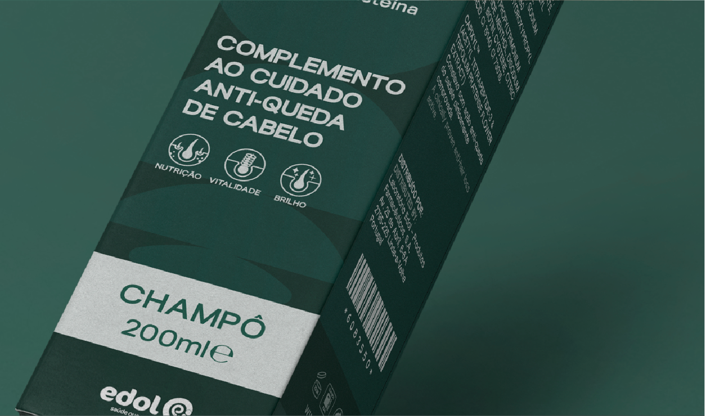
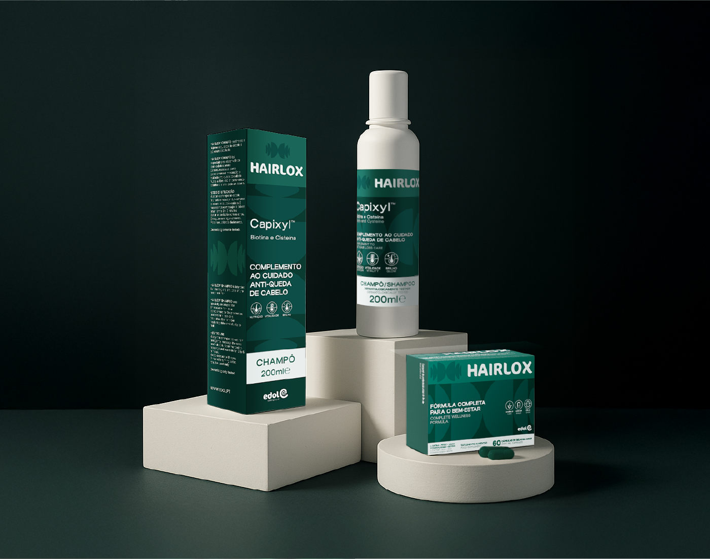
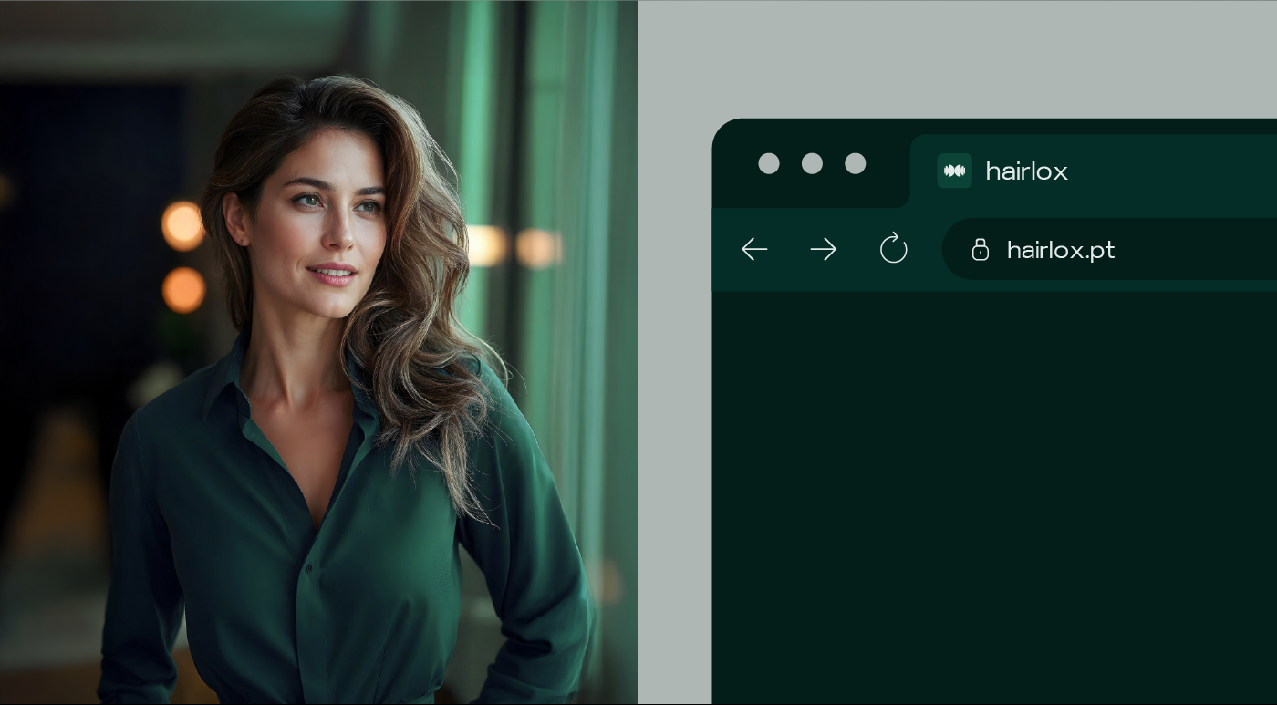
The visual identity was completely renewed. The new logo, inspired by the letter “H,” symbolizes the strength and connection of hair fibers. We created a graphic symbol from the “H” that evokes regeneration and a visual universe that, through a palette of greens and the new typography, positions Hairlox as “Essential Luxury”: a premium, modern, and effective brand, yet simple and accessible. The result is new packaging and a cohesive brand identity, ready to communicate with the end consumer and expand its market share.
Gostou desta marca?
Desafie a GRINGO a questionar a sua marca e sinta o desconforto.