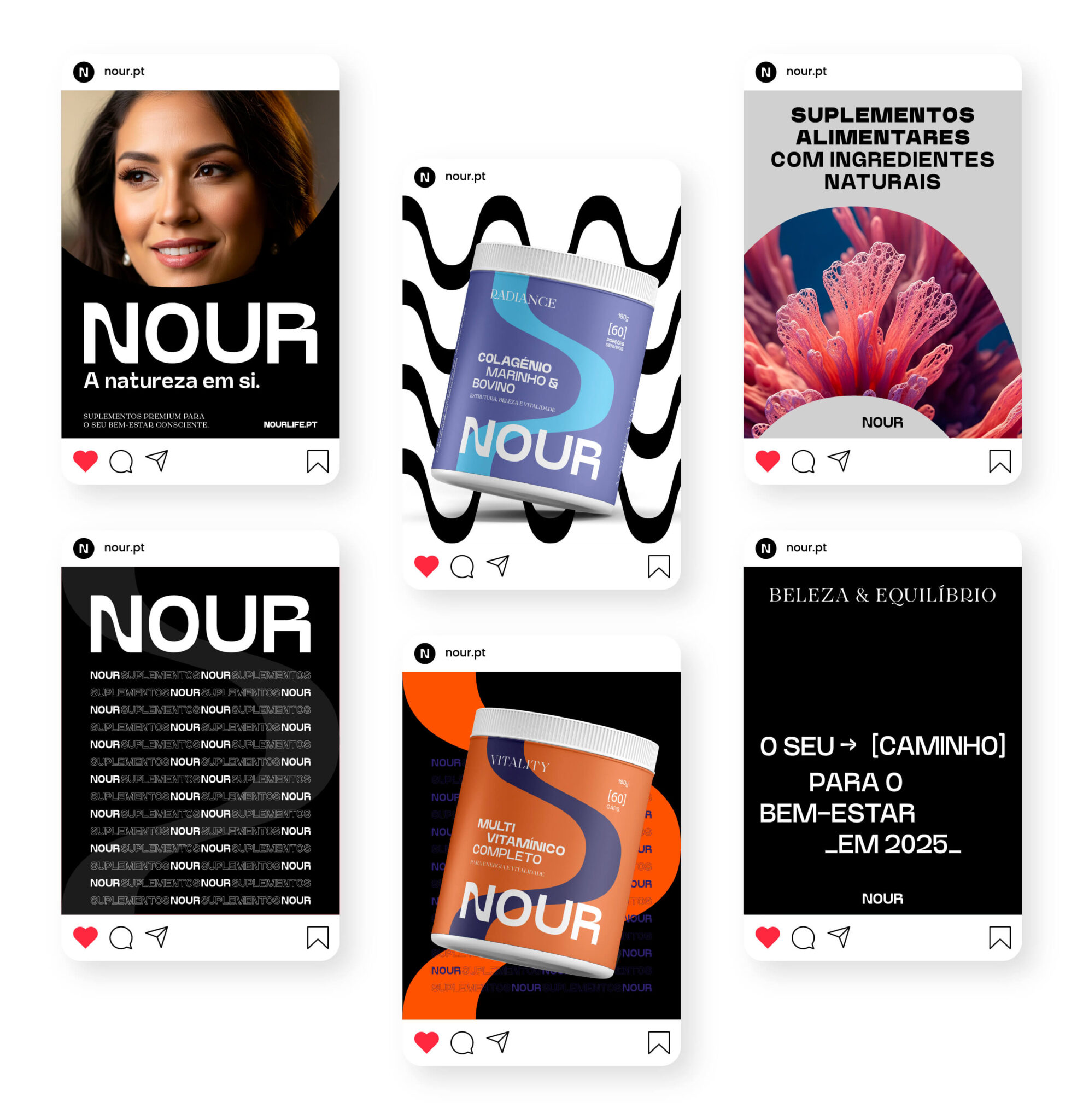
Nour

Naming and Branding

Doctor Blayetza Rosas needed to launch a premium line of natural supplements, but the market demanded more than a personal signature brand. As a branding agency, GRINGO developed the naming “Nour” and a complete visual identity to guarantee portfolio scalability. We built a brand engineered for growth in preventive health, ready to command the shelf.

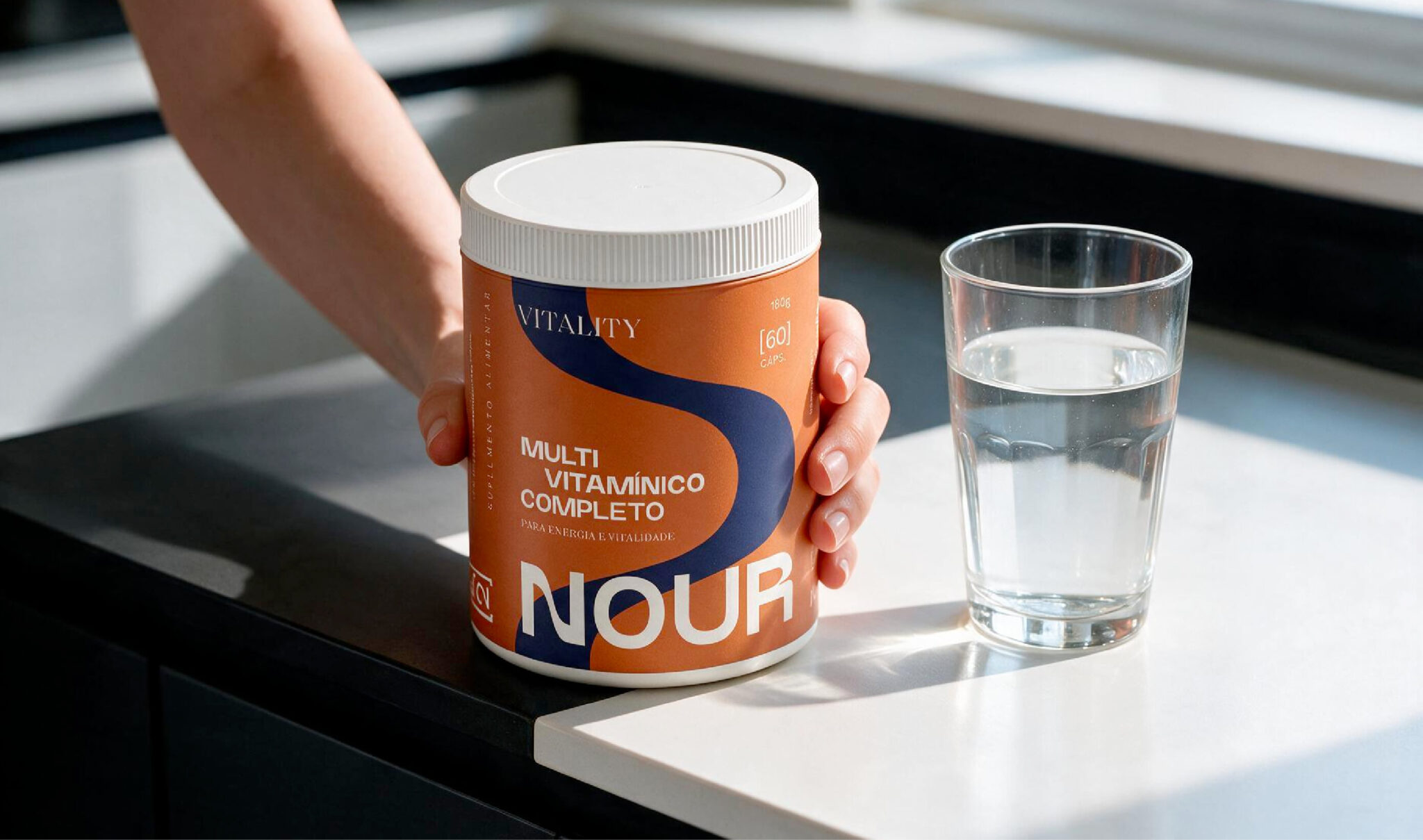
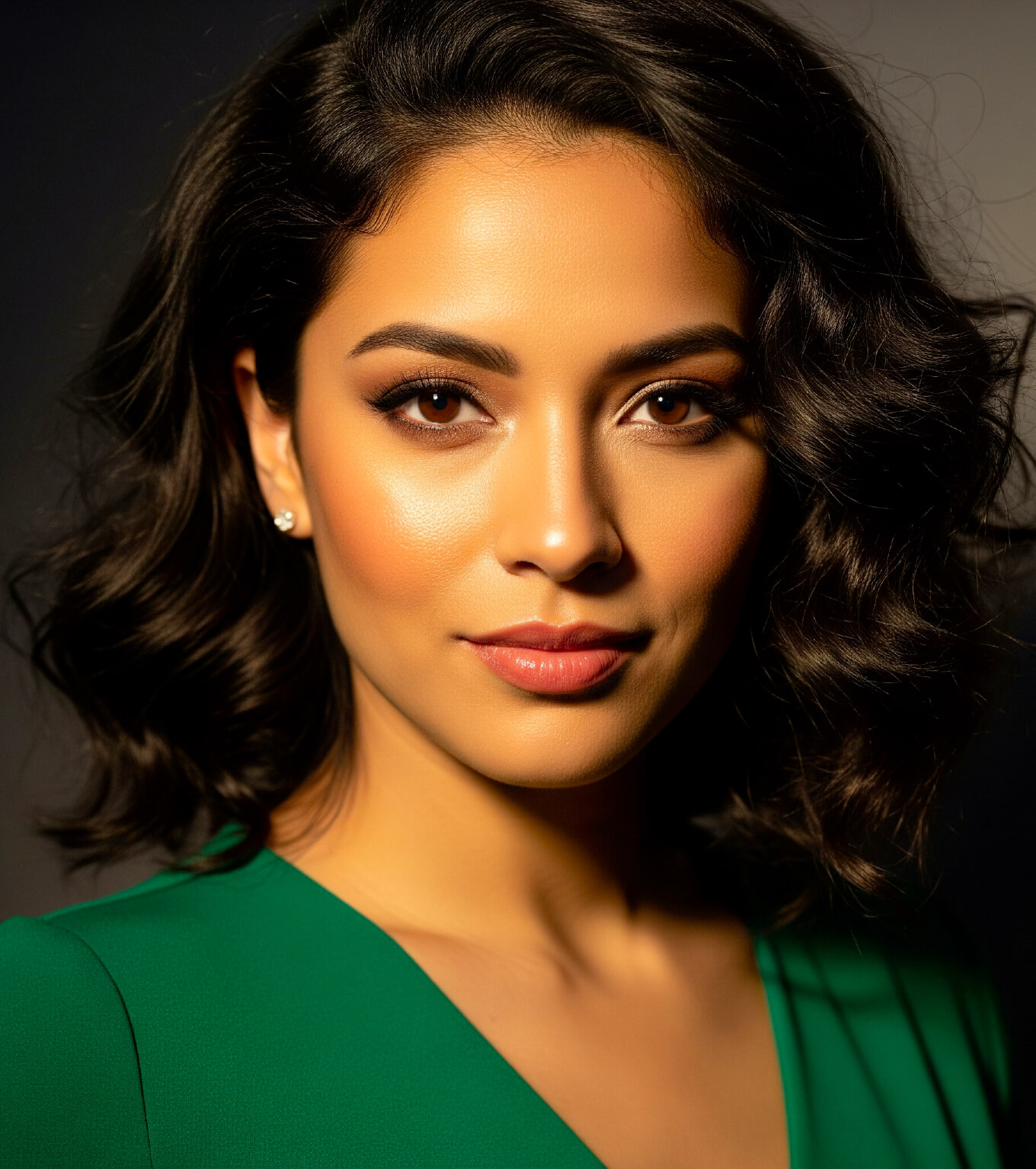
Naming e Branding -Nour pela GRINGO - key visual

To name or not to name: the founder's brand dilemma

The nutraceutical market is flooded with empty promises and products that die on supermarket shelves. The founder, an aesthetic medicine physician, had high-grade formulations like marine collagen and ashwagandha. The knee-jerk reaction when launching a venture like this is to slap the founder’s name on the logo or name the company after a single ingredient. Blayetza wanted to do things differently. Tying the brand to a personal name restricts commercial scalability and limits future product expansions.

How to command a premium price on the shelf

We needed to step in and rub salt into the wound. How do we justify a premium price point without looking like just another generic supplement brand? The answer was in the briefing: the client wanted to educate consumers on holistic wellness transparently while proving the clinical rigor behind her formulas. When creating brand names, we avoid egocentric traps to find a universal, flexible concept. The ambition demanded a short, memorable, and legally clear name built to support a growing portfolio.

From nutrition to high-end design

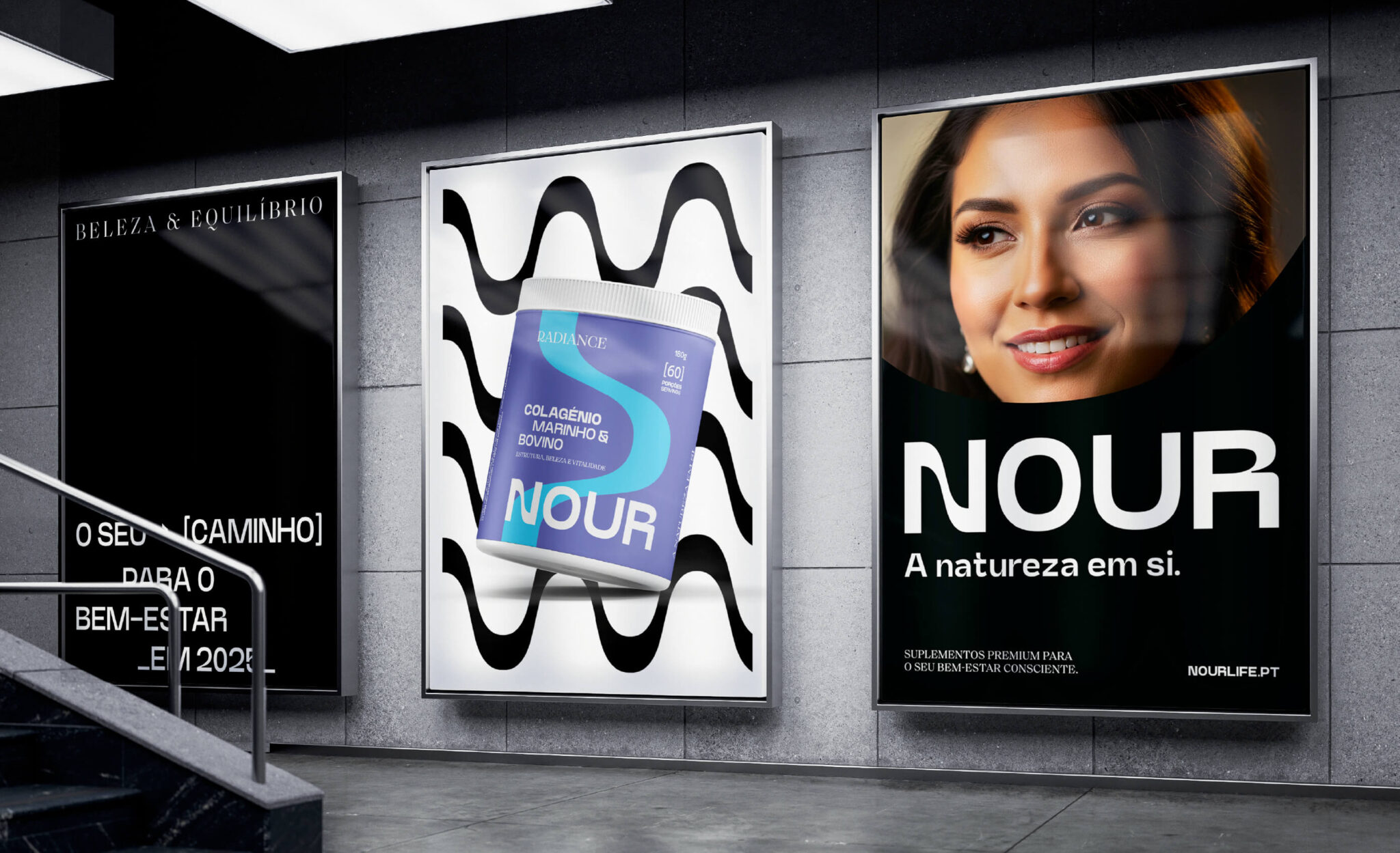
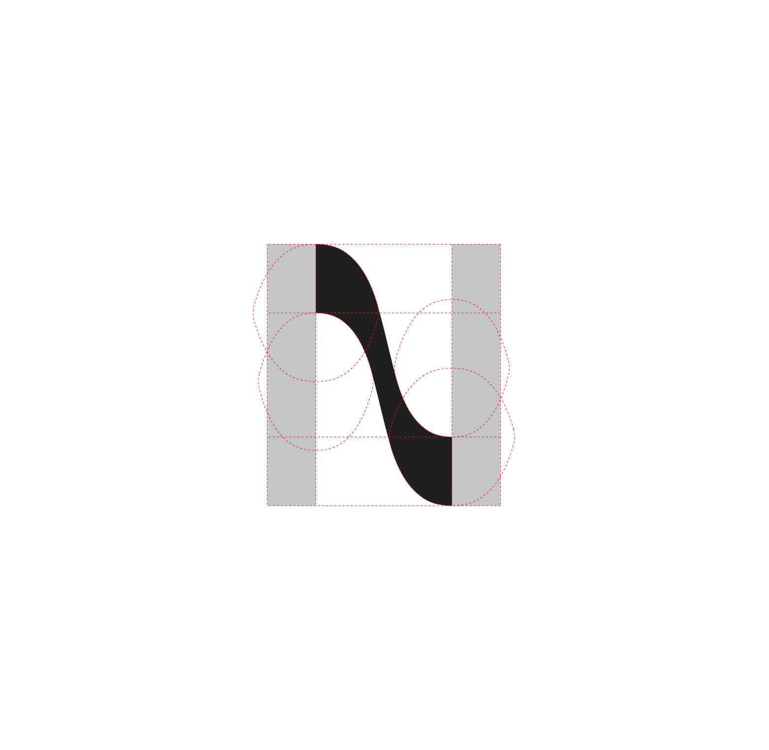
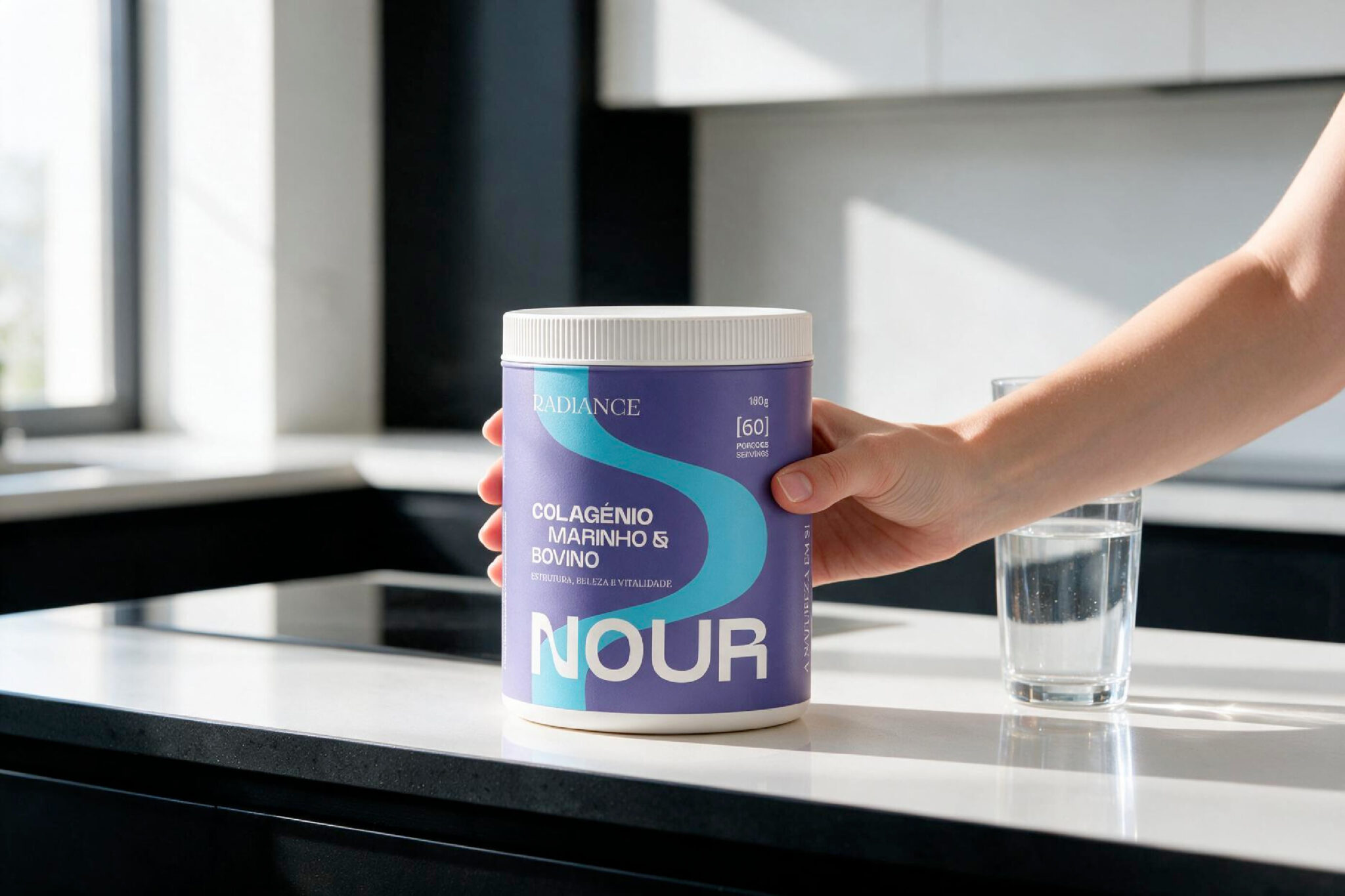
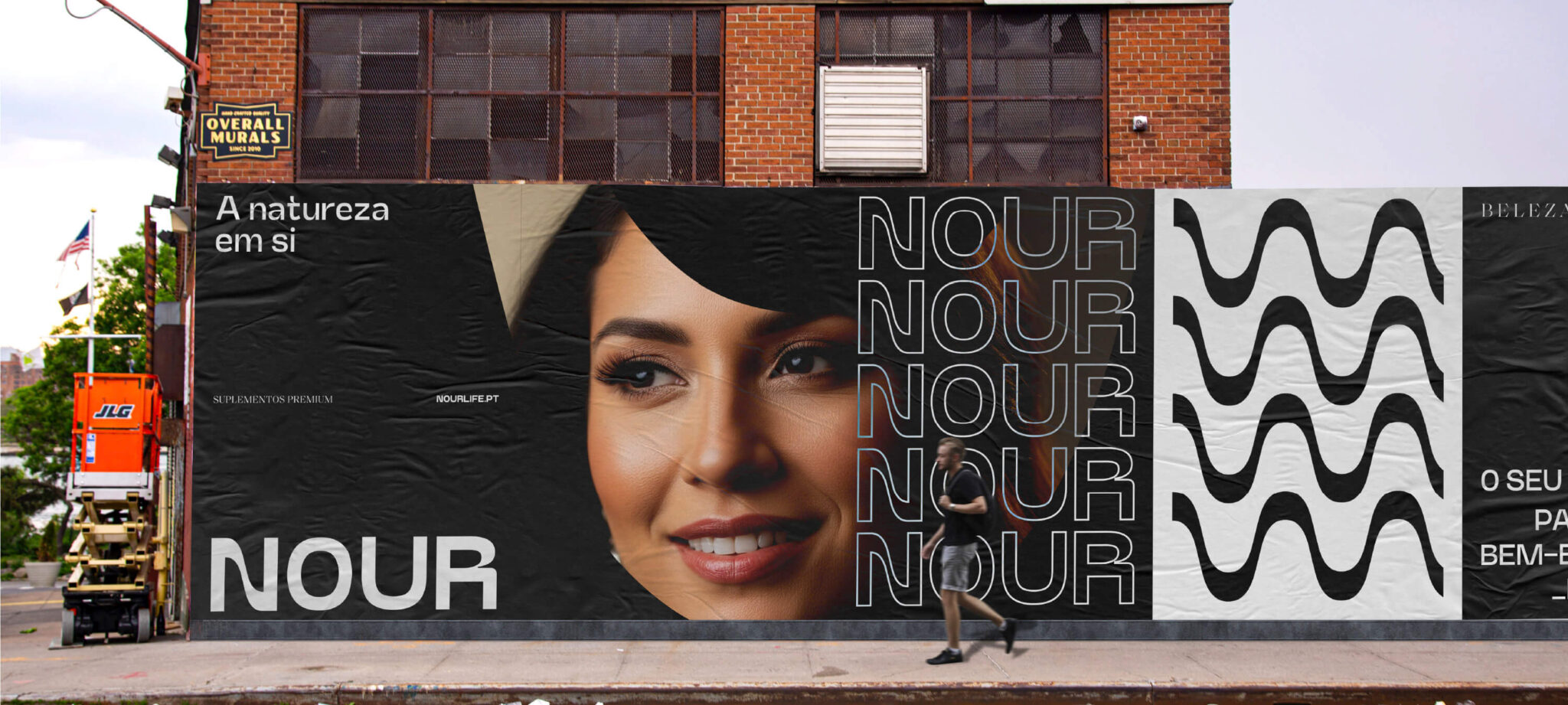
After analyzing direct competitors like Vital Proteins and Drasanvi, the path forward became clear. The approved name was “Nour,” inspired by the word nourish. It sounded high-end, communicated transparency, and freed the business from any single-product bottleneck. For the design, we adopted a modern, sensory aesthetic, steering far away from the cold, clinical look of traditional pharma. We applied a minimalist color palette and built distinctiveness into the letter “N” with a wave that evokes movement and the sea. What we delivered:
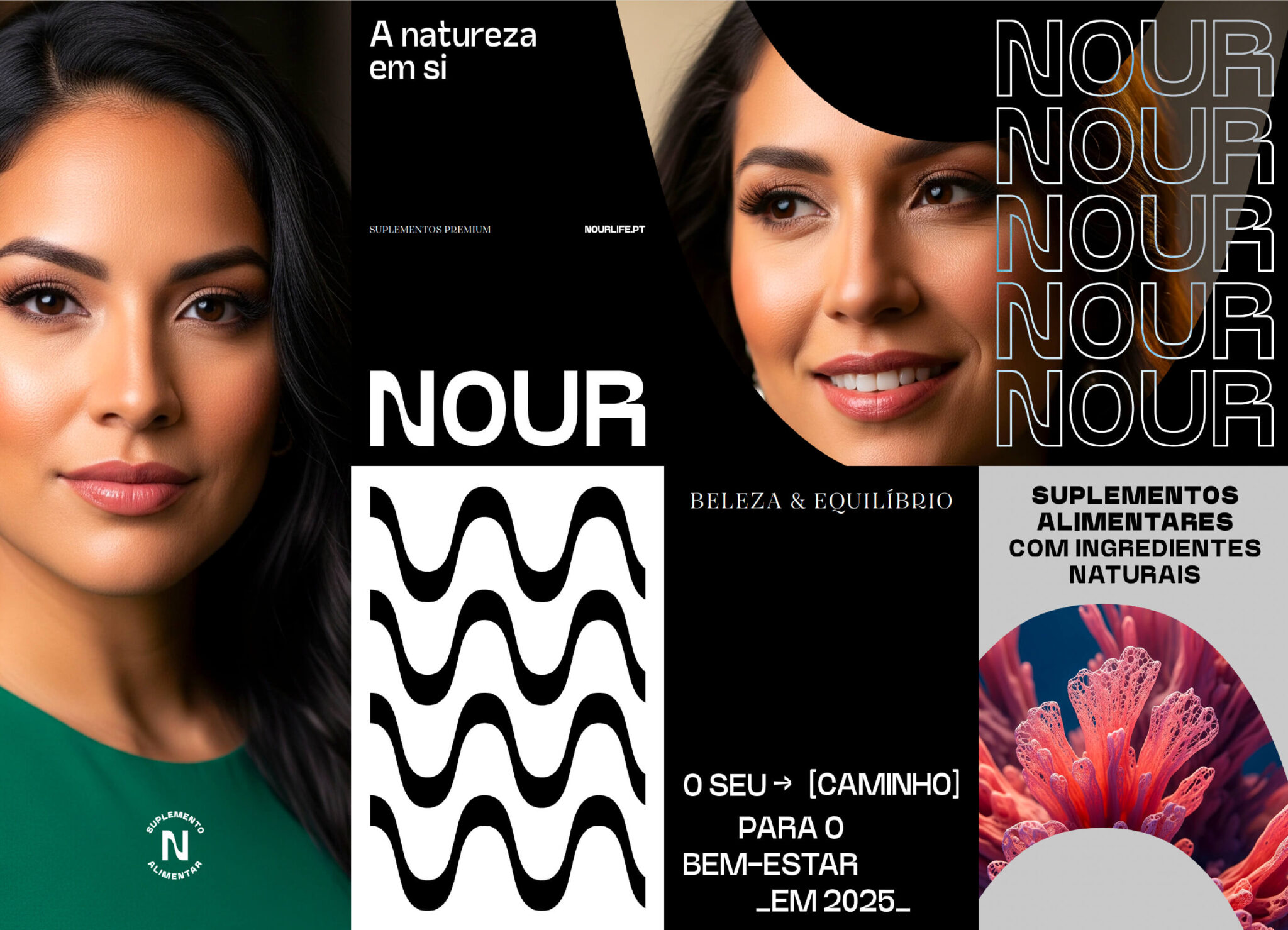
    • Brand Audit

    • Brand Strategy

    • Naming

    • Verbal Identity & Copywriting

    • Visual Identity

    • Packaging Design

Naming e Branding -Nour pela GRINGO - overview visual

The brand tagline

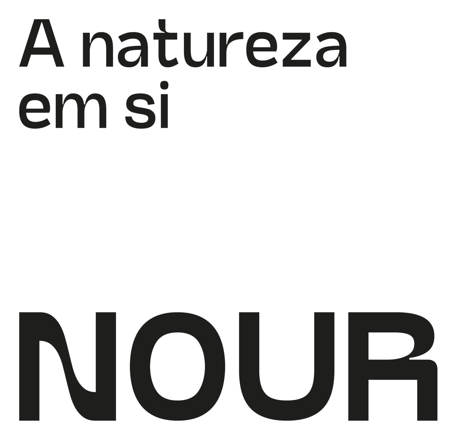
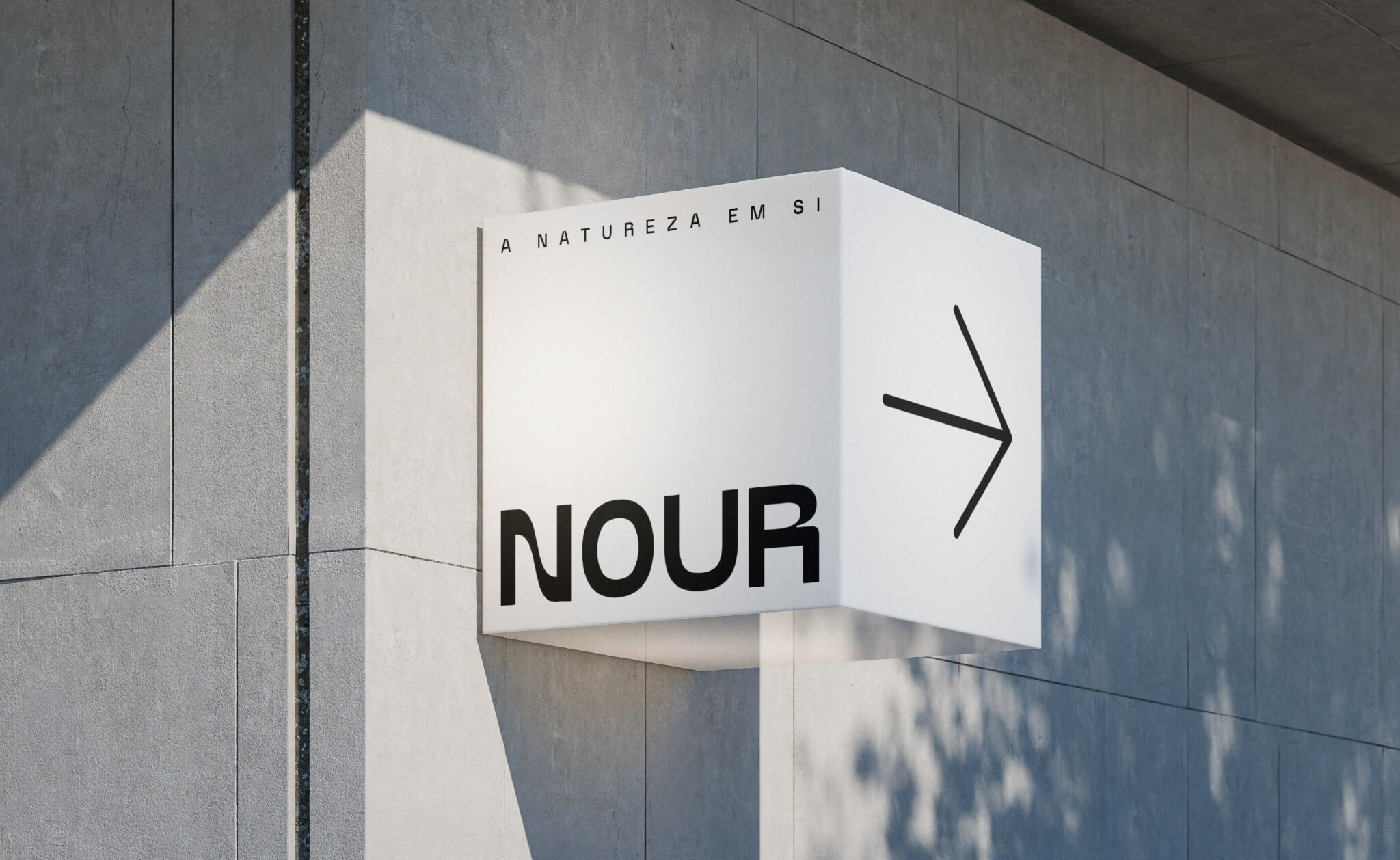
The Portuguese tagline “A natureza em si” relies on a smart double meaning. Literally translated as “Nature itself”, it validates that the brand uses exclusively natural ingredients. However, in Portuguese, “em si” also means “in you” — promising to put the power of nature directly inside the consumer. In a market saturated with fake cure claims, this slogan anchors the communication in honest prevention.

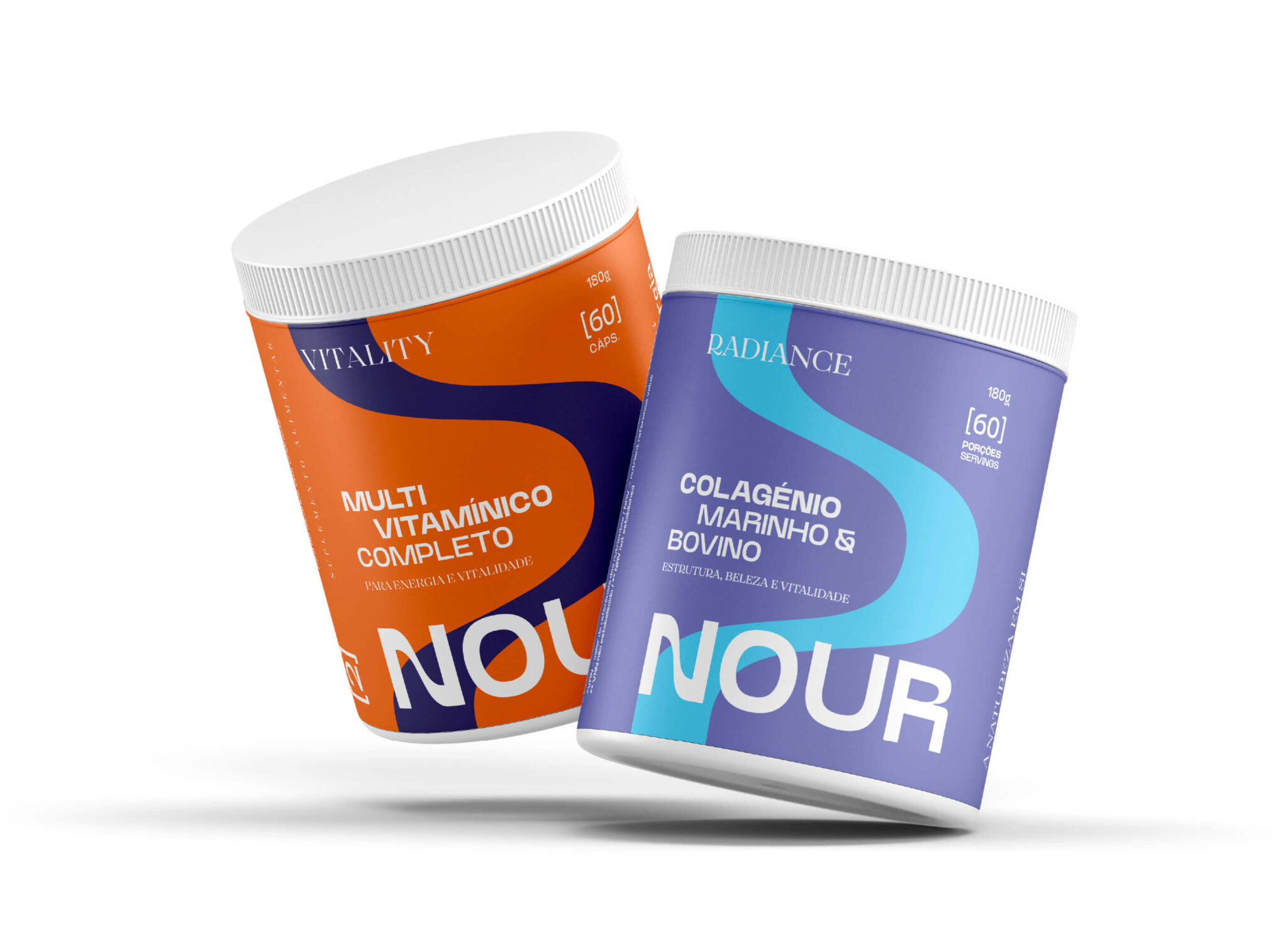
Naming e Branding -Nour pela GRINGO - logotipo, key visual e packaging
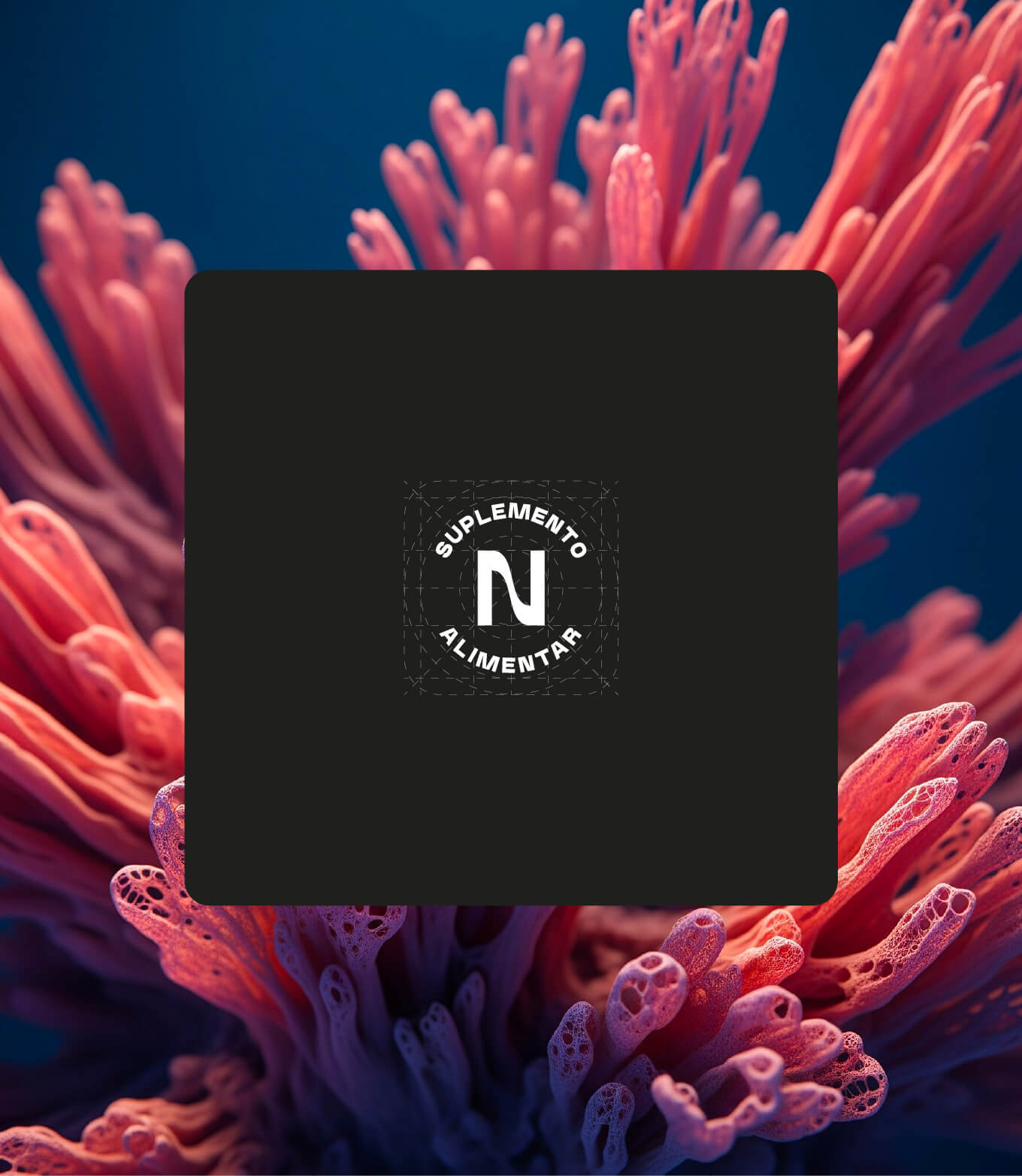
Naming e Branding -Nour pela GRINGO - símbolo

The symbol: a wave of vitality

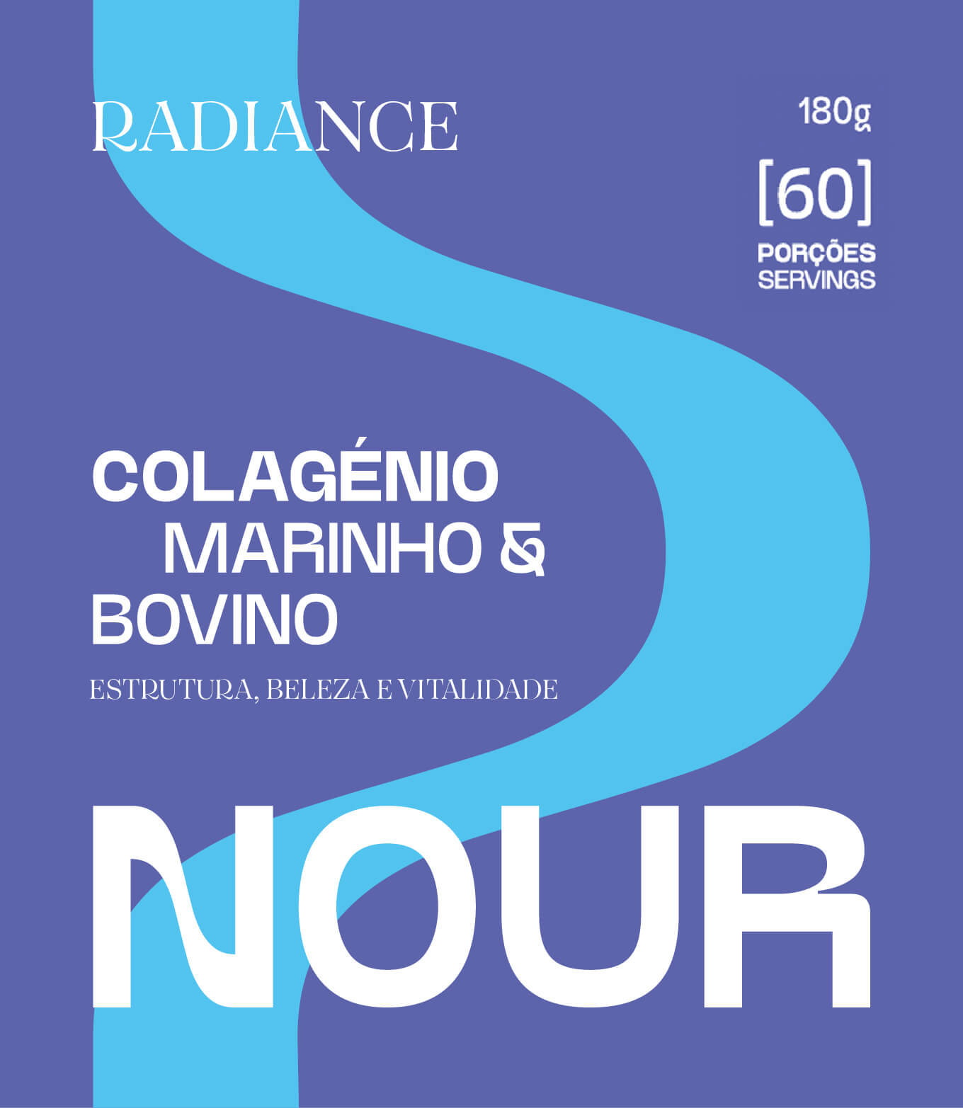
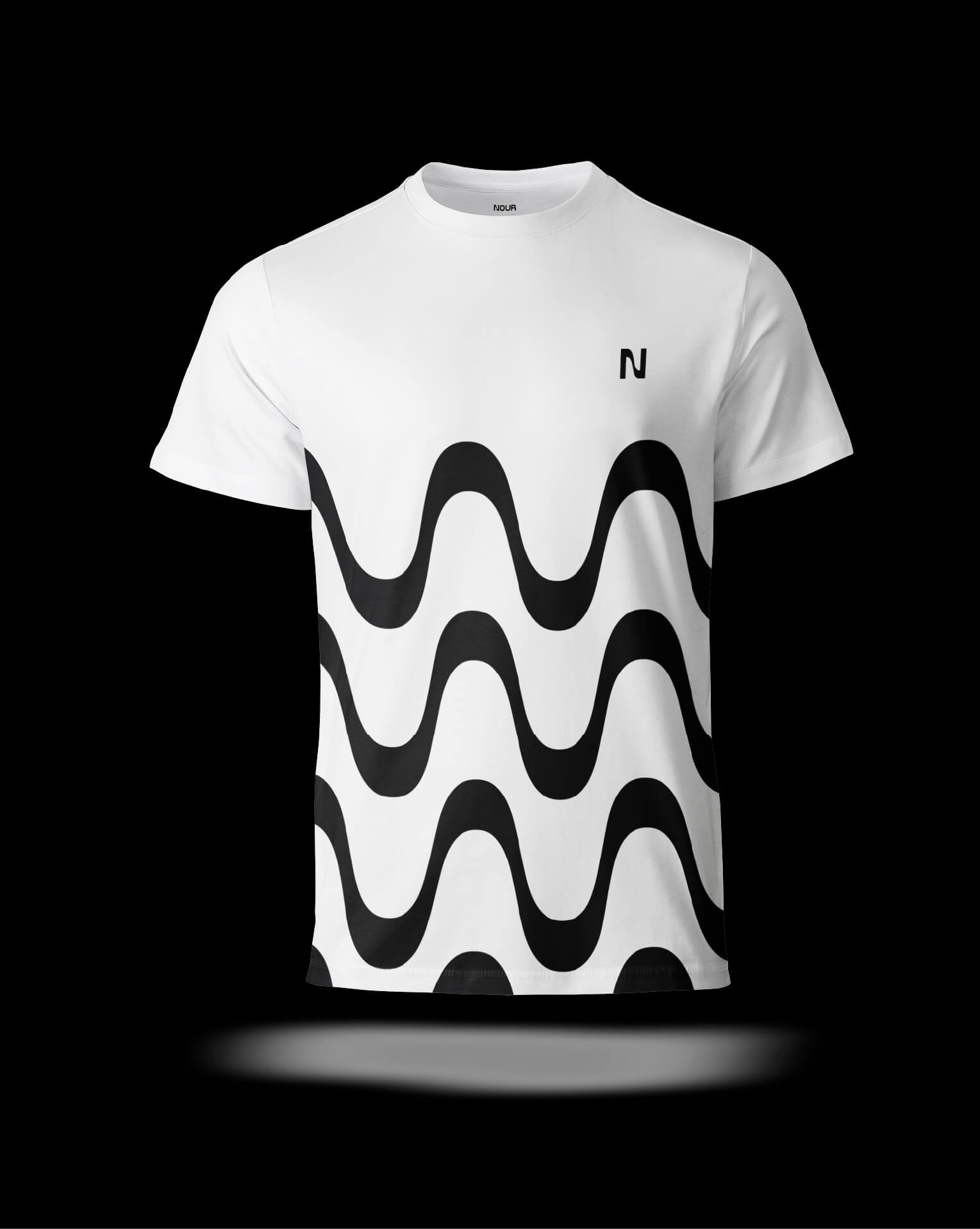
The symbol stylizes the letter “N,” drawing on sea waves to convey vitality and balance. Designed to function independently from the wordmark, this organic wave sits front and center on the labels, driving packaging distinctiveness and driving perceived value on the shelf.

Naming e Branding -Nour pela GRINGO - maquete packaging colagénio
Naming e Branding -Nour pela GRINGO - rótulo colagénio
Naming e Branding -Nour pela GRINGO - t-shirt
Naming e Branding -Nour pela GRINGO - padrão
Naming e Branding -Nour pela GRINGO - maquete packaging multivitamínico
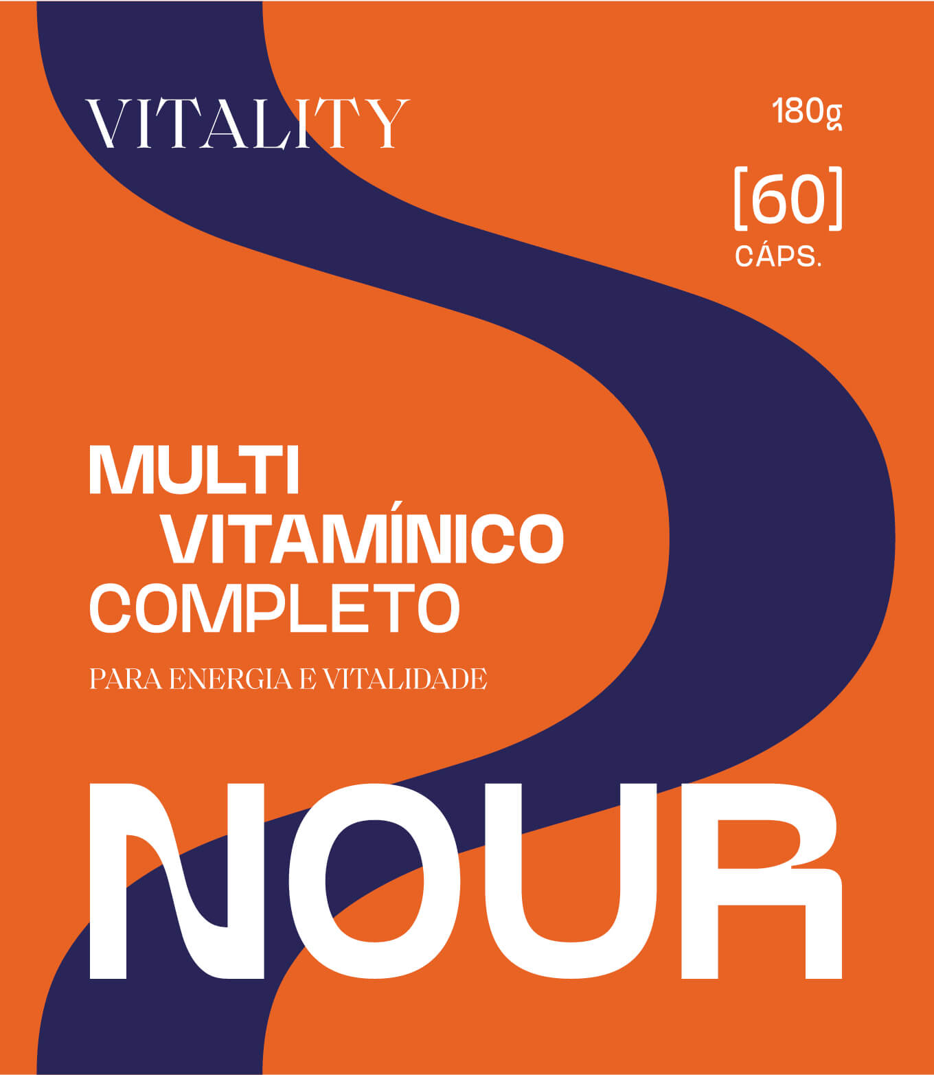
Naming e Branding -Nour pela GRINGO - rótulo multivitamínico
Naming e Branding -Nour pela GRINGO - rótulos
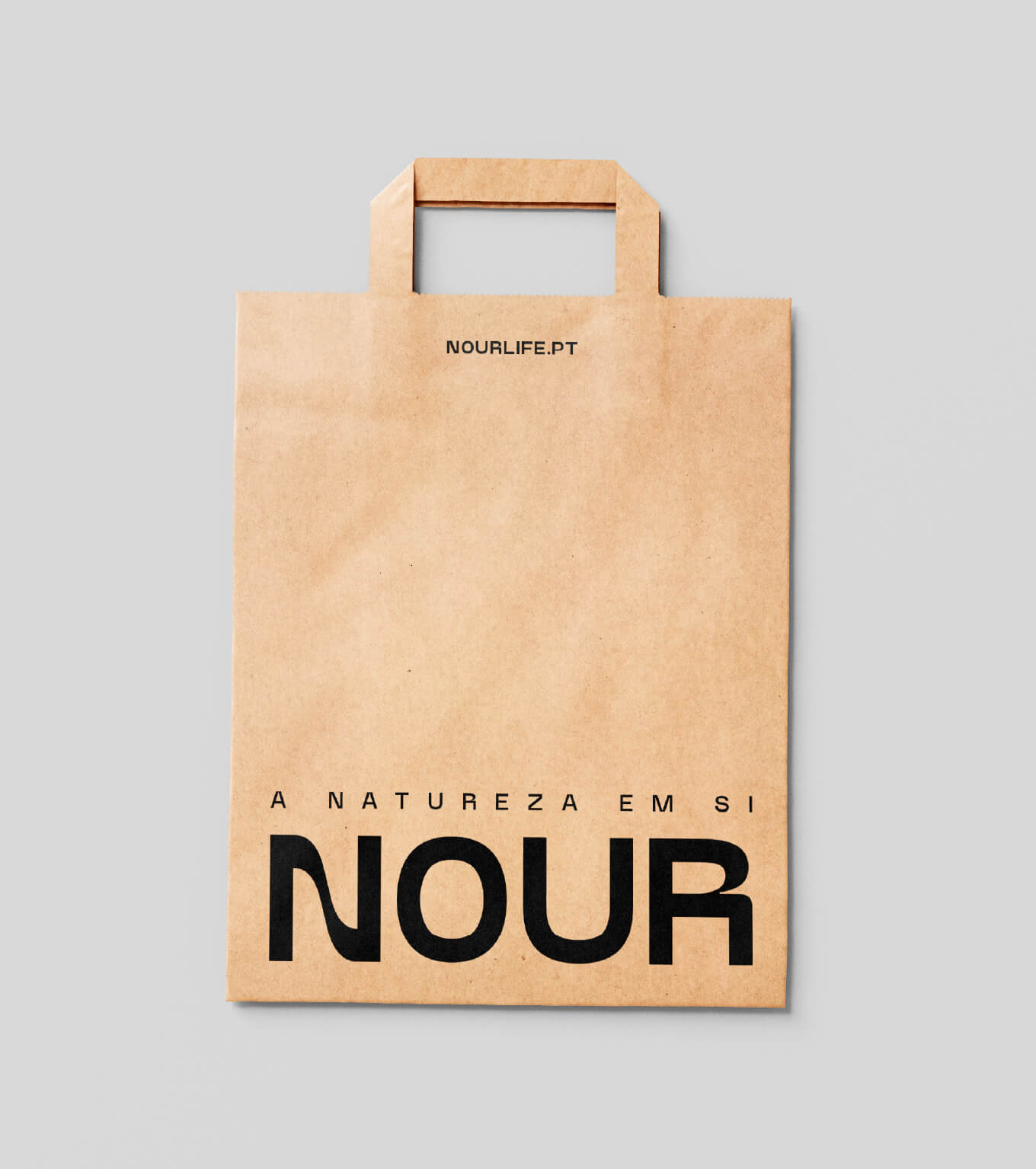
Naming e Branding -Nour pela GRINGO - saco
Naming e Branding -Nour pela GRINGO - variações de aplicações social media
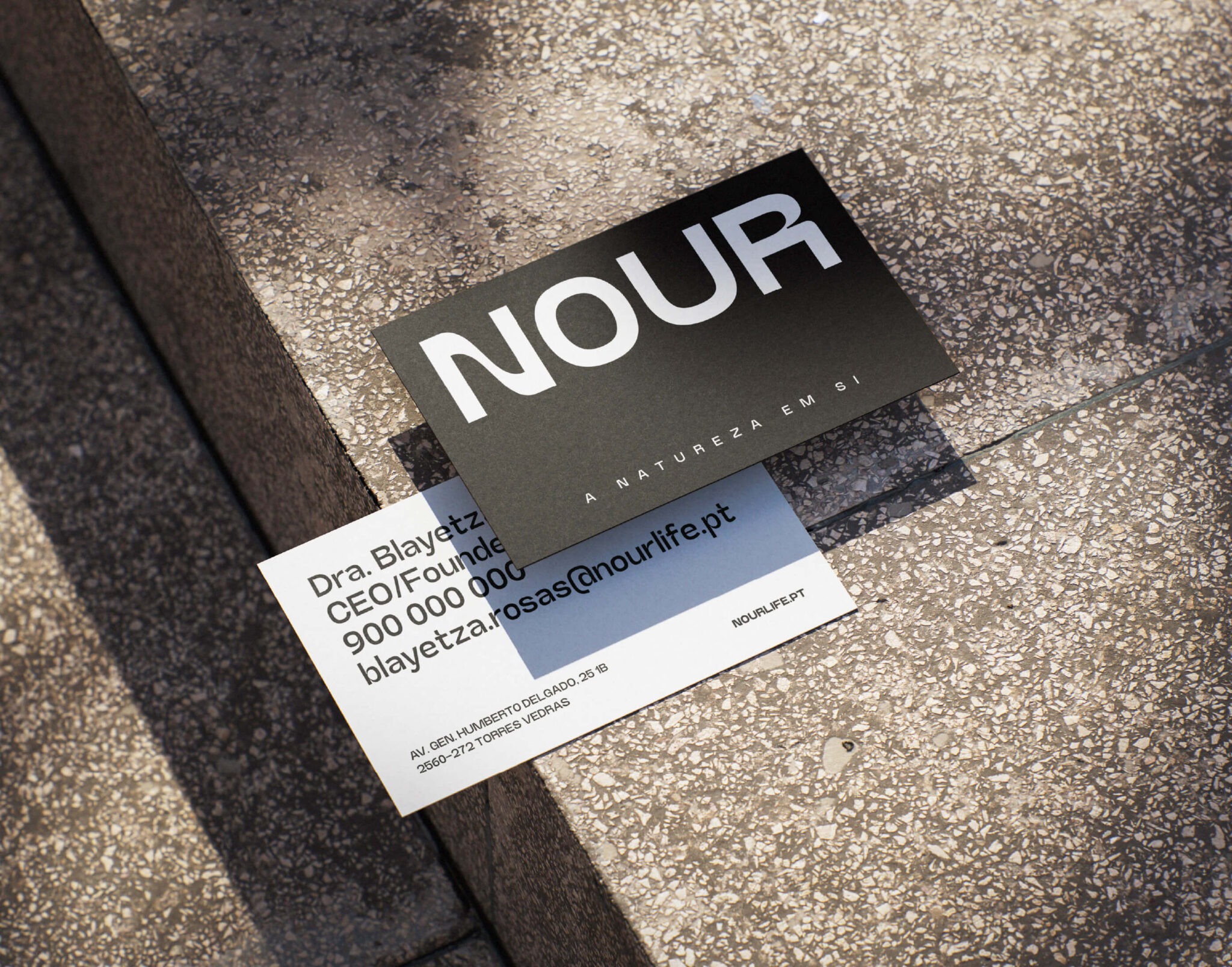
Naming e Branding -Nour pela GRINGO - cartão de visita
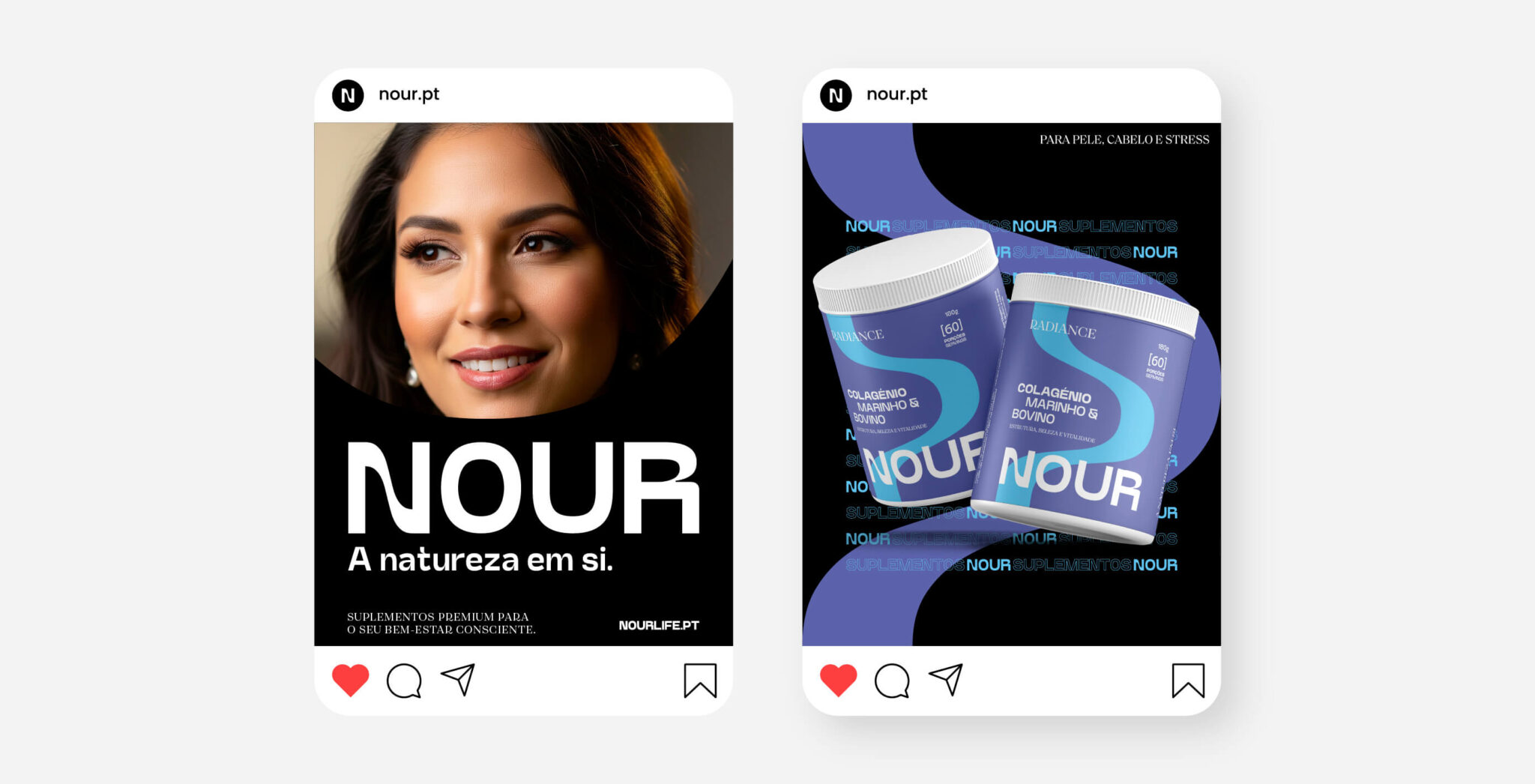
Naming e Branding -Nour pela GRINGO - aplicações social media

Gostou desta marca?

Desafie a GRINGO a questionar a sua marca e sinta o desconforto.