BodyConcept was founded with the mission to democratize beauty, allowing all women to care for themselves using cutting-edge technology and specialized professionals. It is a top-of-mind Portuguese brand, synonymous with quality, boasting the largest network of clinics nationwide—a scale that still allows for a culture of proximity and familiarity with its clients.
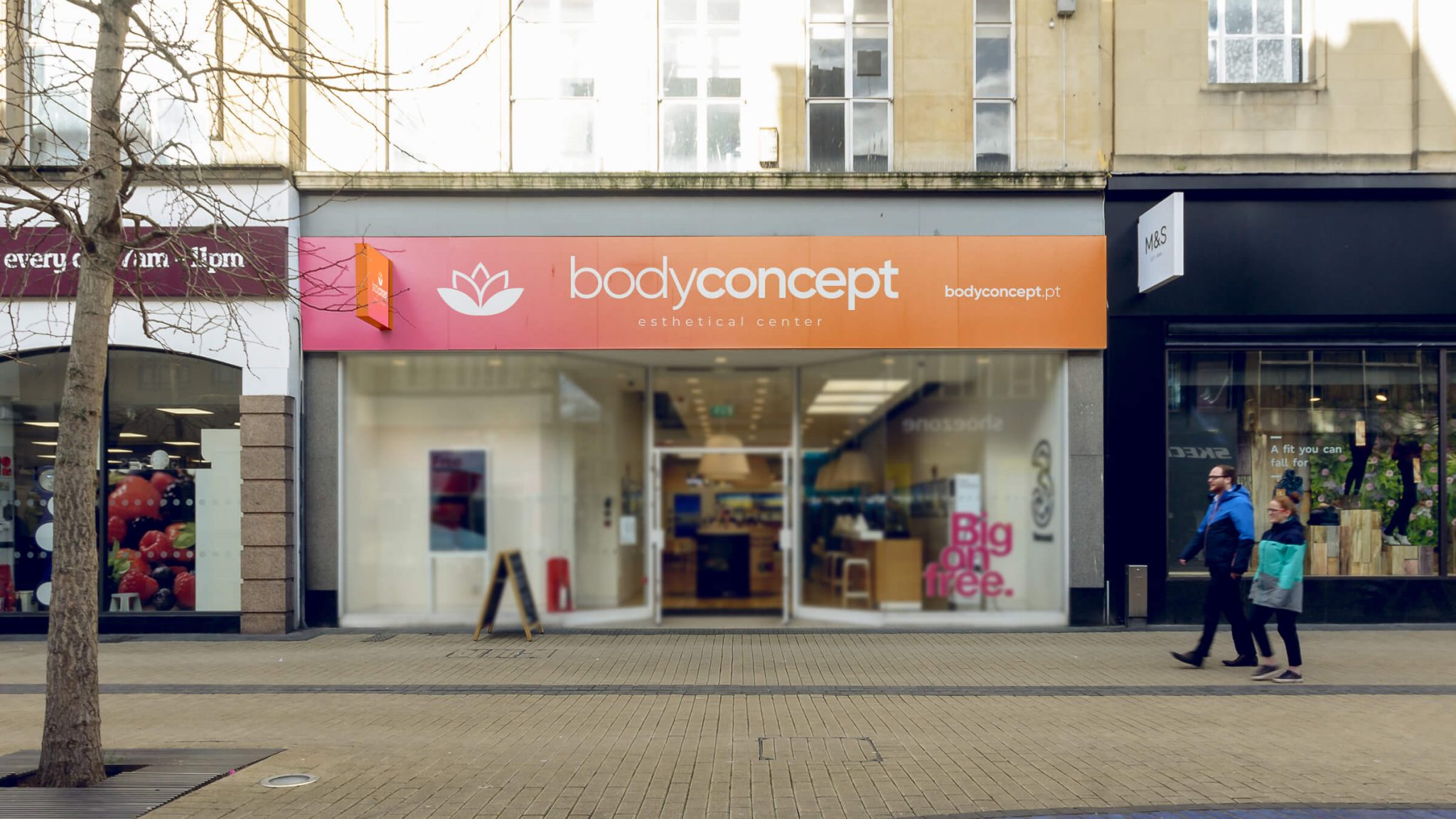
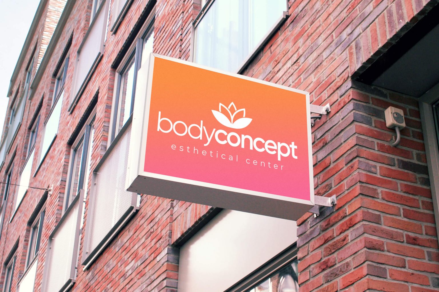
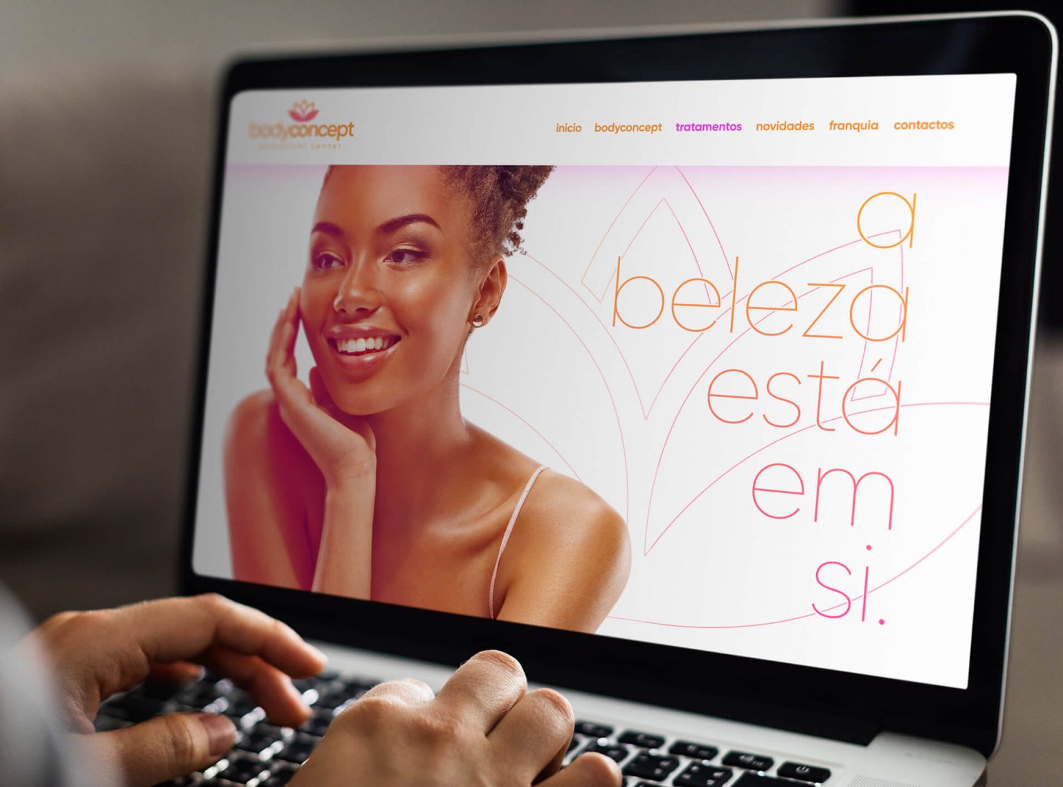
With the main goal of substantially “refreshing” the BodyConcept brand identity, the client wanted to retain some distinguishing features: keeping the association with the color orange and a connection to the current logo, reinterpreting it to make it more contemporary and legible. The new identity had to strike a delicate balance between femininity and the brand’s technological edge.
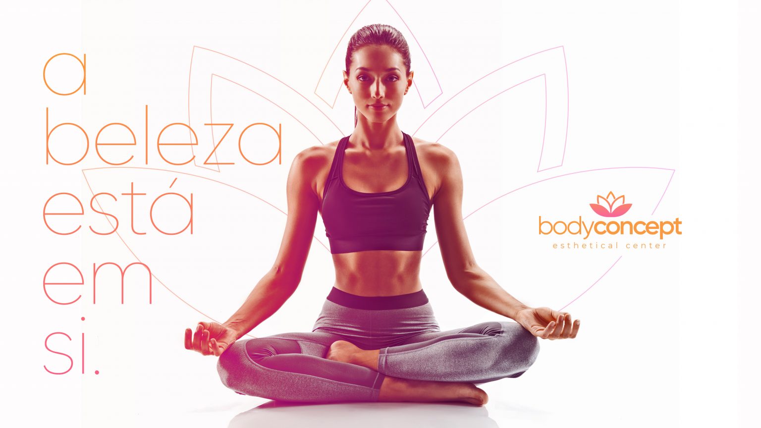
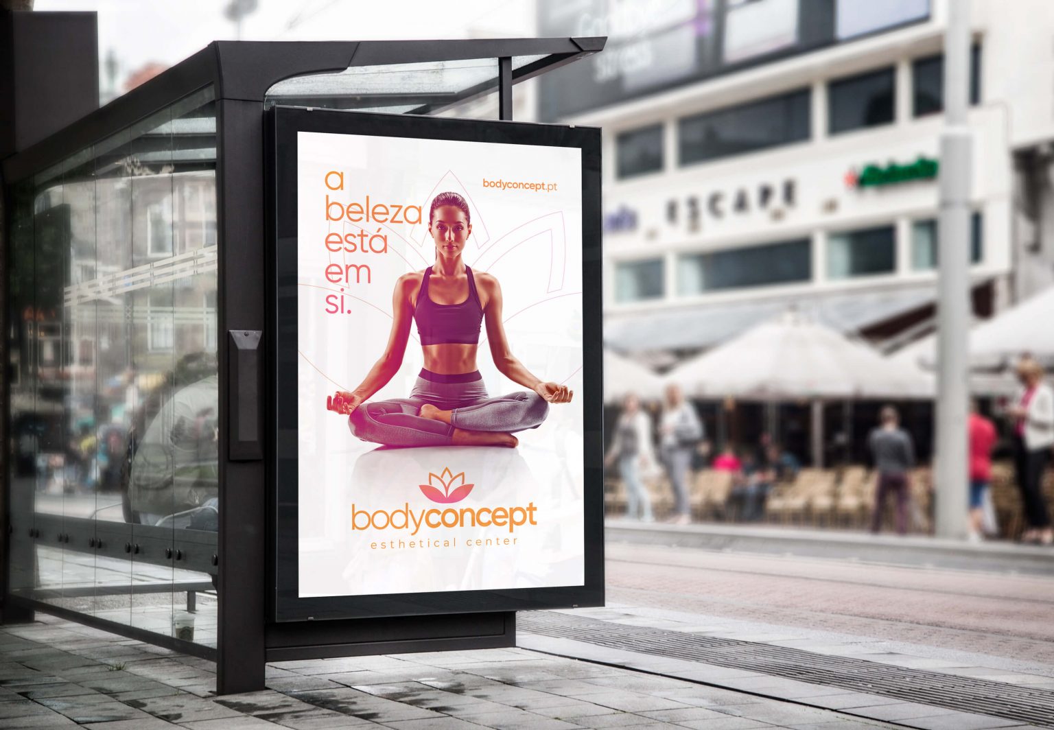
GRINGO’s proposal for BodyConcept is built on the rejection of imposed beauty standards and the profound respect for individual beauty.
We believe a woman’s beauty isn’t in her “shell”, but within herself. This beauty surfaces when a woman feels secure, when she shapes herself to assert her power. Today, we are talking to independent women who know what they want and who they are; women who conquer the world and no longer feel dependent on archaic beauty standards—women who assert themselves and define themselves however they choose.
Therefore, we wanted women to see us (BodyConcept) as a stepping stone to assert who they already are, without any fear of seeking their own standard of beauty, perfectly aligned with their unique individual traits.
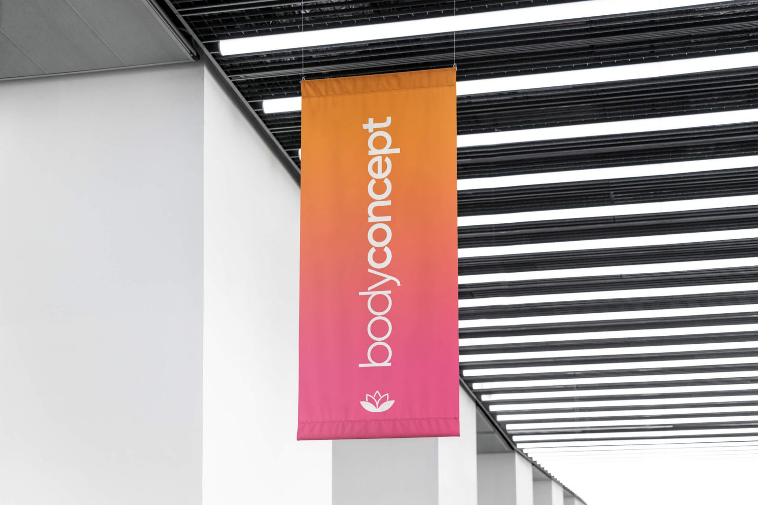
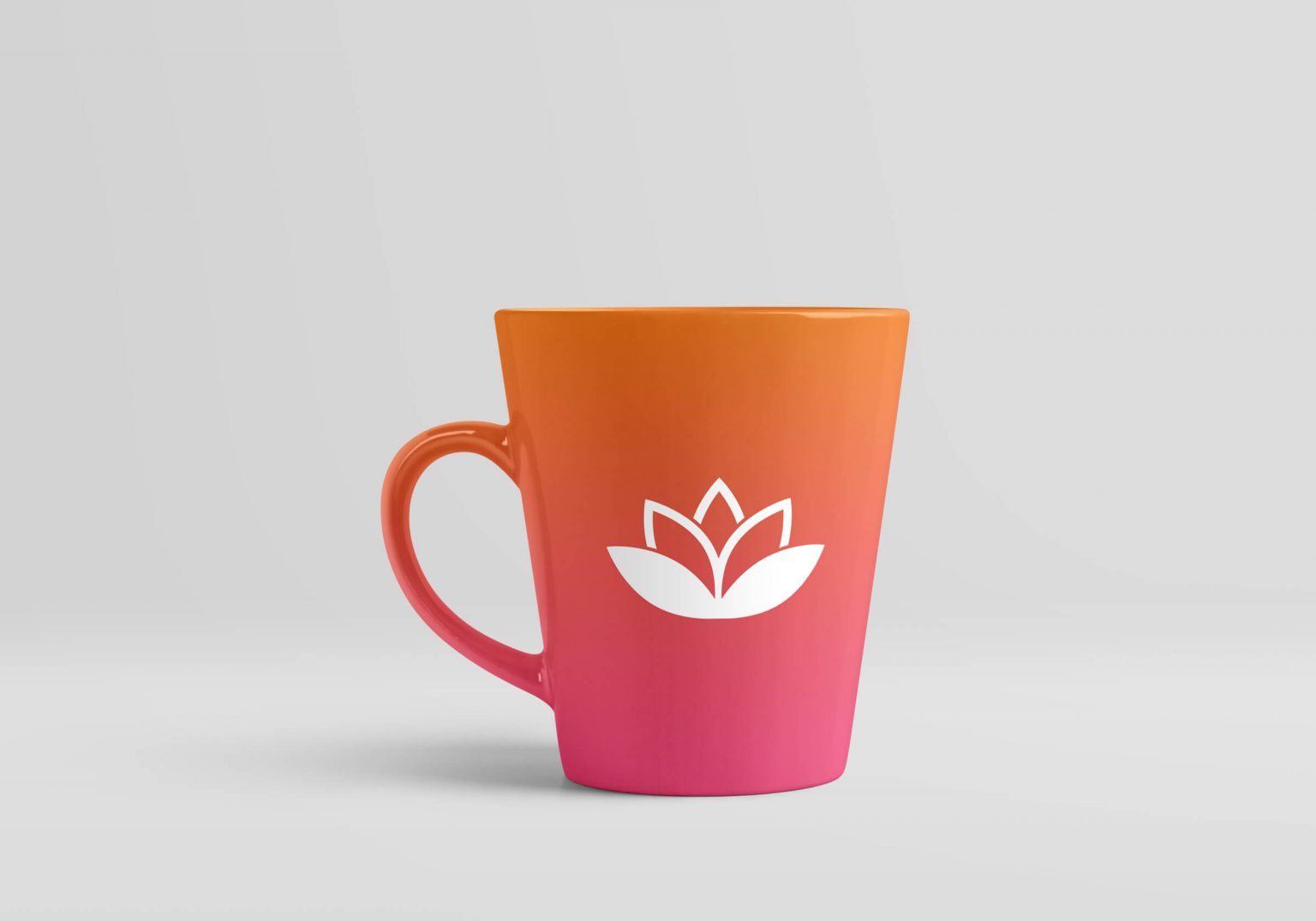
We aligned the brand’s shapes and colors without losing its core characteristics. We updated the traditional orange to a brighter, more vivid version, blending it with pink to create movement and get closer to the proposed new concept. We achieved this by embracing a gradient trend to modernize the overall communication and unlock more architectural possibilities for the brand.
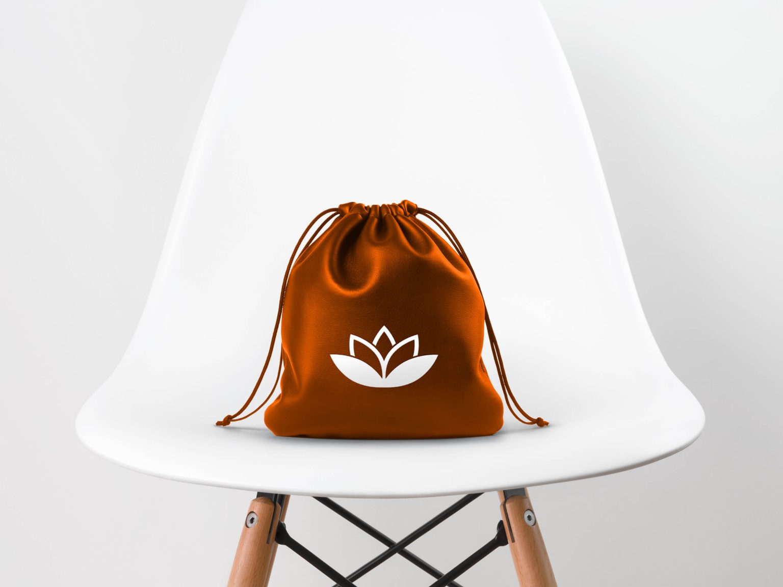
With a modern, clean design and a wide variety of weights and variations, we chose Gilroy as the new logo font. The new symbol is a strategic modernization of the current one. The goal was to connect the concept of “owning your beauty” to the “surfacing” mentioned earlier. We opted for smooth, rounded lines, but with fine, delicate tips as a subtle reference to the female body.