Qloop Architects doesn’t just design buildings; they engineer spatial flow. The challenge wasn’t to create a “pretty” logo, but to visually materialize their core philosophy: “Intelligent Minimalism”. In a market where minimalism is often confused with a lack of ideas, the brand needed a visual system that proved its simplicity is, in fact, the result of highly resolved complexity. The identity had to convey the same rigor the firm applies to its corridors, areas, and transitions, where everything flows as “one”.
Following our “Discomfortology” method, the first rule was to eliminate all architectural visual cliches (roofs, compasses, or sketched buildings). We focused on the essence of Qloop’s method: perfect metrics.
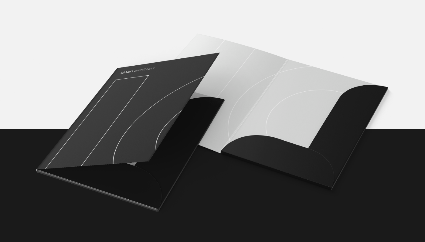
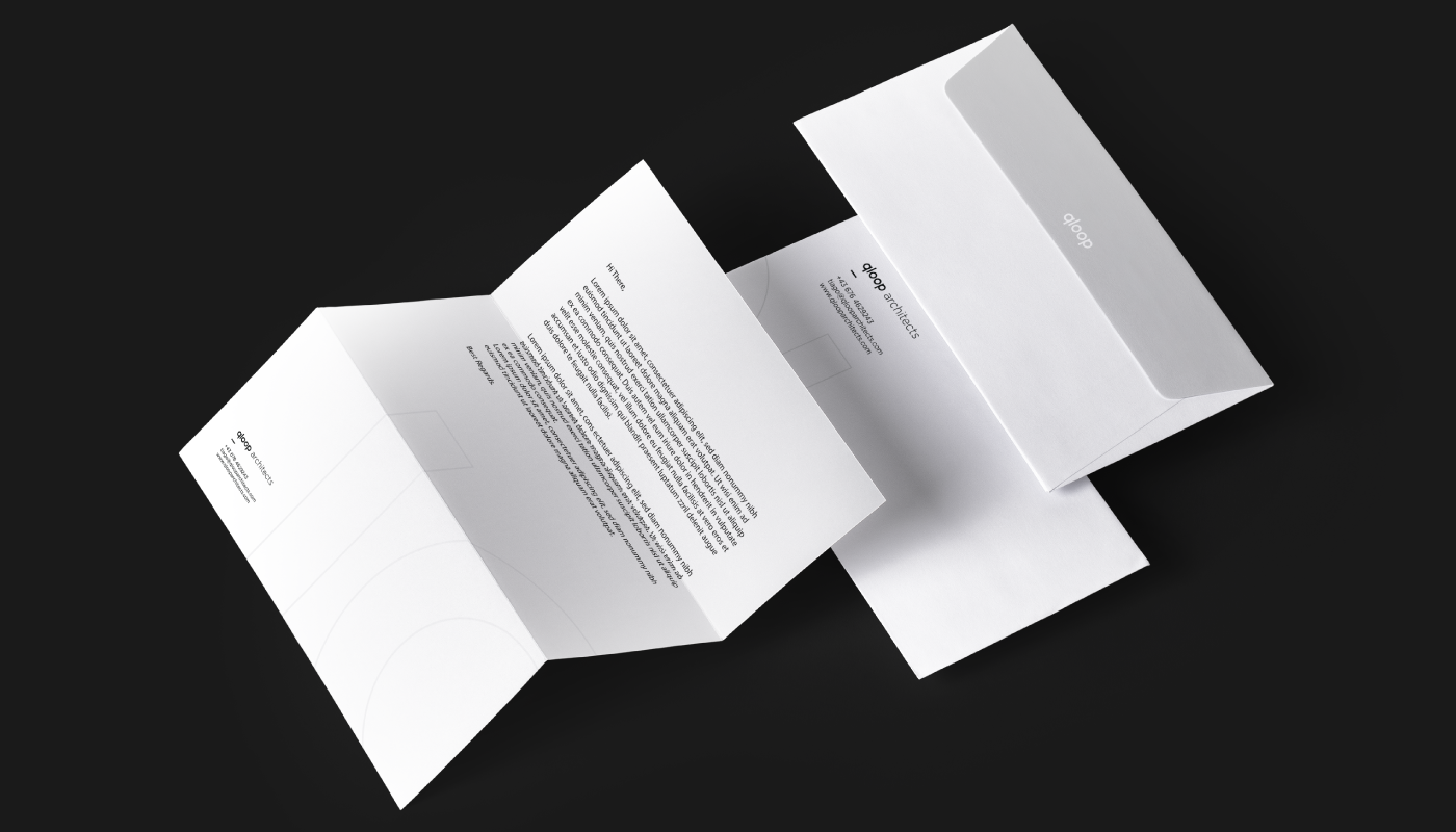
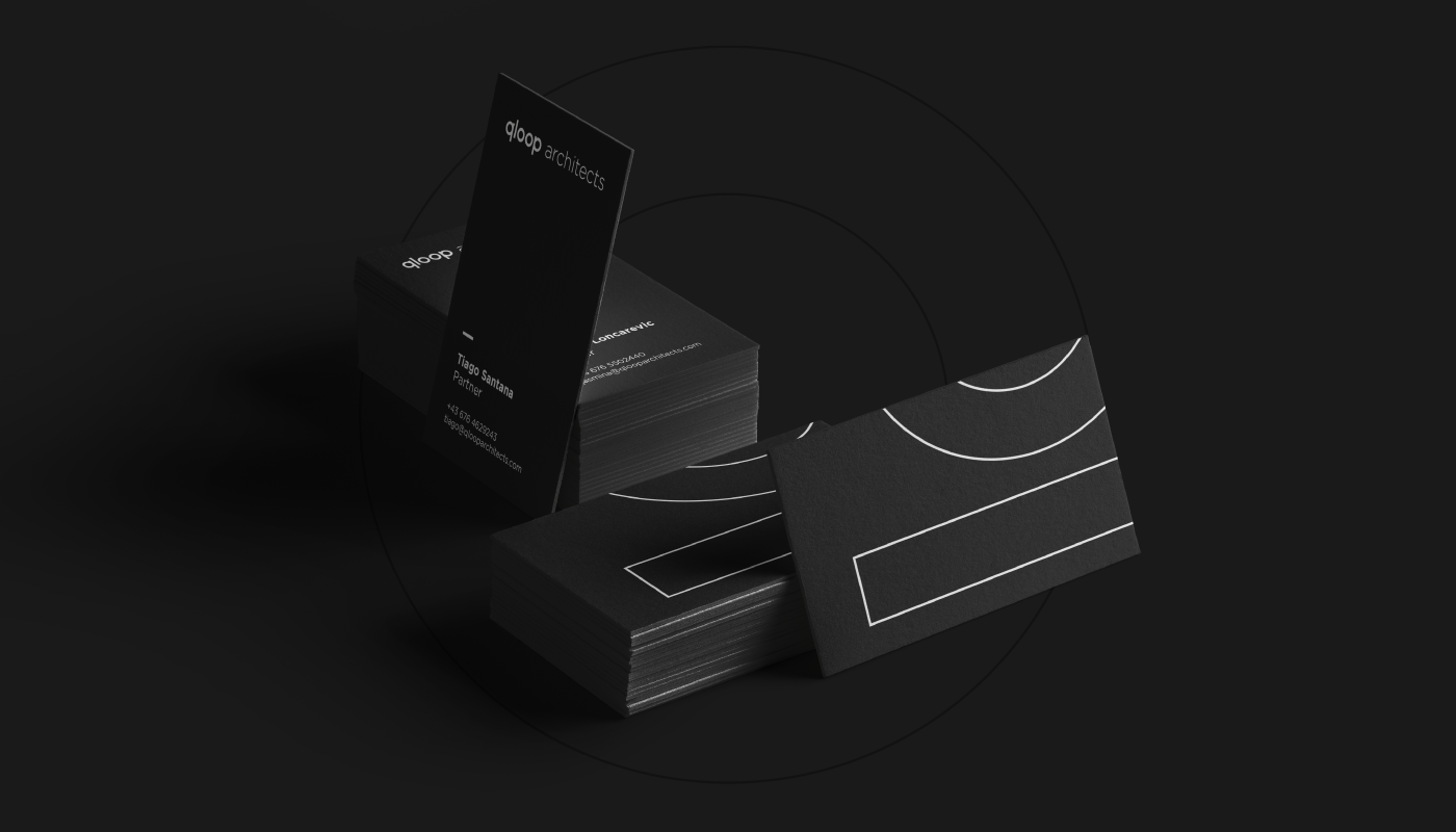
We embraced the ultimate expression of “less is more”, translating it into a strictly mathematical visual concept. The brand was built upon a grid of perfect circles and straight lines with exact 90º intersections. There are no decorative elements or unnecessary noise. Every stroke serves a function, just like in high-end architectural design.
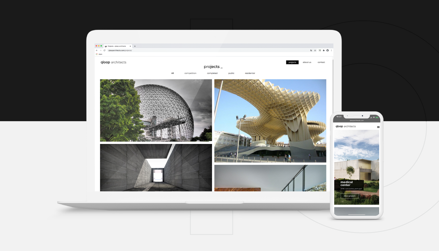
The outcome is a logo and visual identity system that doesn’t scream for attention but commands the space through proportion and balance. It is a sober, highly contemporary, and functional graphic identity that acts as a blank canvas, allowing Qloop’s architectural portfolio to truly shine.