Hairlox

Rebranding, Packaging

Pharma Rebranding: The Strategic Shift from B2B to Consumer

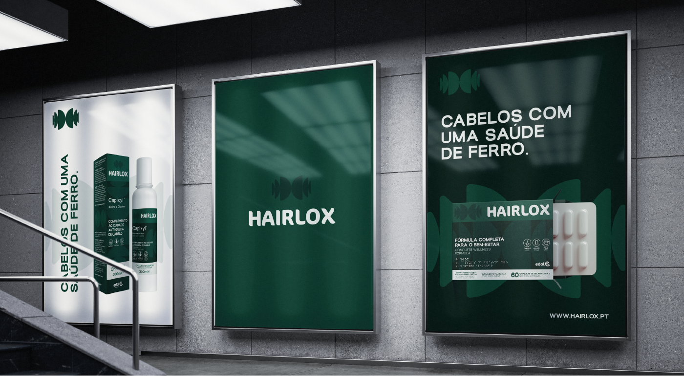
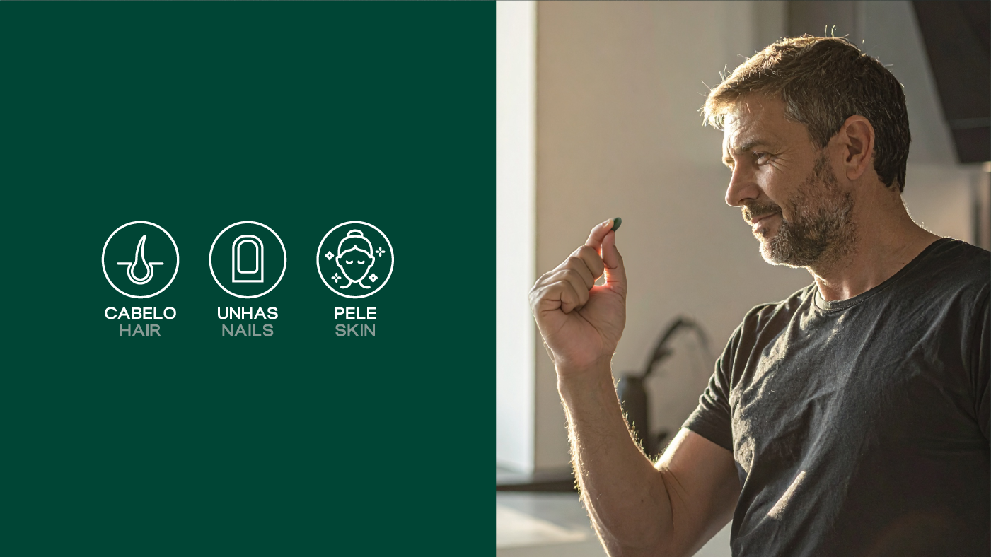
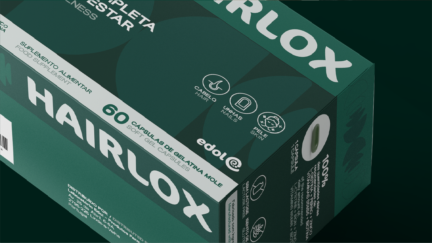
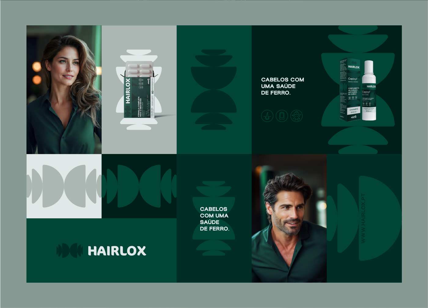
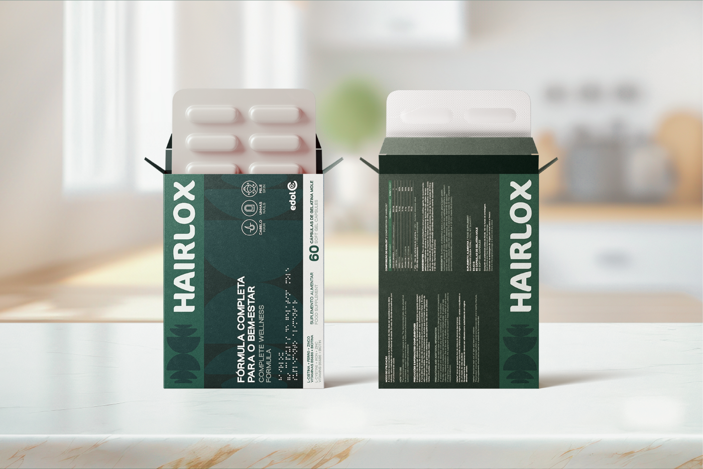
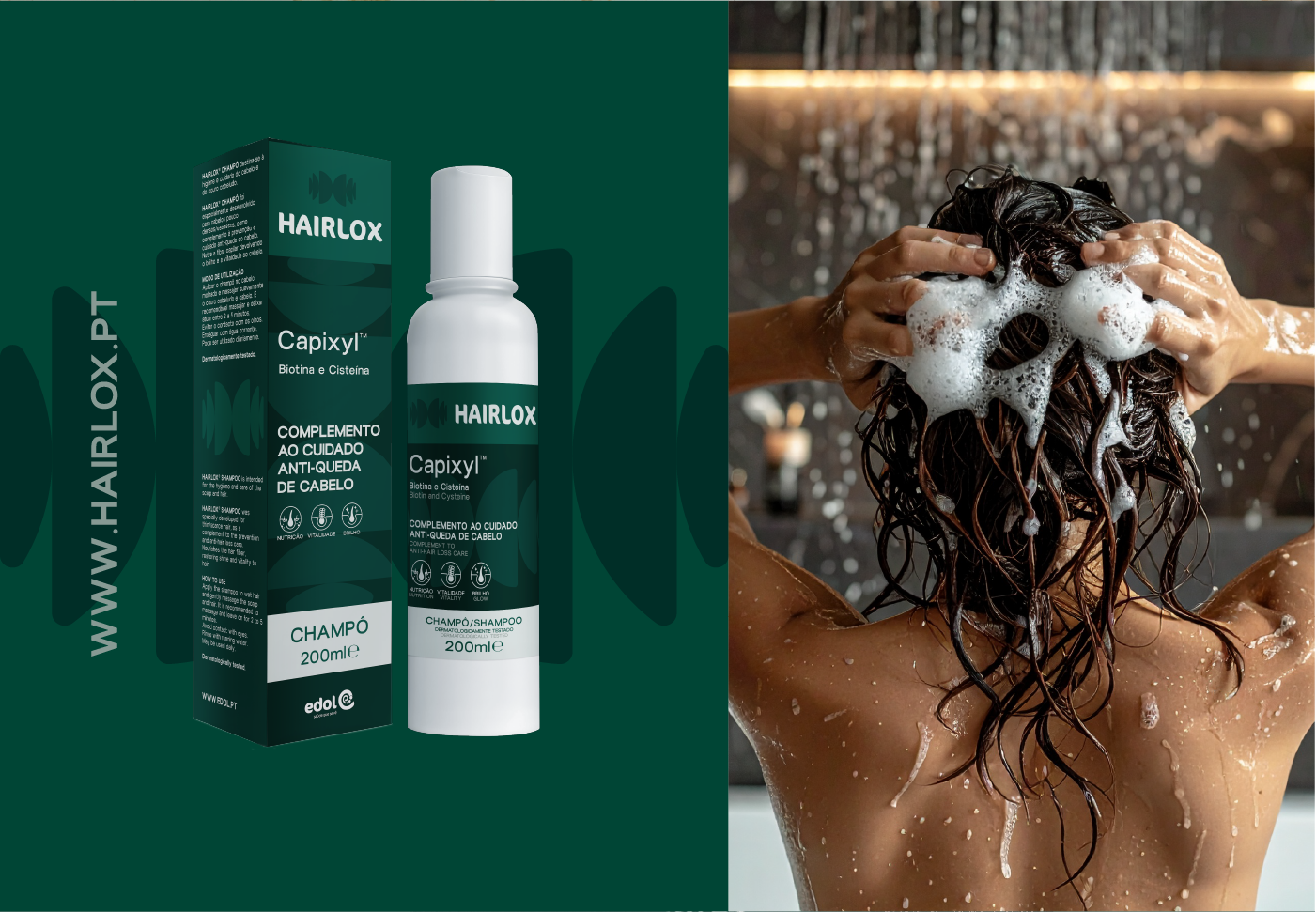
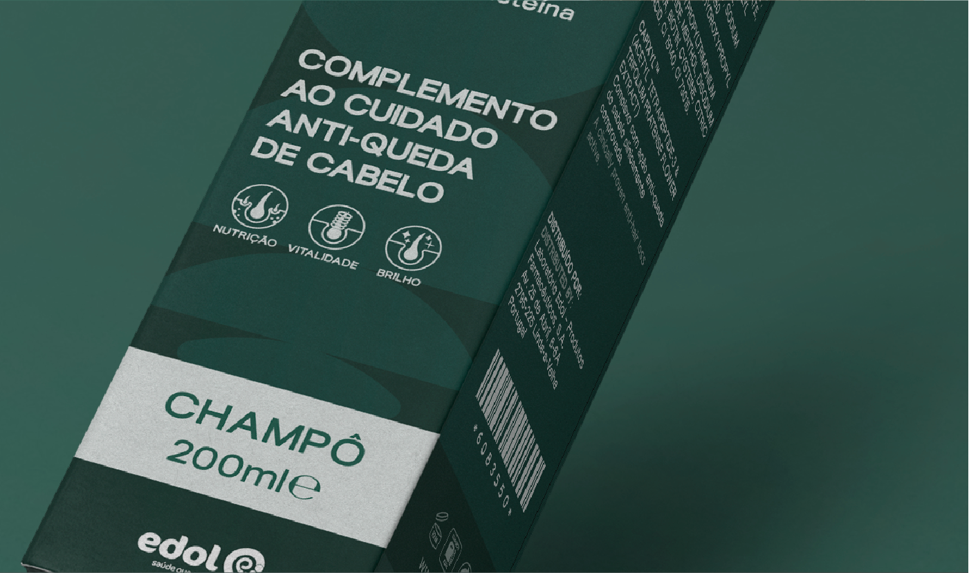
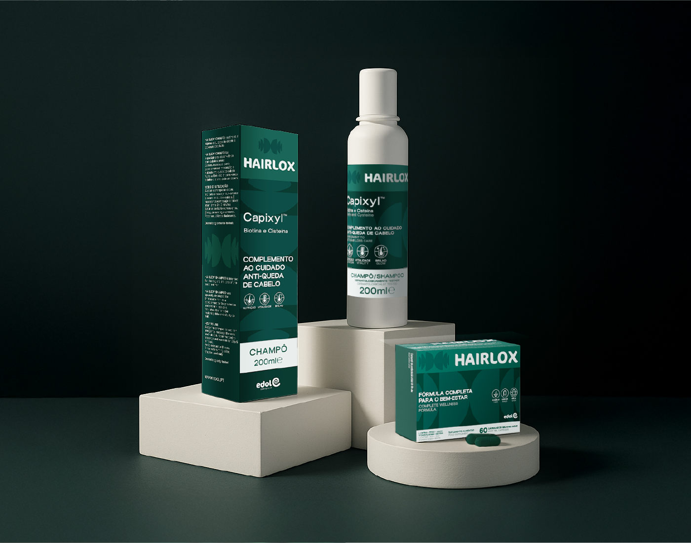
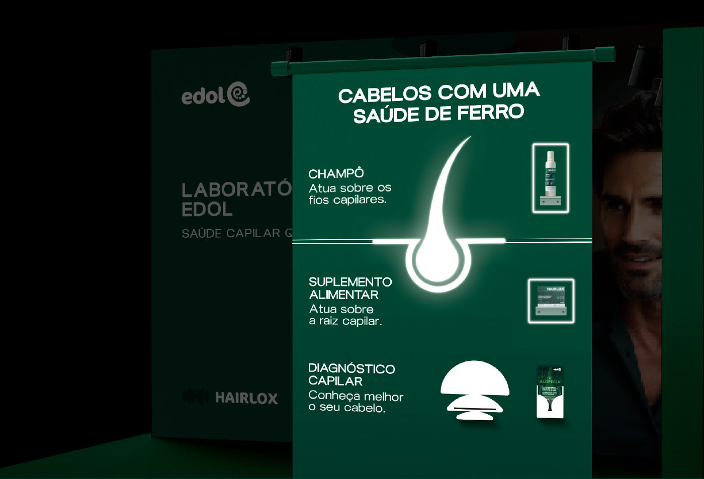
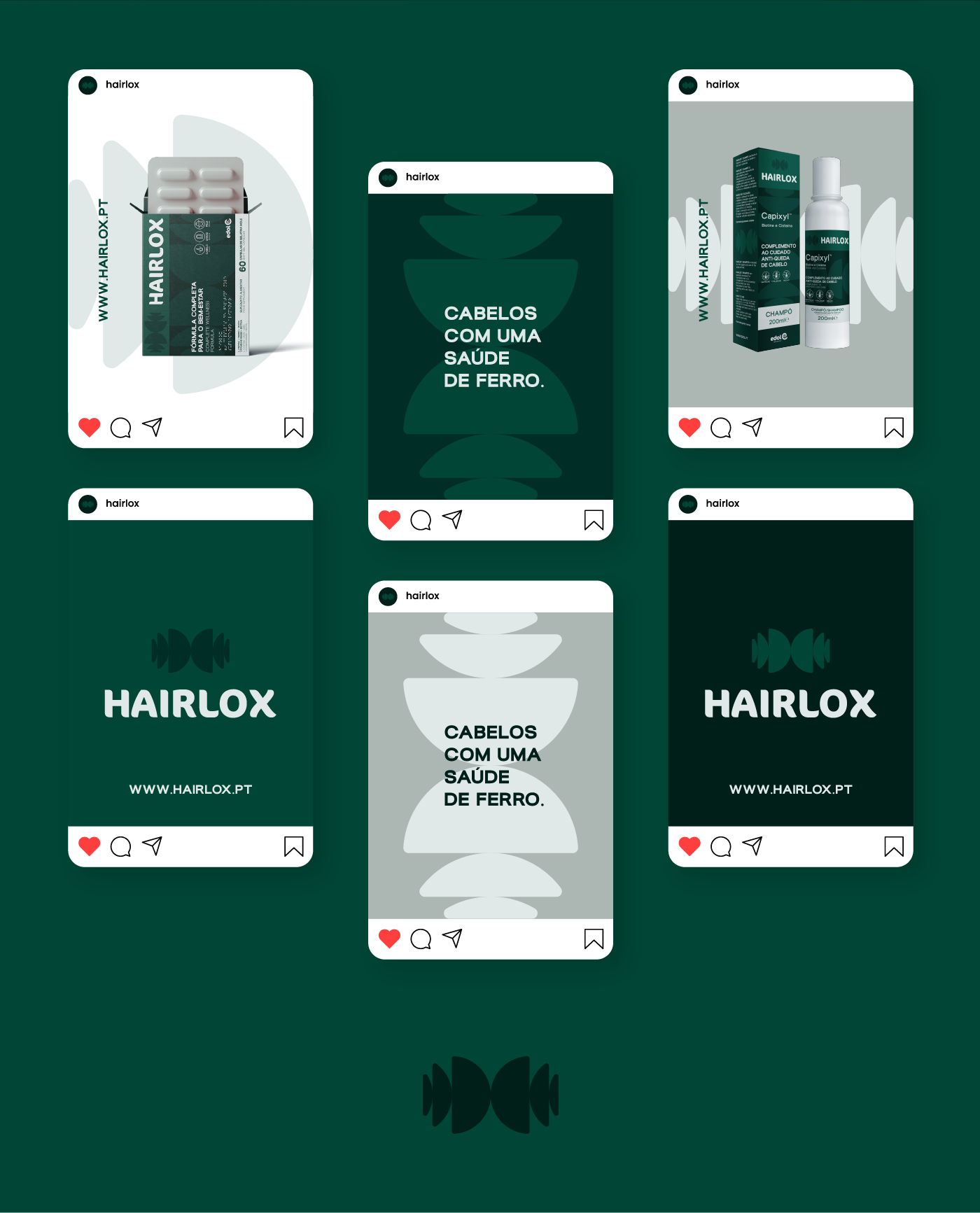
Hairlox, a flagship product of the Portuguese pharmaceutical laboratory Edol, faced the classic challenge of an established brand with stagnant growth. Historically focused on healthcare professionals and medical prescriptions (B2B), the brand’s potential with the end consumer was hindered by an overly technical image that lacked shelf-appeal in the retail environment. GRINGO was selected to lead this rebranding and packaging strategy project, with the goal of making the brand relatable, disruptive, and capable of capturing the male audience.

rebranding-hairlox pela GRINGO - packaging e key visual

The Diagnosis: From "Medical Logic" to the "Bio-Scientist Friend"

Our Analysis & Diagnosis process revealed that to unlock the market, we needed to humanize the science. We redefined the brand persona as the “Bio-Scientist Friend”: an authoritative yet approachable figure—a biologist by trade, passionate about research, who communicates clearly and assertively.

The “360º Hair Health” Tactic:

    • Strategic Insight: We used a “hair agriculture” analogy to simplify the consumer journey.

    • Nurture (Capsules): The supplement acts as the essential nutrient for growth within the follicle.

    • Hygiene (Shampoo): The substrate (scalp) must be clean to ensure a healthy growth environment.

Packaging Design: The "Essential Luxury" Concept

The new visual identity breaks away from the monotony of the pharmaceutical sector, embracing an “Essential Luxury” positioning.

    • Verbal Identity: We created the new tagline “Hair with iron-clad health” (Cabelos com uma saúde de ferro). This tagline capitalizes on the double meaning of iron as a symbol of strength and as a core ingredient in the Hairlox formula.

    • Logotype & Symbolism: The new symbol, inspired by the letter “H”, uses circular forms to suggest regeneration and the connection of hair strands. The Blauer Nue typography brings a modern, minimalist aesthetic.

    • Color Palette: We moved away from generic greens to a palette of Night, Intense, and Refined Greens, evoking vitality, healing, and premium sophistication.

Commercial Efficacy and Market Expansion

The final result is a coherent visual and verbal system that balances the professional credibility required by pharmacists with the emotional appeal needed by the end consumer. With the new packaging and point-of-sale (POS) strategy, Hairlox now stands as an authority in hair health, ready to lead the prevention and hair reinforcement segment in the retail market.

rebranding-hairlox pela GRINGO - storytelling
rebranding-hairlox pela GRINGO - assinatura de marca
rebranding-hairlox pela GRINGO - cores
rebranding-hairlox pela GRINGO - símbolo
rebranding-hairlox pela GRINGO - key visual
rebranding-hairlox pela GRINGO - iconografia
rebranding-hairlox pela GRINGO - packaging suplementos
rebranding-hairlox pela GRINGO - overview
rebranding-hairlox pela GRINGO - packaging suplementos frente e verso
rebranding-hairlox pela GRINGO - rótulo e packaging de champô
rebranding-hairlox pela GRINGO - packaging champô
rebranding-hairlox pela GRINGO - gama
rebranding-hairlox pela GRINGO - símbolo web
rebranding-hairlox pela GRINGO - roll up
rebranding-hairlox pela GRINGO - aplicações social media

Enjoyed this brand?

Challenge GRINGO to question yours and feel the discomfort.