Watergliders

Rebranding

Watergliders operated as a standard tourist surf school on São Miguel island, but their ambition demanded more. As a branding agency, we took on the challenge of pulling the business away from tourism banality. We established a raw brand positioning anchored in the #Glider attitude and the “Go Outside” signature. The result is a verbal and visual identity that finally projects the grit the founder always envisioned.

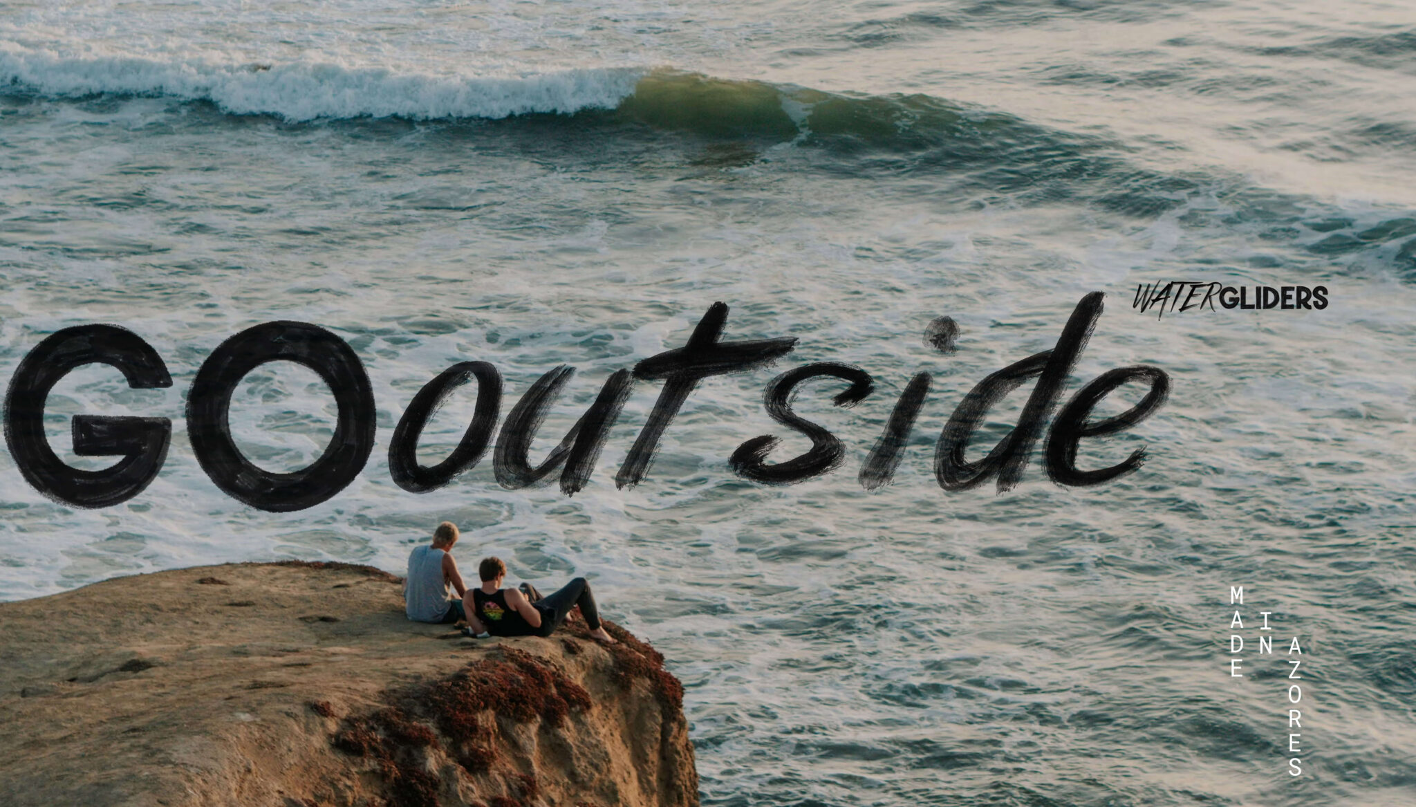
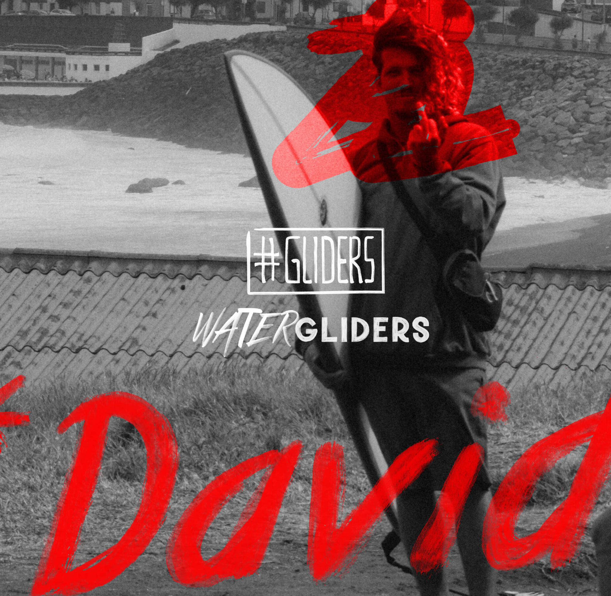
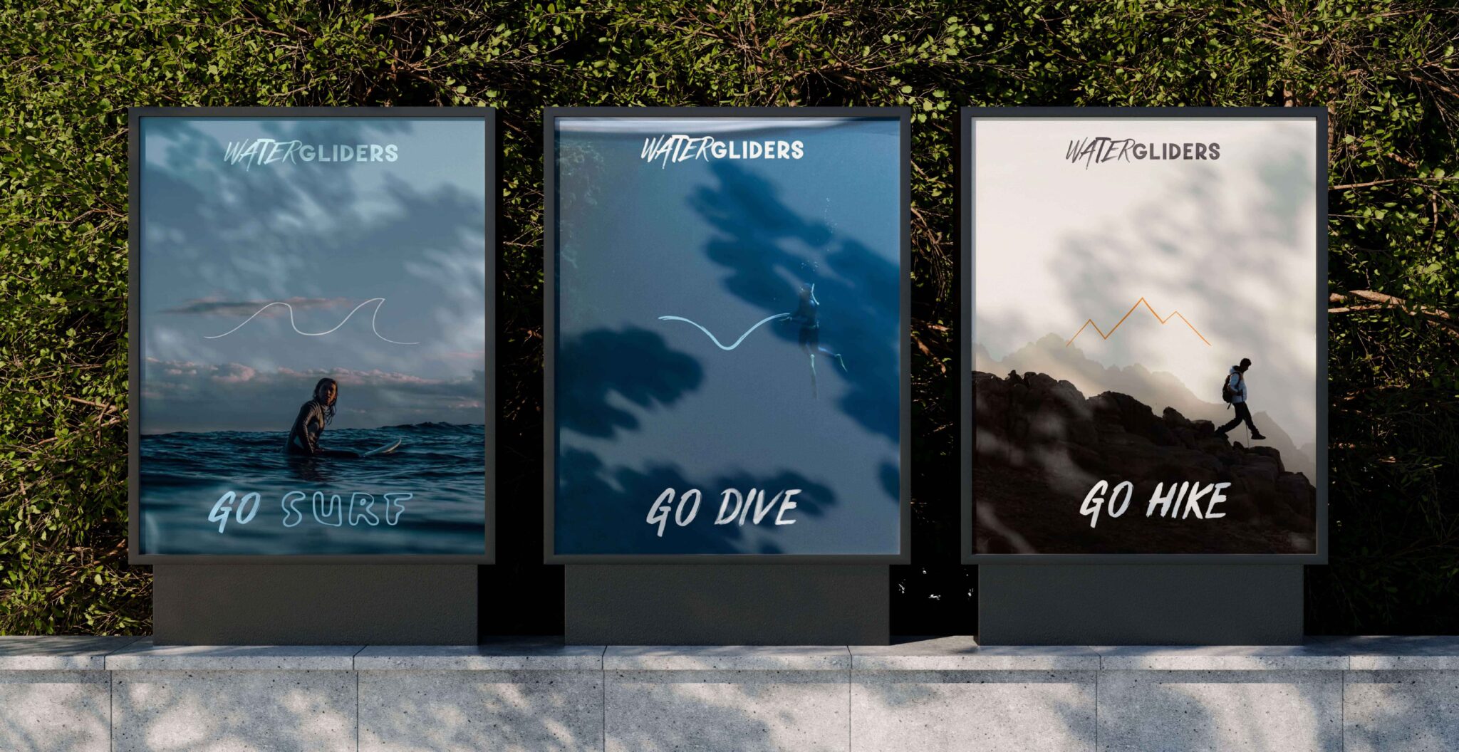
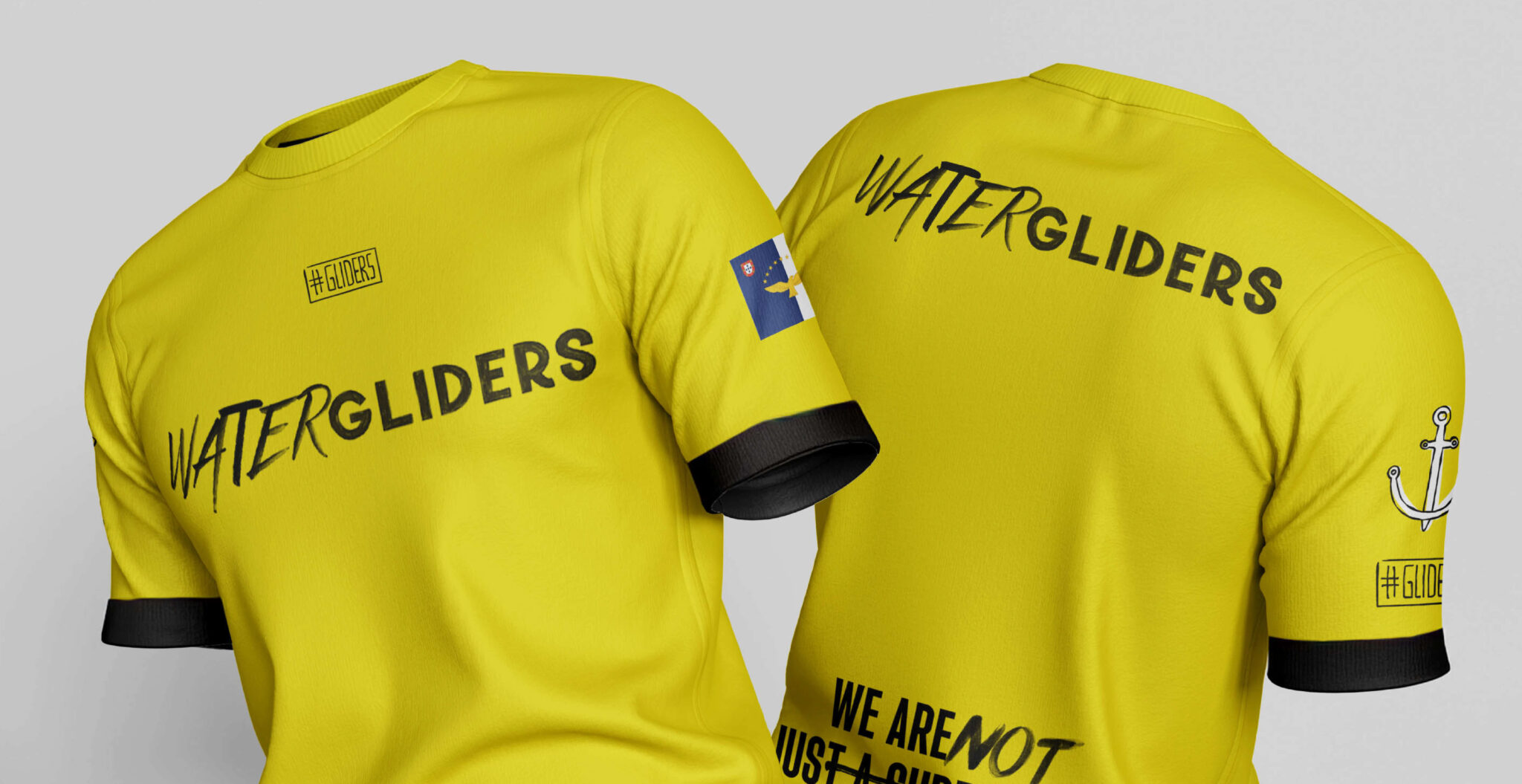
Rebranding de surf club - Watergliders pela GRINGO - elementos visuais

The Context: The Azorean tourism market and the stagnation of surf schools

Watergliders’ business model relied almost exclusively on high-season tourists visiting the Azores. Although student feedback was excellent and the return rate for consecutive lessons reached 70%, the operation was trapped in a limiting label. In a local market saturated with standardized offers and heavily dependent on travel agencies, the company needed to dictate its own rules and attract clients independently during the low-traffic months.

The Challenge: Escaping generic noise to claim a strong brand positioning

Founder João Rodrigues had an aggressive commercial goal. Watergliders needed to scale operations and establish itself as a genuine Surf Club. The brief demanded communicating the team’s true essence without falling into polished, fake or elitist aesthetics. Watergliders needed the exact opposite. It required authentic, grounded communication capable of translating the visceral force of the Azorean ocean.

The Discomfortology: Brand audit and direct contact with leadership

Through intense and direct conversations with João, the diagnosis became clear. Right from the first contact, the client explicitly demanded an “uncomfortable approach” capable of colliding head-on with the market. During our brand audit, we scrutinized commercially strong competitors like Santa Barbara Surf School and Azores Surf Center. We realized the service delivered by Watergliders went far beyond the surfboard. The team solved logistical problems out of the water and forged deep emotional connections with tourists. The brand was already a lifestyle, it just lacked the visual and verbal courage to shout it out loud.

Rebranding de surf club - Watergliders pela GRINGO - overview visuais

The Strategy and Solution: Verbal identity and the #Glider manifesto

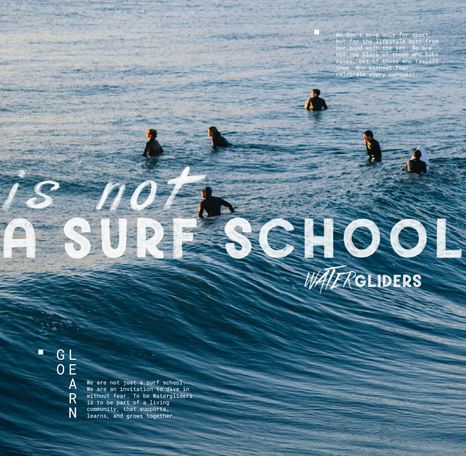
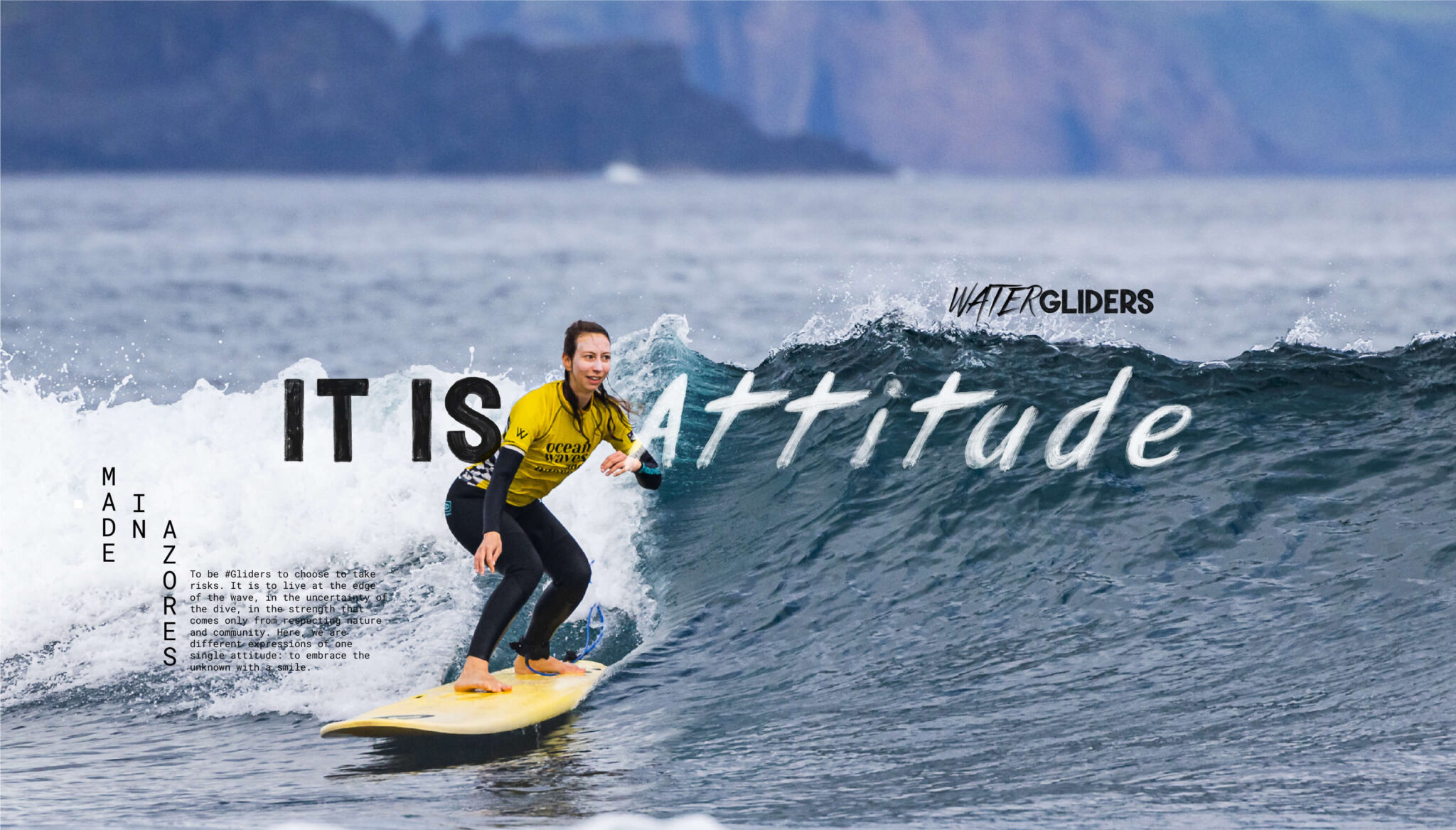
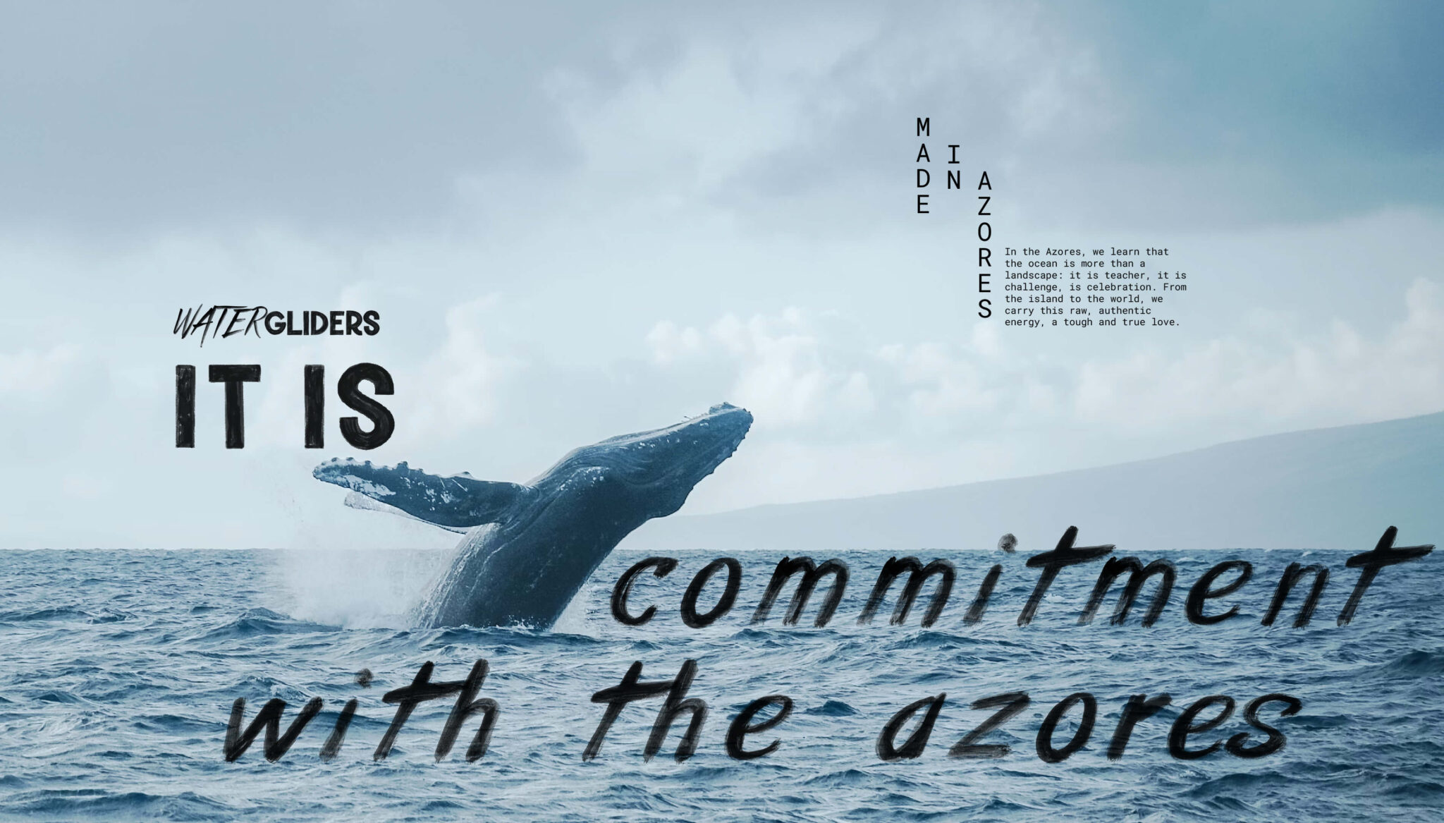
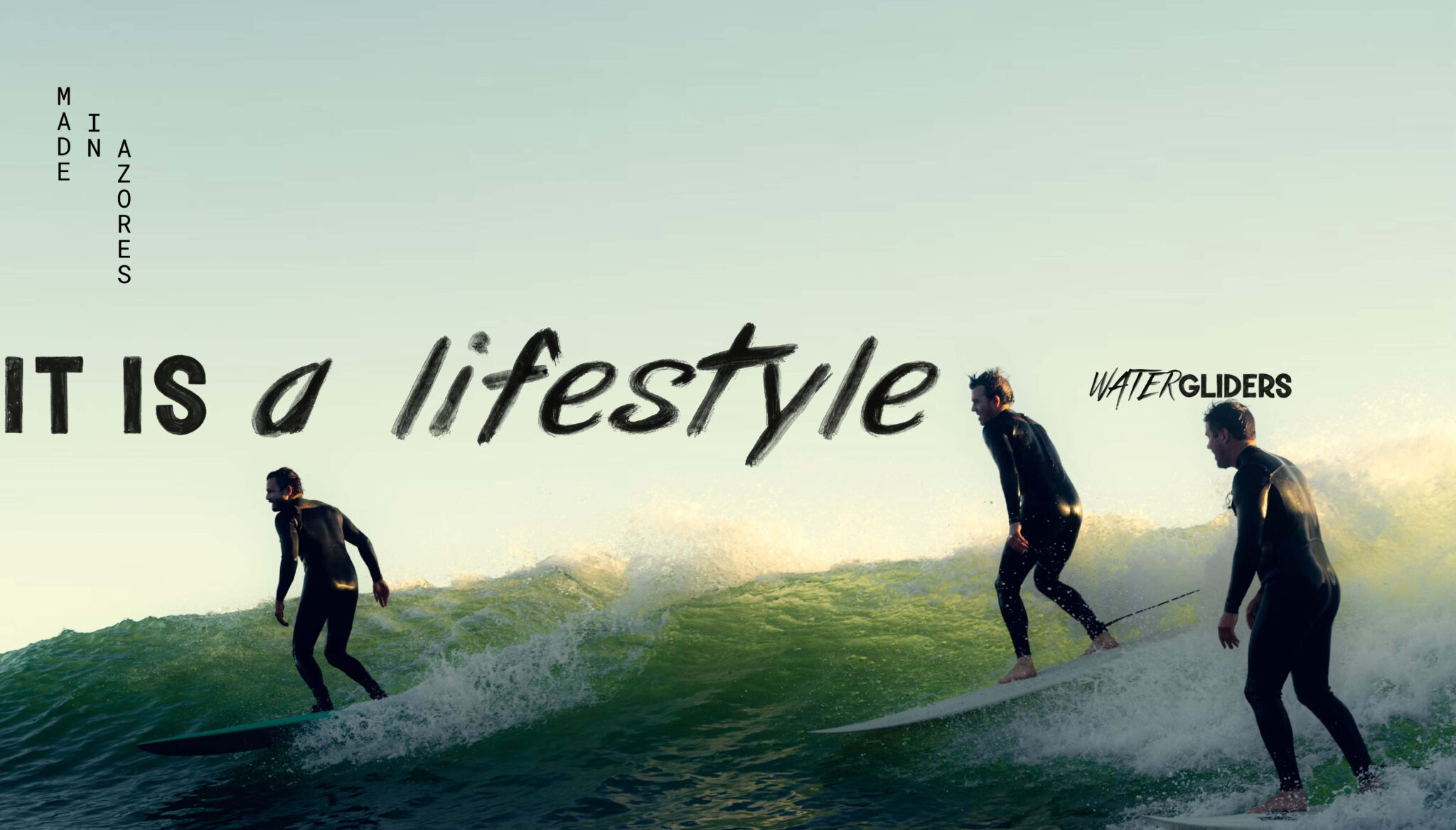
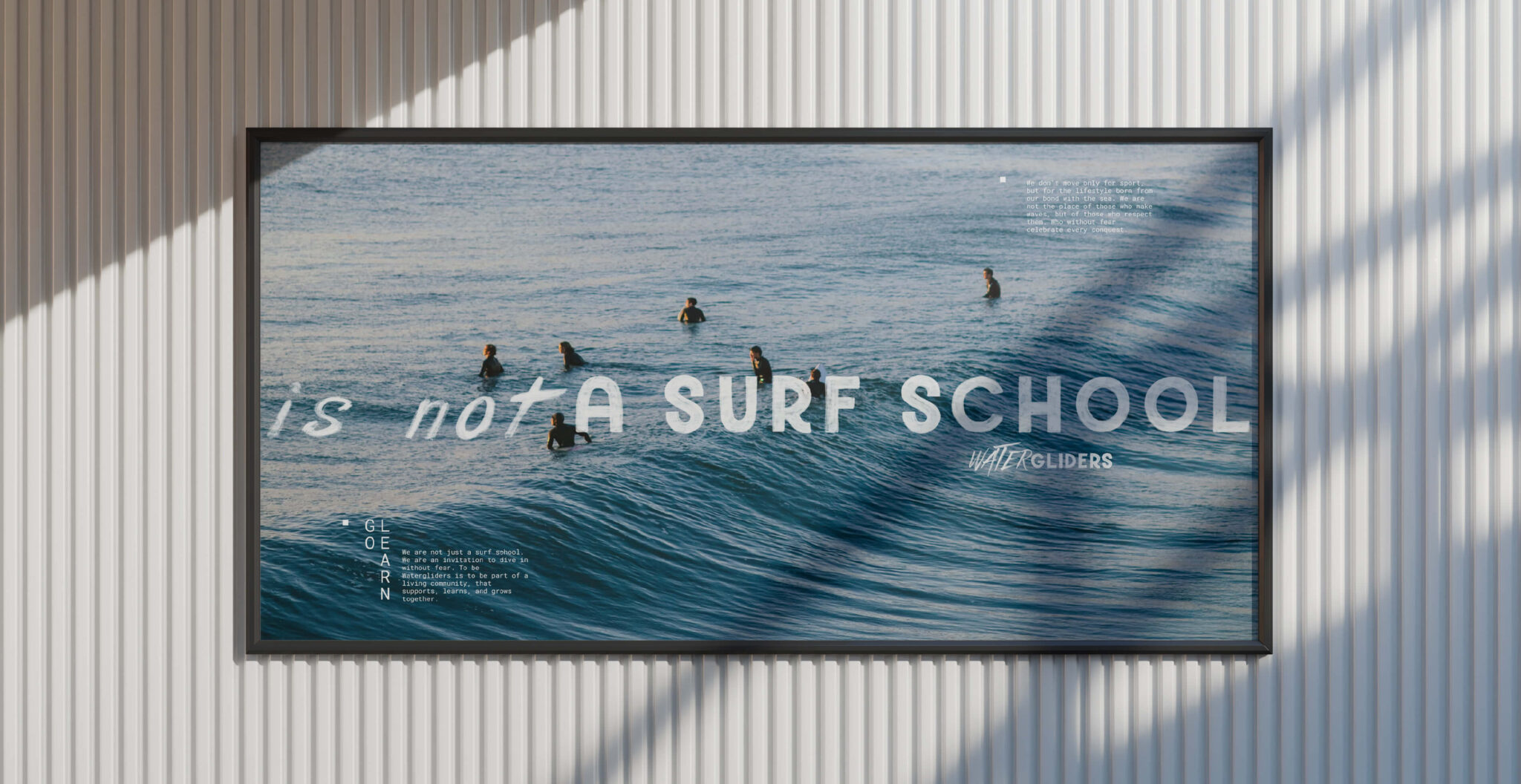
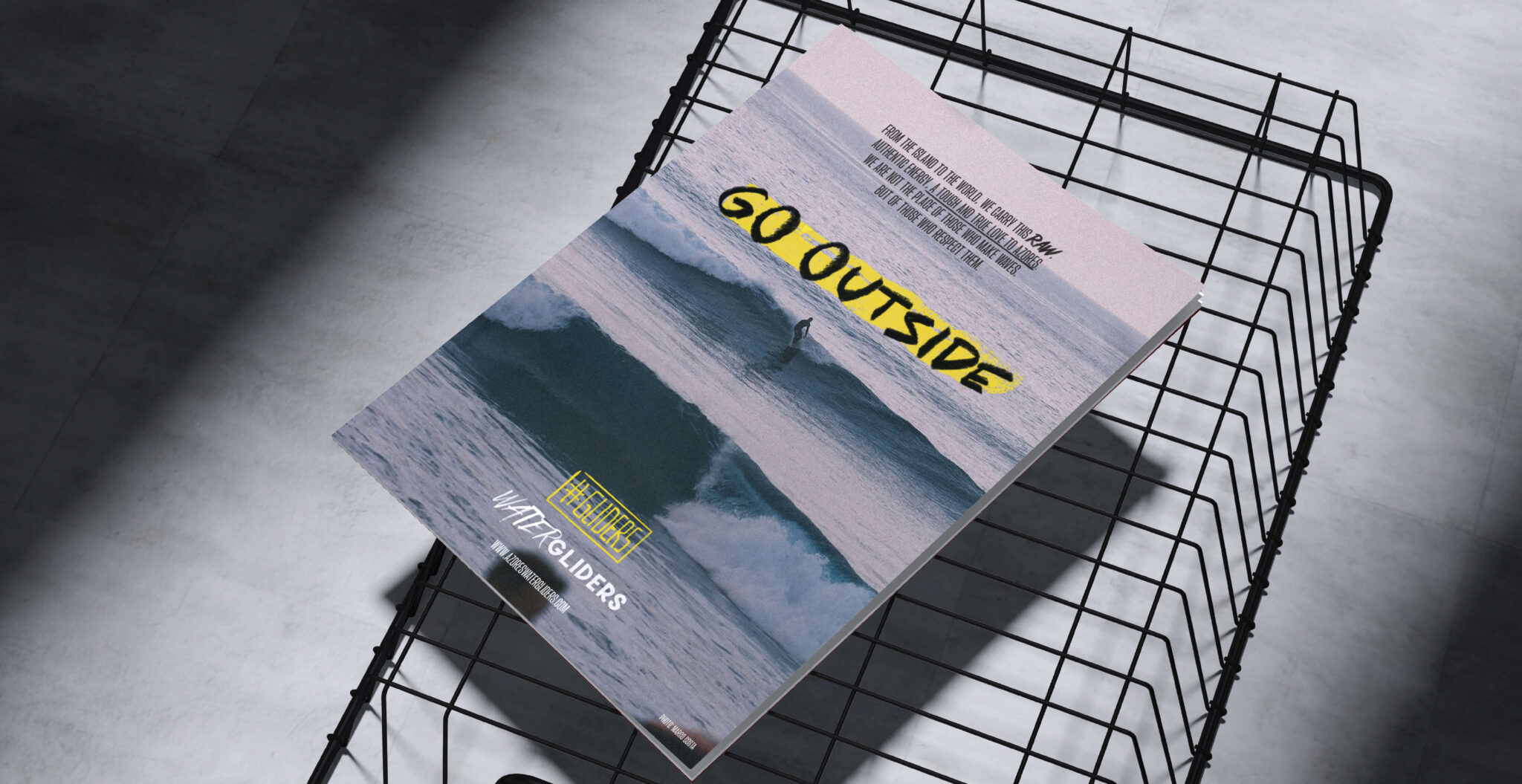
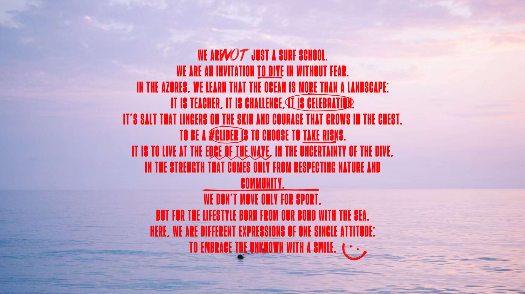
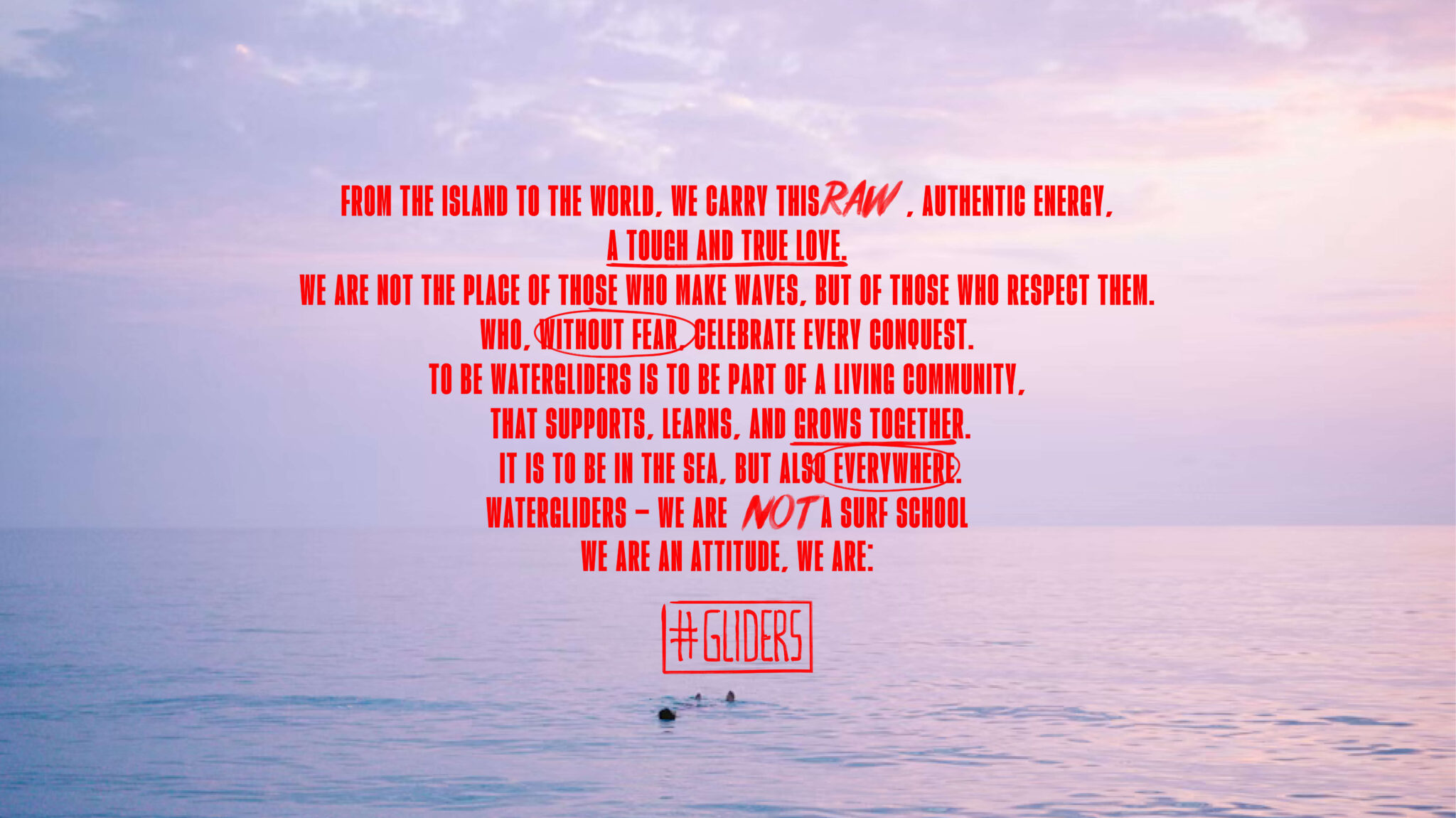
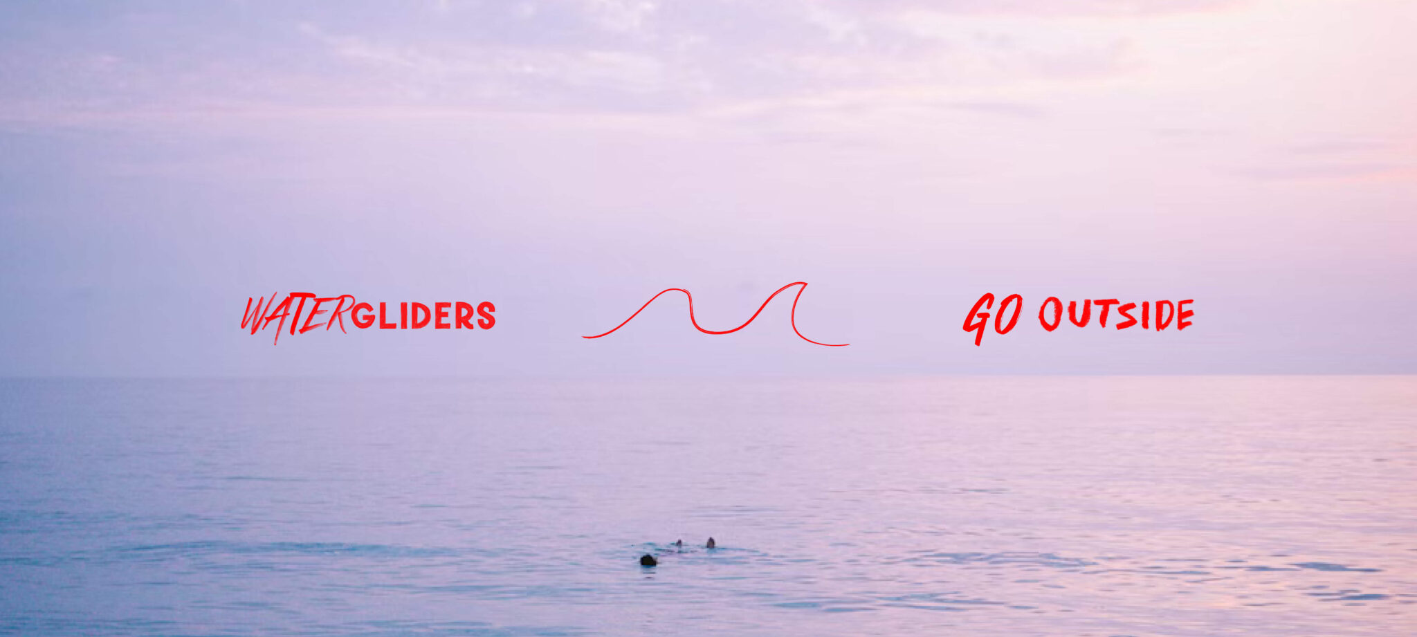
The strategic solution meant tearing up the comfortable narrative. We developed a brand manifesto built on the premise that Watergliders refuses to act merely as a school. We created the “#Glider” concept, establishing a strict code of conduct for those who respect the sea and take real risks. The creation of the “Go Outside” signature works as a blunt call to action.

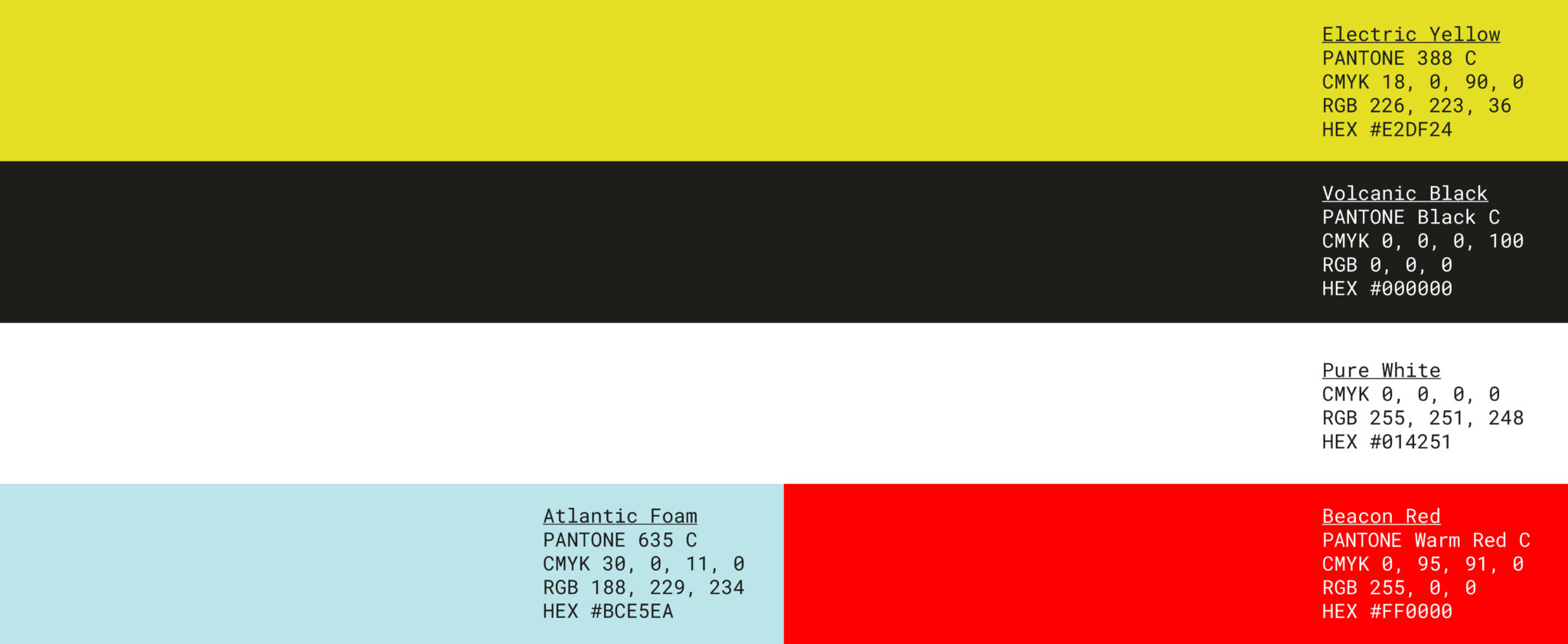
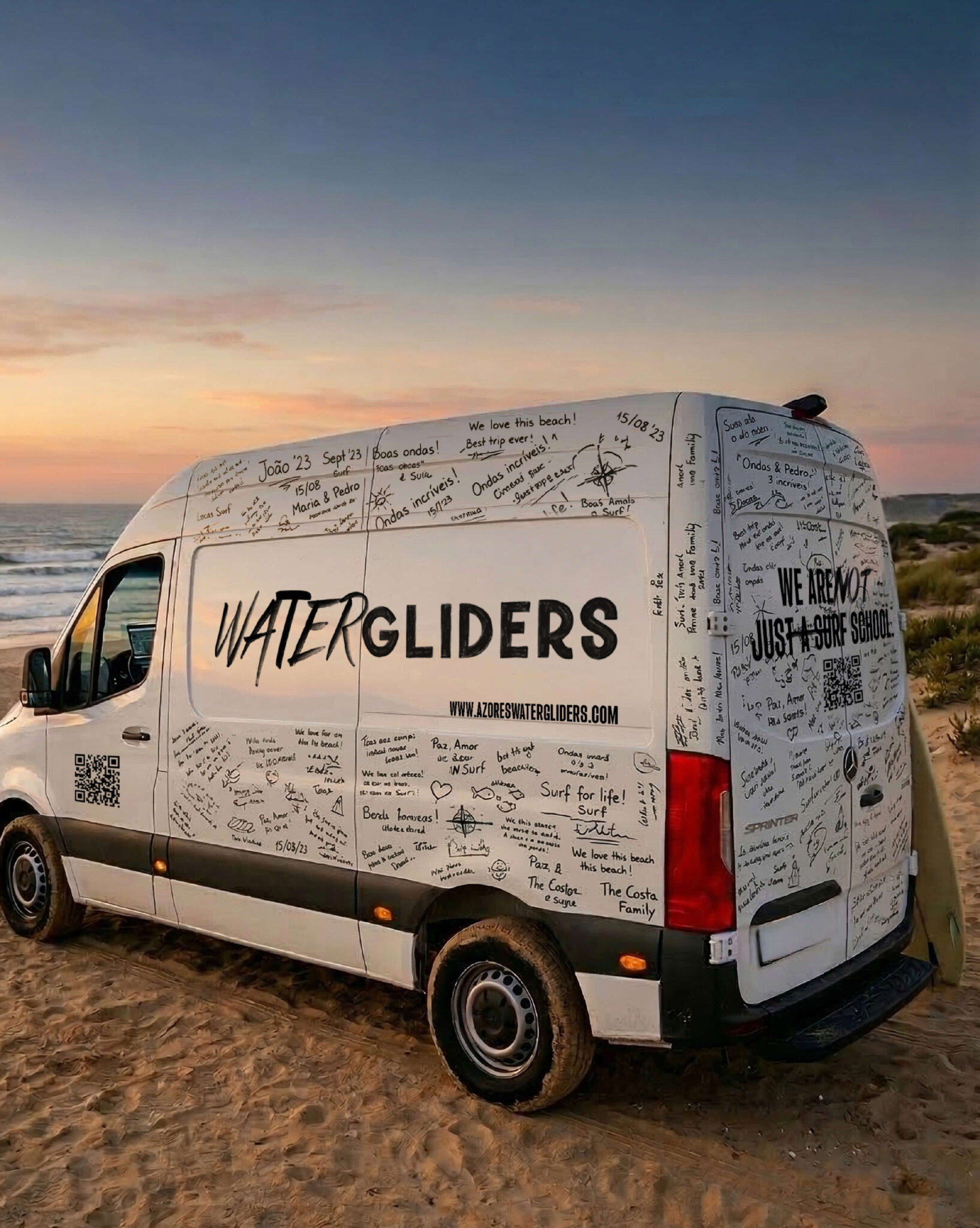
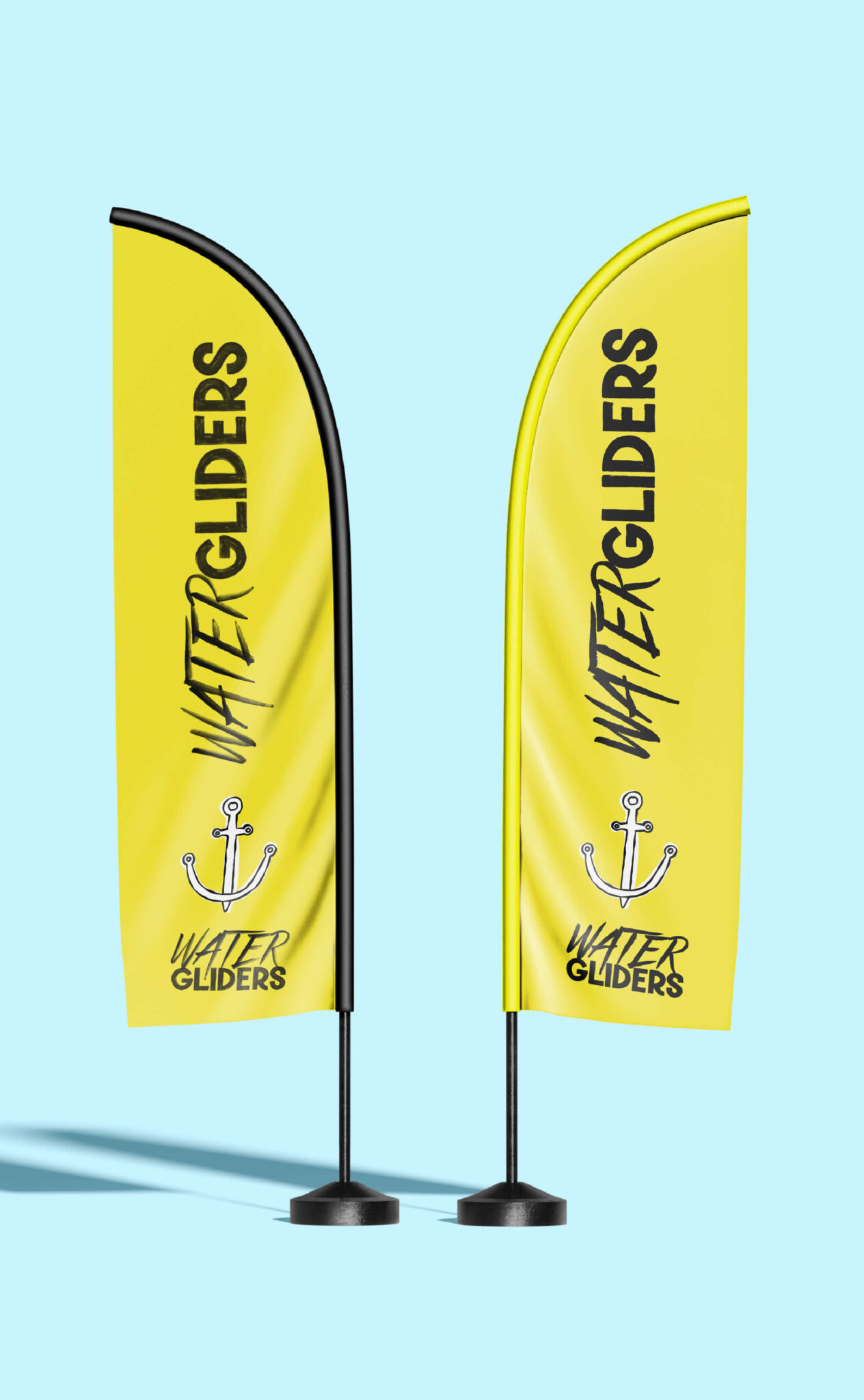
For the visual identity, we applied a raw aesthetic that simulates the wear and tear of salt and wind, defining colours with high commercial contrast. The logo and visual universe adopted expansive typography, complemented by manual scribbles and imperfect logbook textures.
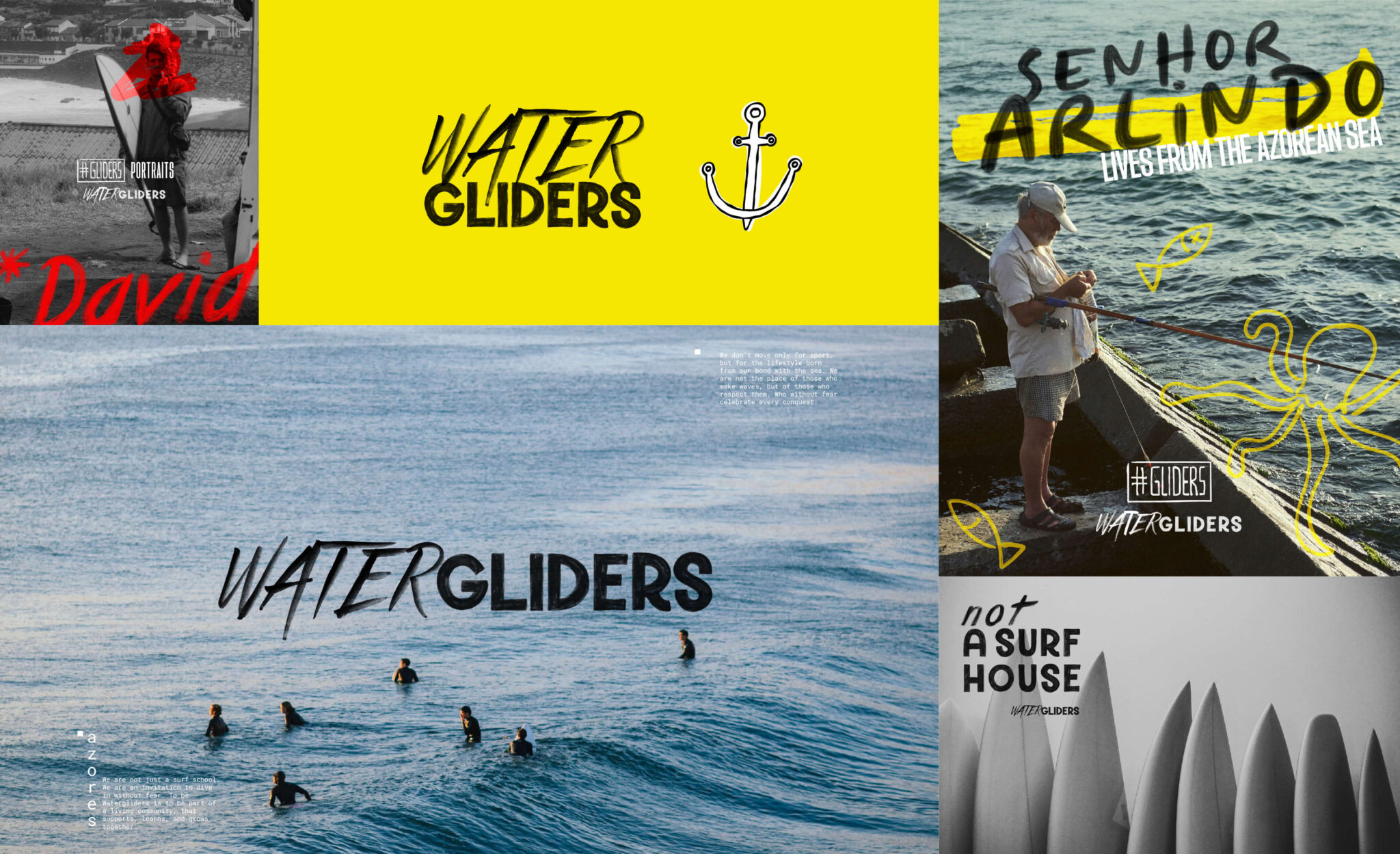
Rebranding de surf club - Watergliders pela GRINGO - logotipo horizontal
Rebranding de surf club - Watergliders pela GRINGO - logotipo vertical
Rebranding de surf club - Watergliders pela GRINGO - logotipo vertical com cor
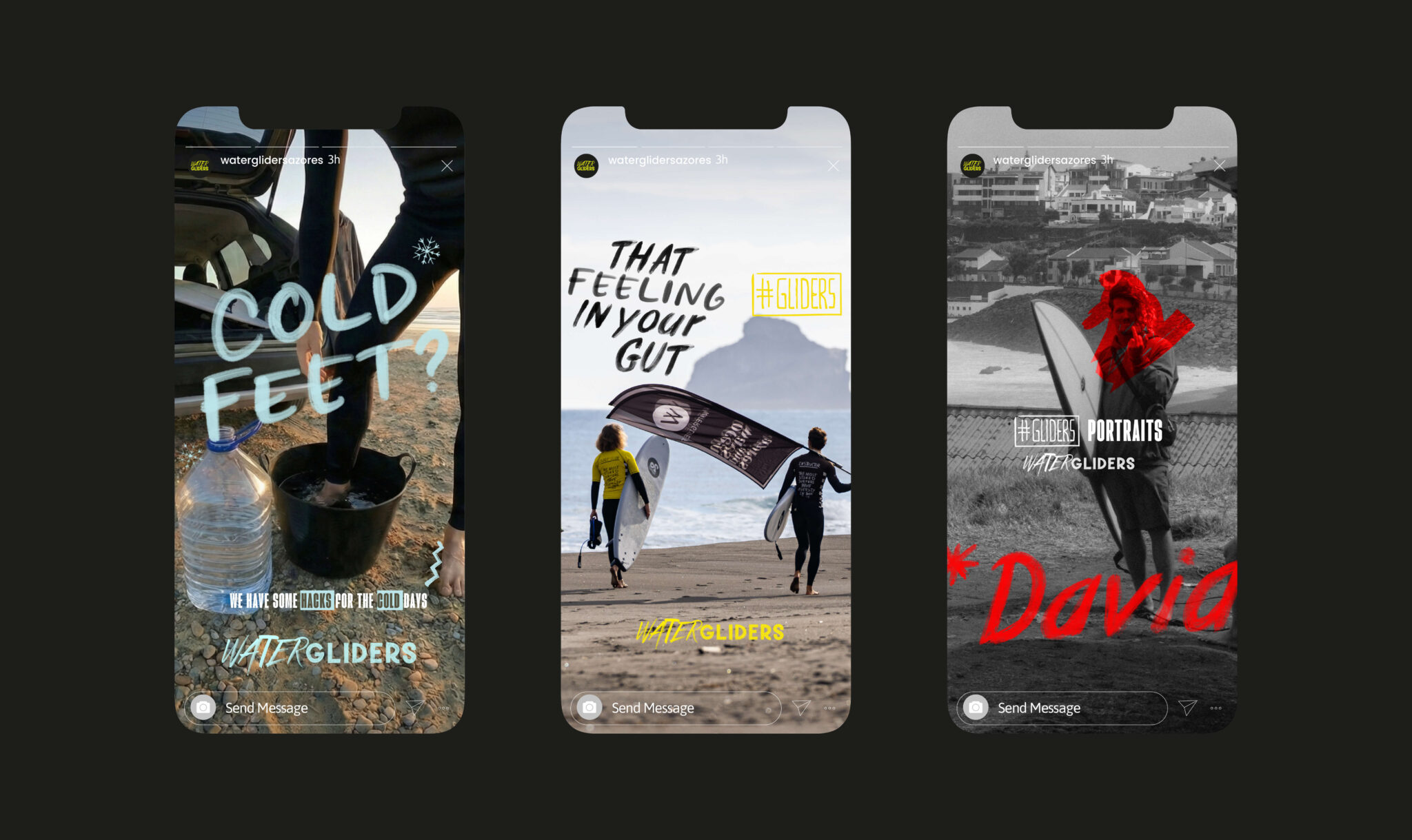
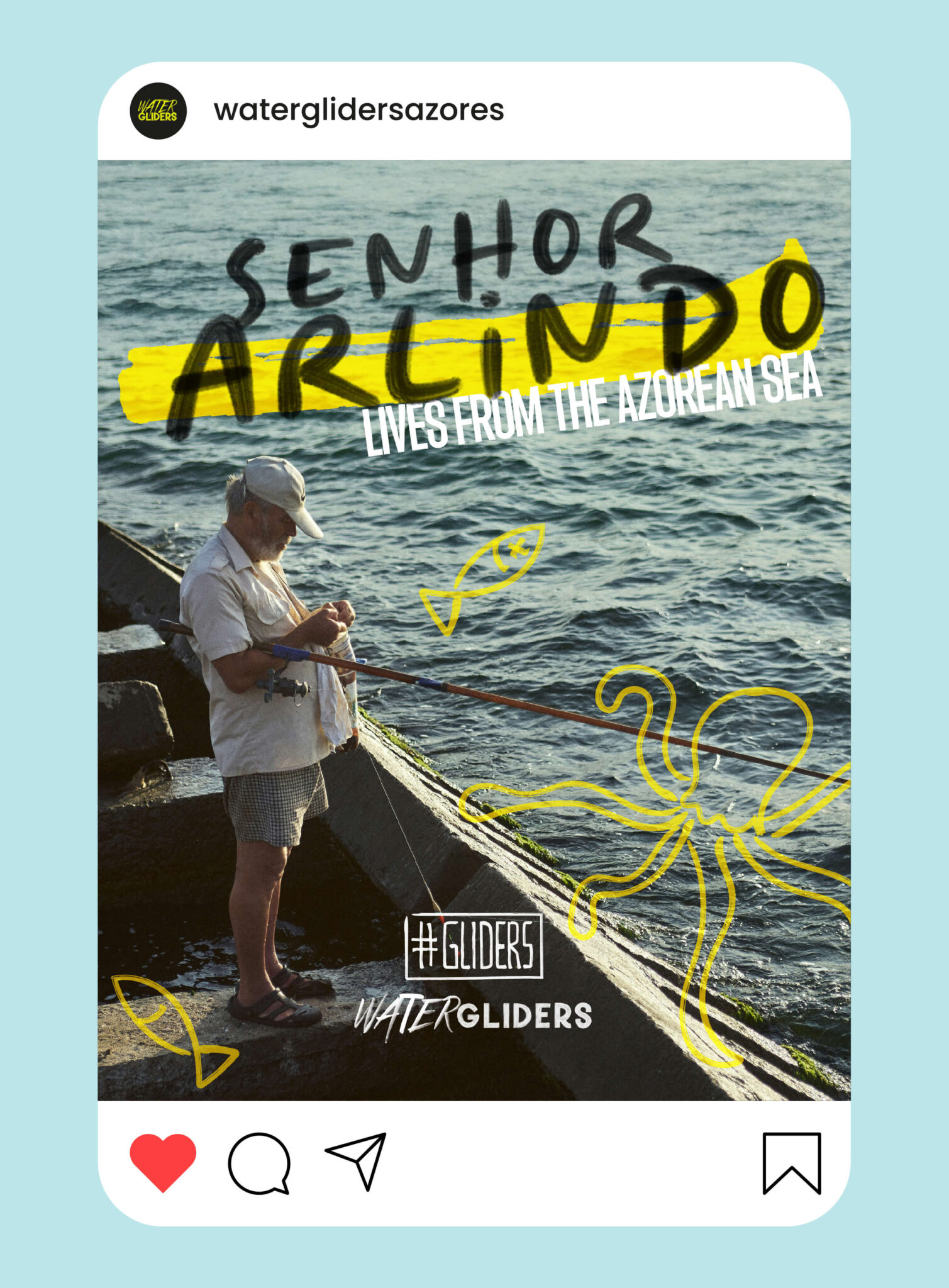
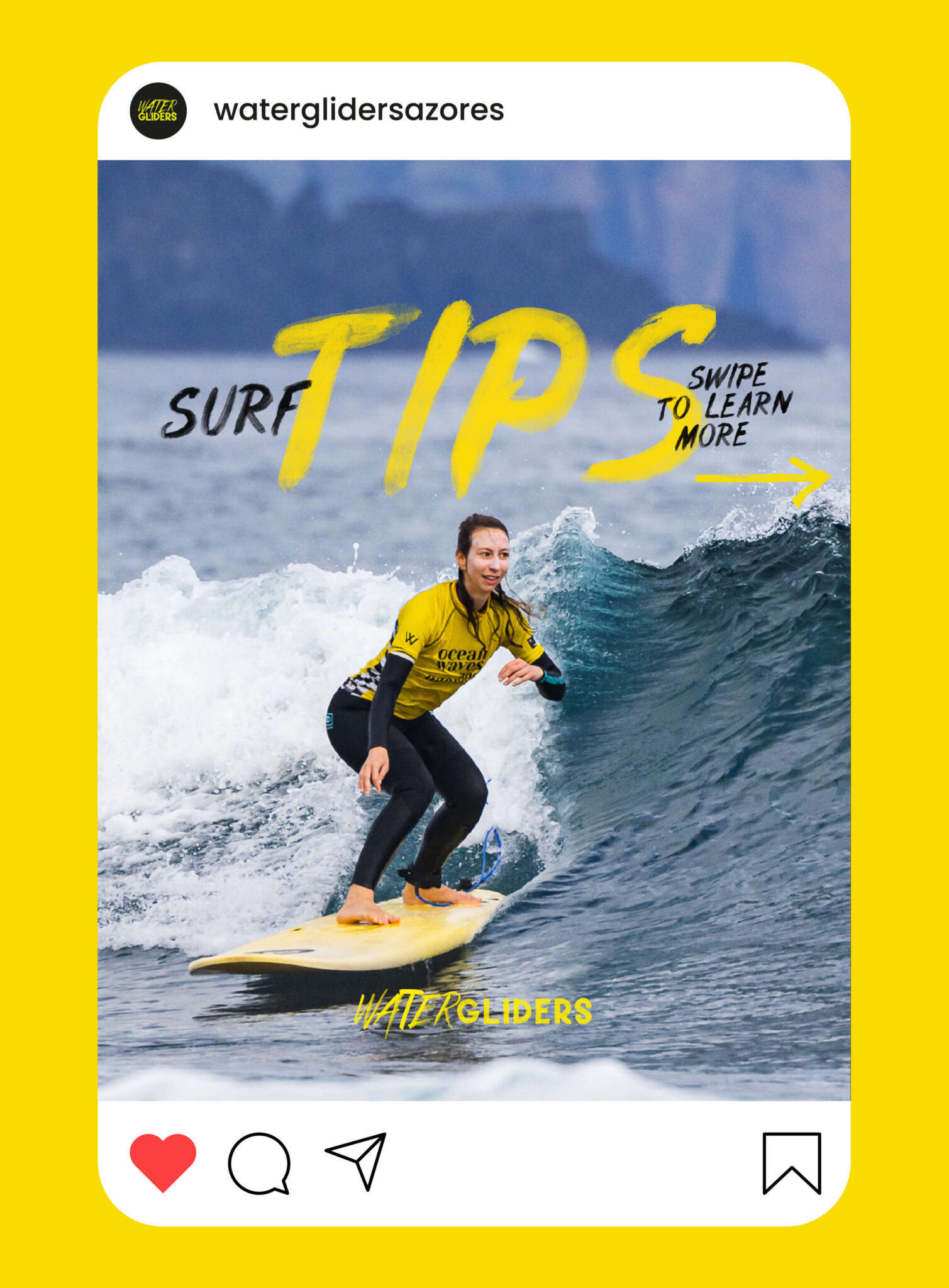
Rebranding de surf club - Watergliders pela GRINGO - rubrica 3 social media

What we delivered

    • Brand Audit

    • Brand Strategy and Positioning

    • Verbal Identity and Copywriting

    • Visual Identity and Logo Design

    • Tagline (Go Outside)

    • Social Media Strategy and Web Copywriting

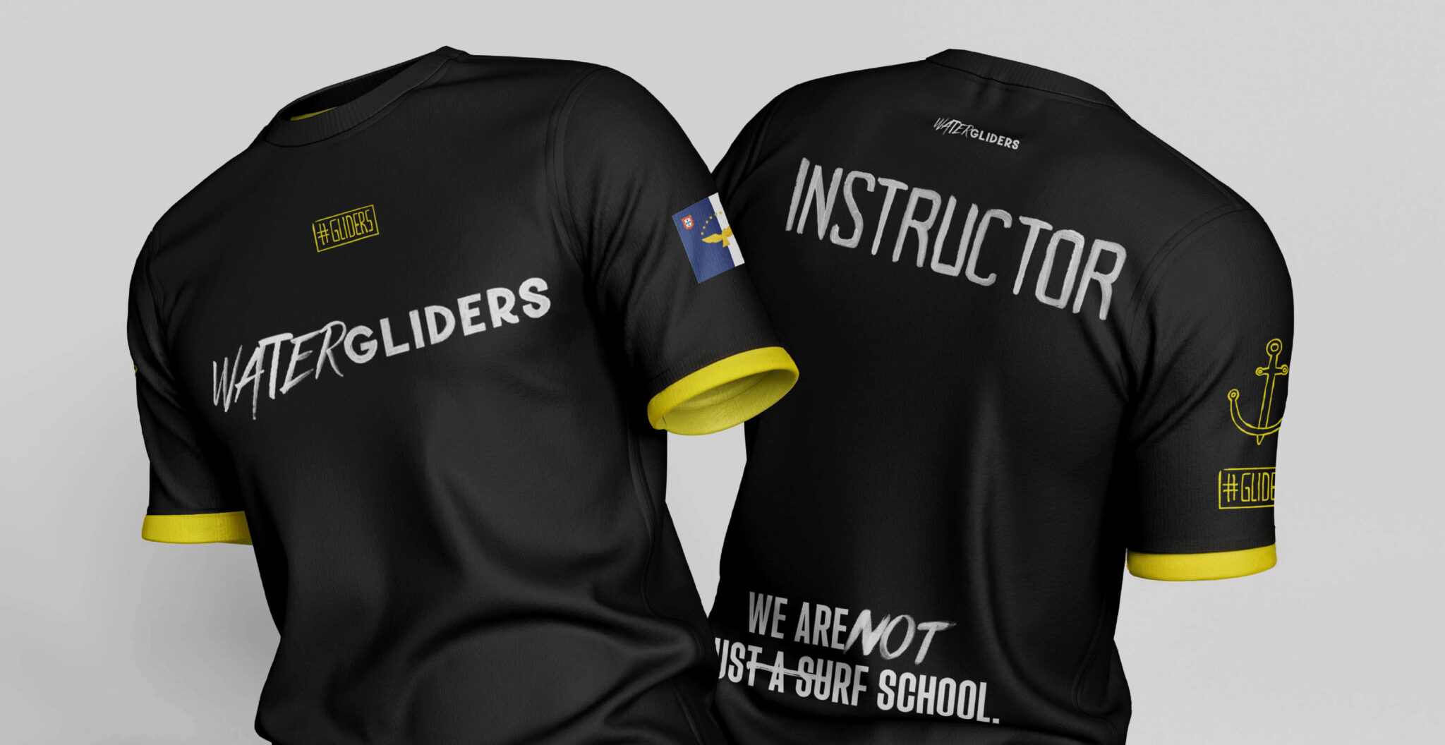
Rebranding de surf club - Watergliders pela GRINGO - licras instrutor
Rebranding de surf club - Watergliders pela GRINGO - paleta de cores
Rebranding de surf club - Watergliders pela GRINGO - áreas
Rebranding de surf club - Watergliders pela GRINGO - carrinha
Rebranding de surf club - Watergliders pela GRINGO - bandeiras
Rebranding de surf club - Watergliders pela GRINGO - anúncio de imprensa
Rebranding de surf club - Watergliders pela GRINGO - licras alunos
Rebranding de surf club - Watergliders pela GRINGO - rubrica 1 social media
Rebranding de surf club - Watergliders pela GRINGO - rubrica 2 social media

The Impact: Market validation and attitude on the ground

Refusing purely decorative design generated immediate impact. When a rebranding project messes with the business DNA, leadership acceptance dictates success or failure. The founder’s reaction to the new communication line was visceral. João’s email (“WE L-O-V-E IT, it’s F***ING great. This is exactly what I asked for”) proved that strategic roughness was the right path.


“João asked us for an uncomfortable approach and we delivered the exact opposite of an Azores postcard. We created a brand that smells of salt and truth.”

Pedro Santana, Partner and Account Director da GRINGO

Rebranding de surf club - Watergliders pela GRINGO - manifesto
Rebranding de surf club - Watergliders pela GRINGO - manifesto (continuação)

Gostou desta marca?

Desafie a GRINGO a questionar a sua marca e sinta o desconforto.